Aeris Landing Page
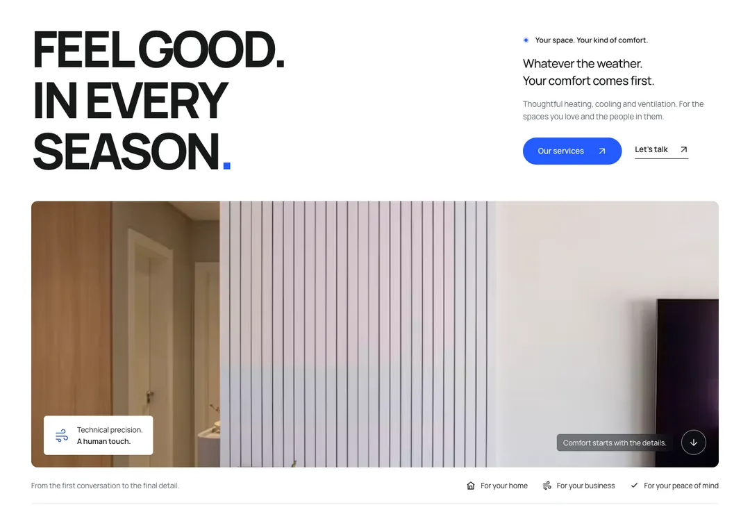
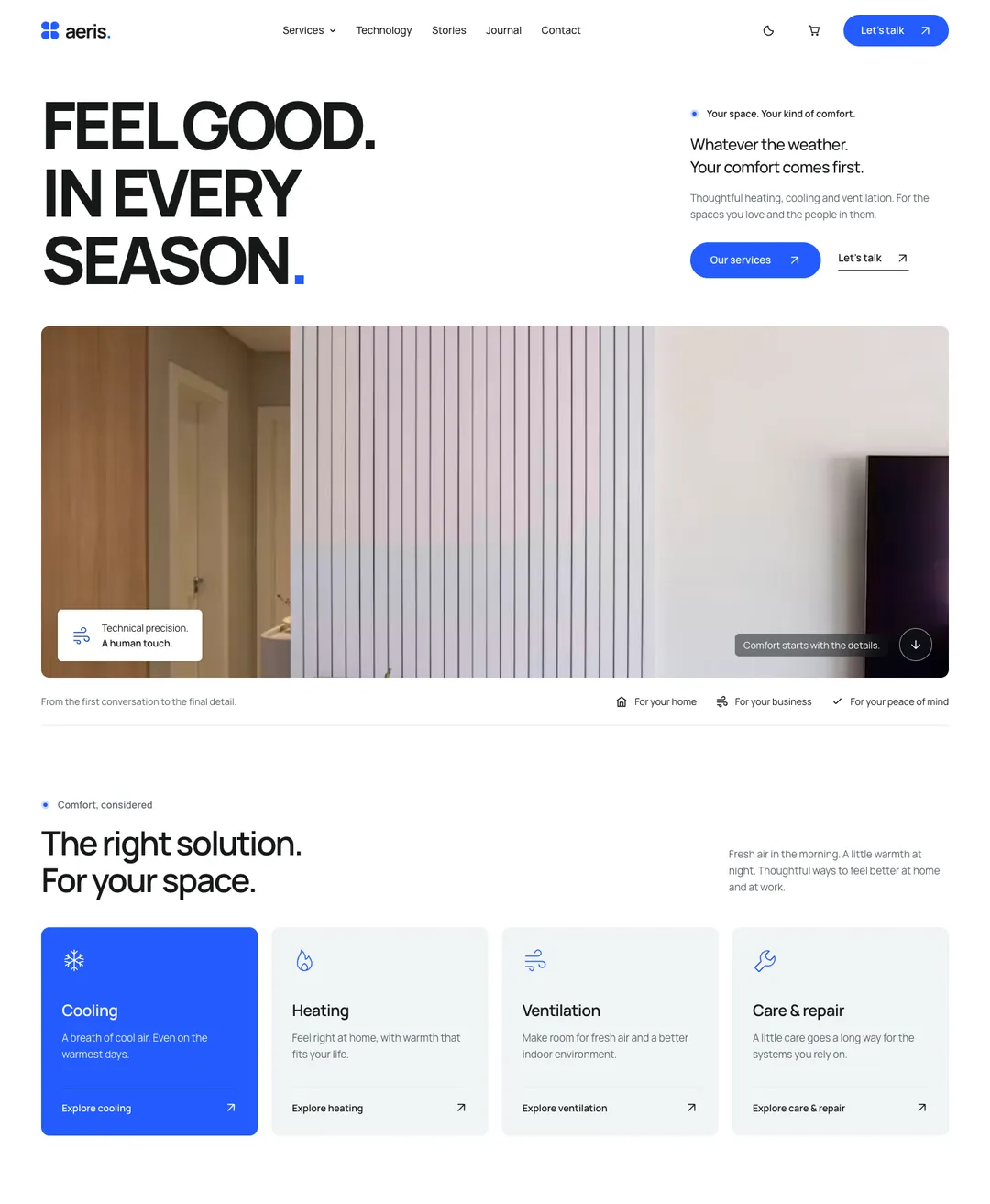
A heating and cooling company home page: capital headline over a wide photo, service cards, a climate dial and a journal.
Aeris is a bright, technical style for service companies in React and Tailwind CSS v4 with 92 pieces: 63 components, 27 blocks and 2 full pages. It was designed light first, on white, and its dark theme is a deep slate.
Aeris is a bright page on white. Wide photographs with soft corners carry it, cards sit on a soft grey-blue fill instead of lines, and one electric blue does all the pointing: the pill buttons, the one featured card and the closing panel with its thin arcs and round call. One family, Manrope, sets everything. The page headline is extra bold and in capitals, in short stacked sentences that end in a blue full stop; section titles stay in sentence case. Text links sit on a thin line and end in an arrow, and the page closes on a dark slate band.
It began as a heating, cooling and ventilation style and also suits installers, home services, energy and smart-home brands. It was designed light first, and the dark theme is designed too, not inverted. Of its full pages, the landing page is a heating and cooling company's home page with service cards, a climate dial, a customer story and a journal. The service page presents one service: the process in steps, a system finder, a before and after slider, maintenance plans and a service area check. The climate pieces are found only in this style.
A heating and cooling company home page: capital headline over a wide photo, service cards, a climate dial and a journal.
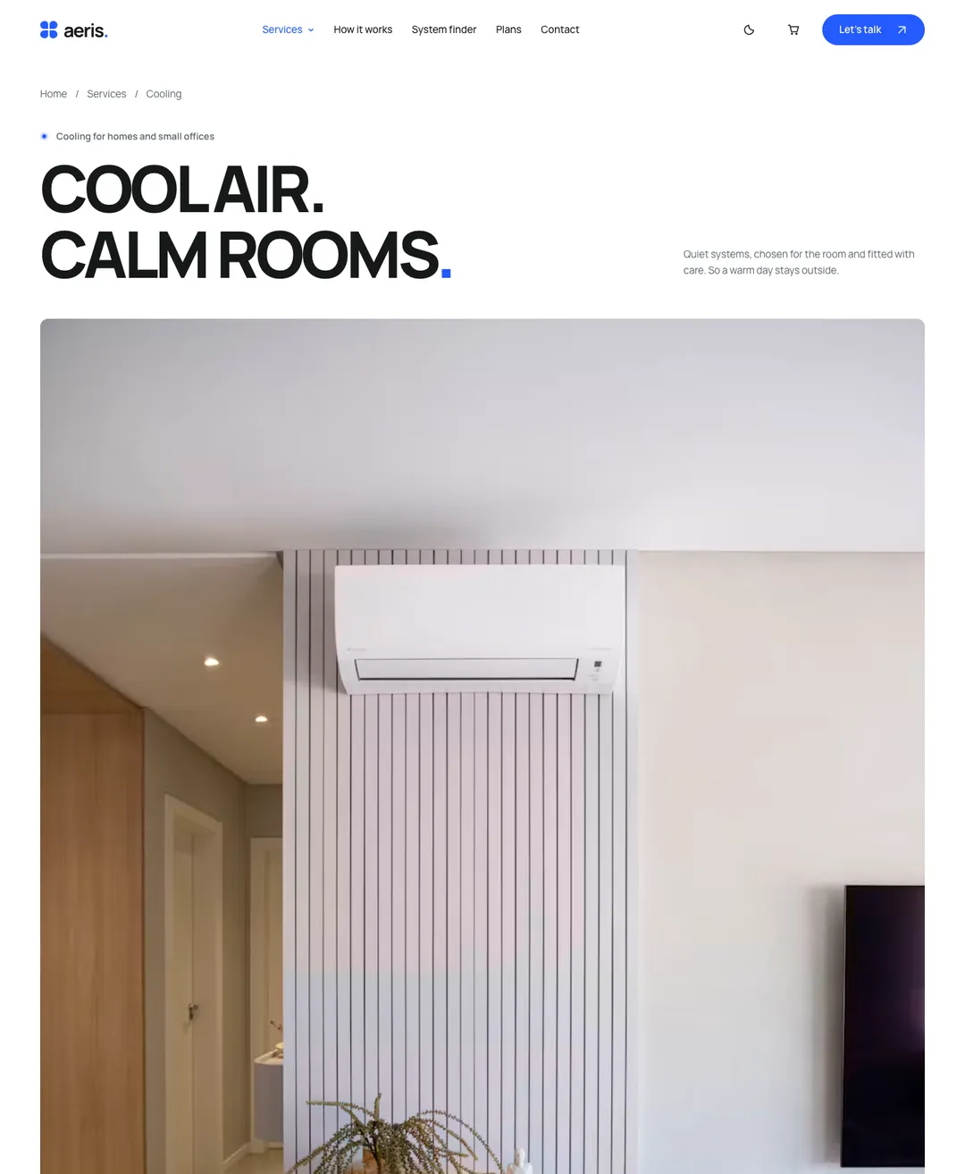
The page of one service: facts, a process in steps, a system finder, a before and after, plans and a service area check.
Opens the page with its one main heading; media sits beside the copy, below it, or is left out.
Site header with logo, links and actions; its mobile menu opens before hydration and closes on Esc.
One short announcement as a strip above the navbar or a hero pill; the whole message can be a link.
Brand, actions and link columns above a legal row with social links, plus an optional wordmark.
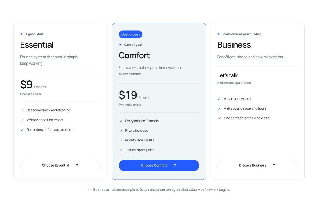
Up to four plans, one featured, with a monthly/yearly price switch that works without JavaScript.
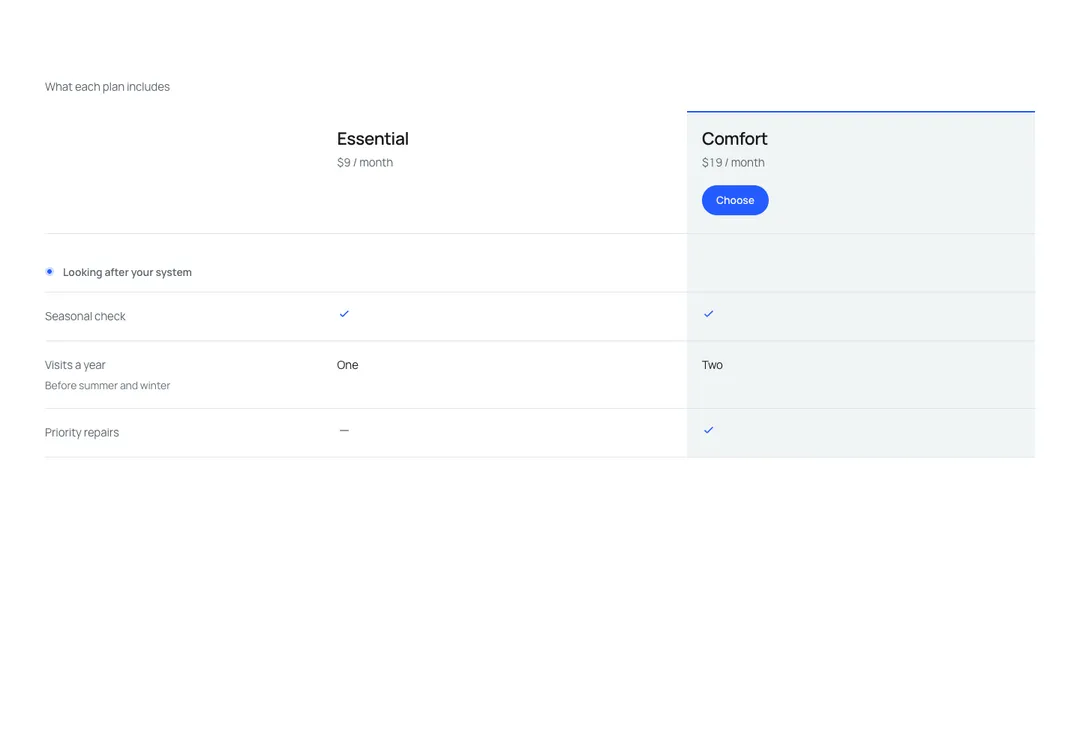
Plans side by side with grouped feature rows; on phones it scrolls with the feature column pinned.
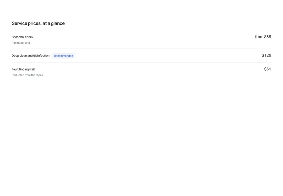
Services or menu items, each name joined to its price by a dotted leader, in one or two columns.
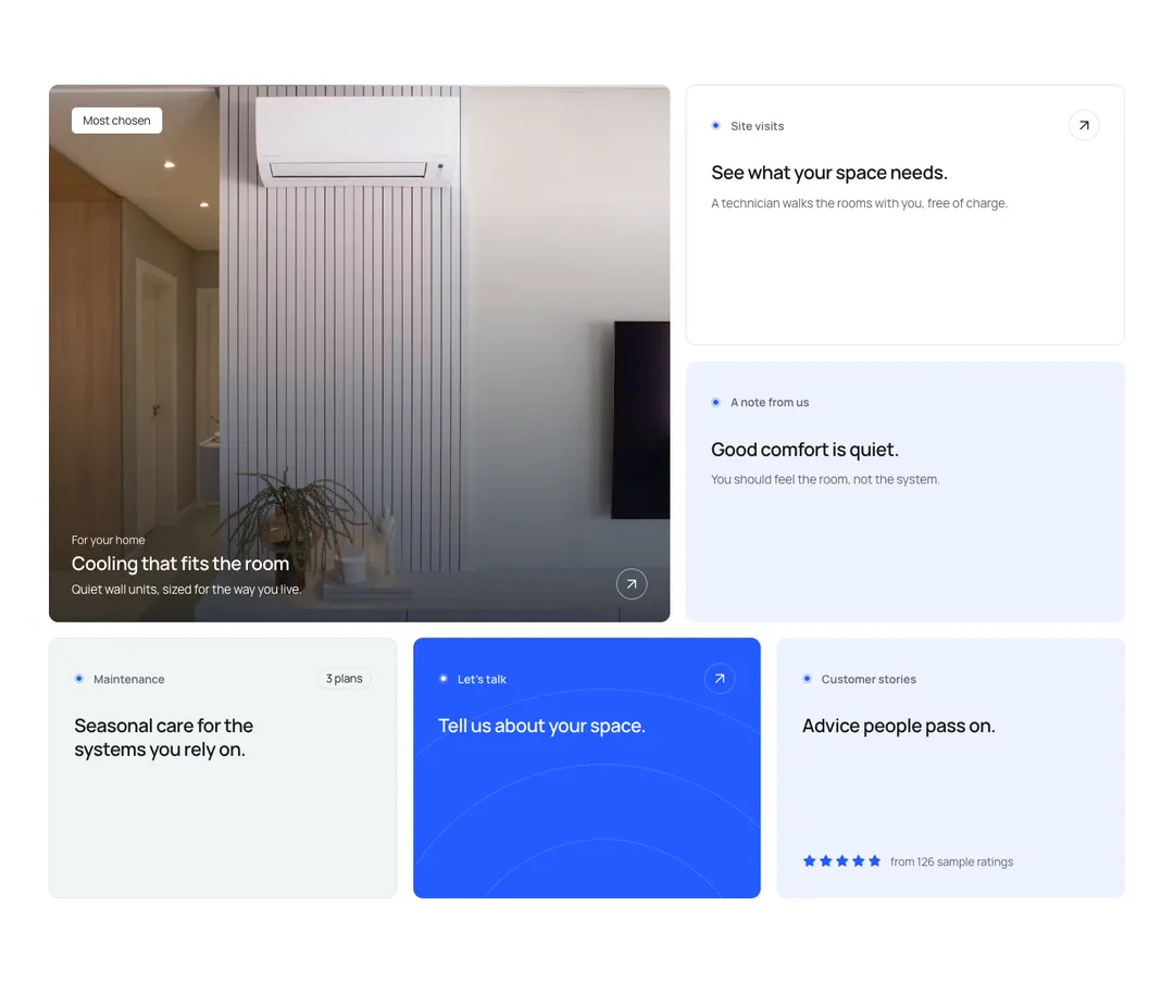
Feature tiles that set their own width and height on a 12-column grid and stack on phones.
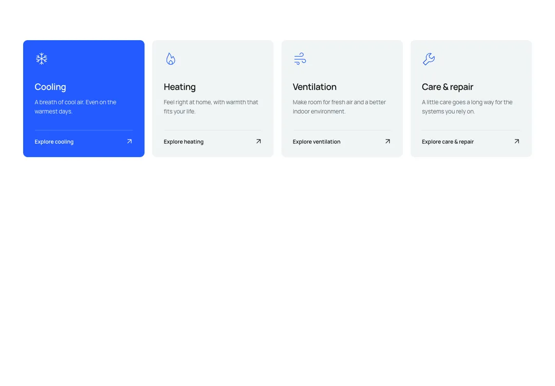
Icon, title and text items in two to four columns, shown as cards, plain or between rules.
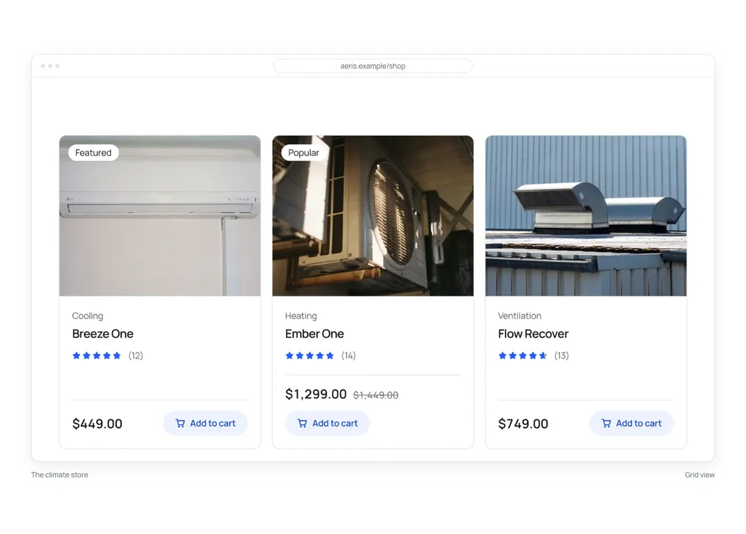
Wraps a screenshot or mockup in a browser, app window or phone frame that screen readers skip.
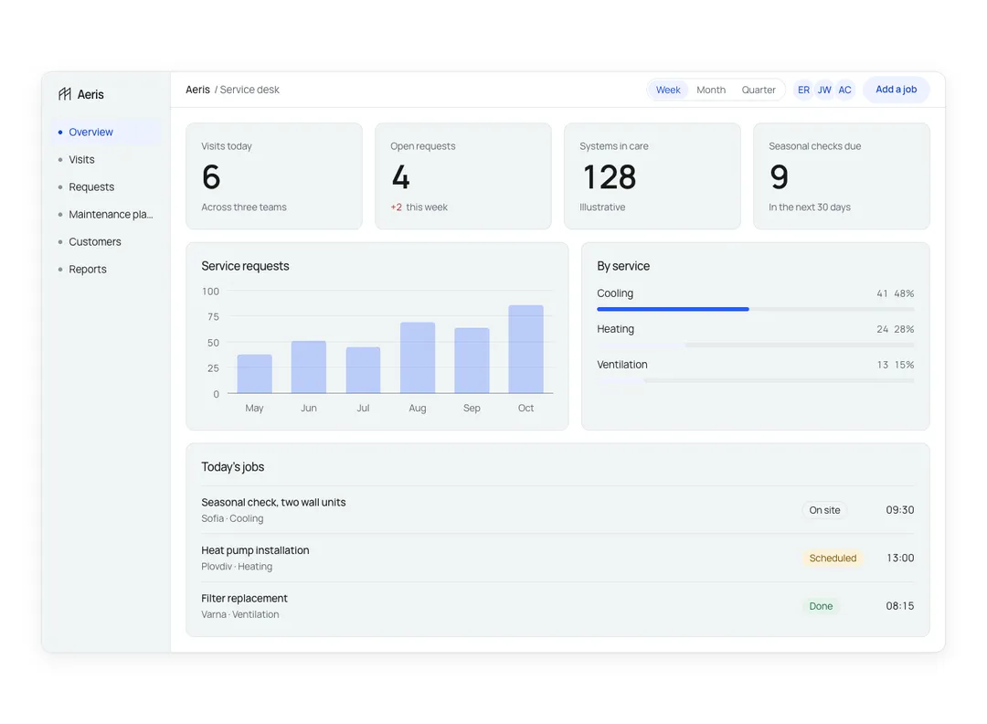
Sample app dashboard for a hero, with tabs, metrics and a chart; it rearranges to fit its column.
Trail of links ending at the current page, with separators hidden from screen readers.
Page links with previous, next and ellipses, reduced to previous, current and next on phones.
Seven variants, three sizes, a loading state that keeps the width, and a link with the same look.
Shows one icon and no text; the label you set is both its accessible name and its native tooltip.
Related buttons in a row or column, marked up as a group and optionally joined edge to edge.
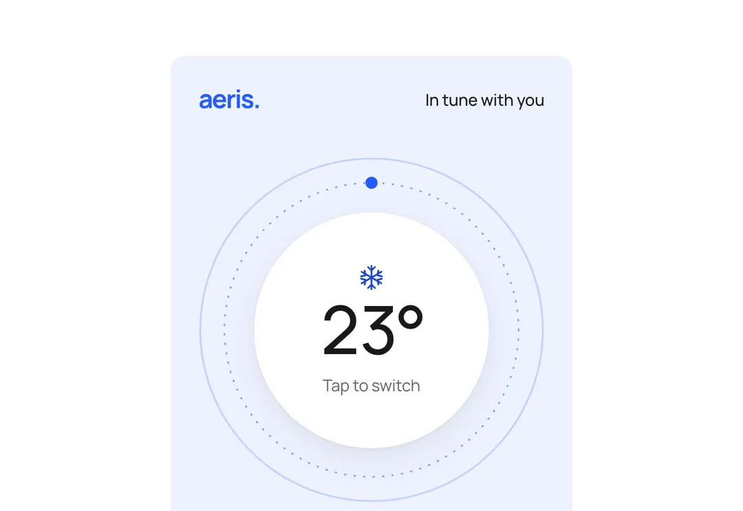
A round dial in a pale panel that shows a temperature and steps through cool, warm and fresh-air settings.
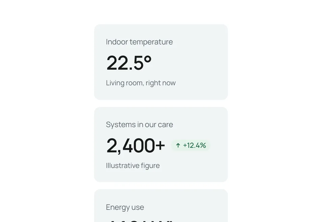
Shows one KPI: label, value, a change tag colored for good or bad news, and a hint.
All 92 pieces, category by category.
Save a favorite or a whole style, and find them in your workspace on any device.