Bavaria Button
Seven variants, three sizes, a loading state that keeps the width, and a link with the same look.
Seven variants, three sizes, a loading state that keeps the width, and a link with the same look.
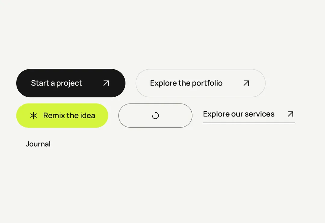
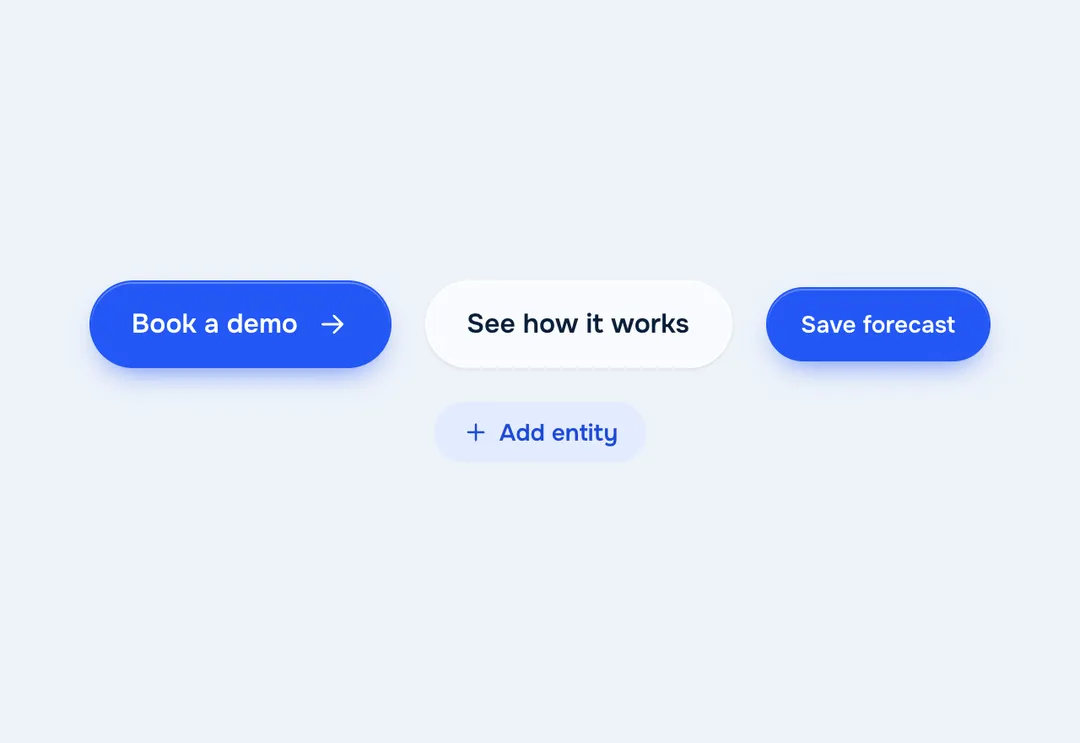
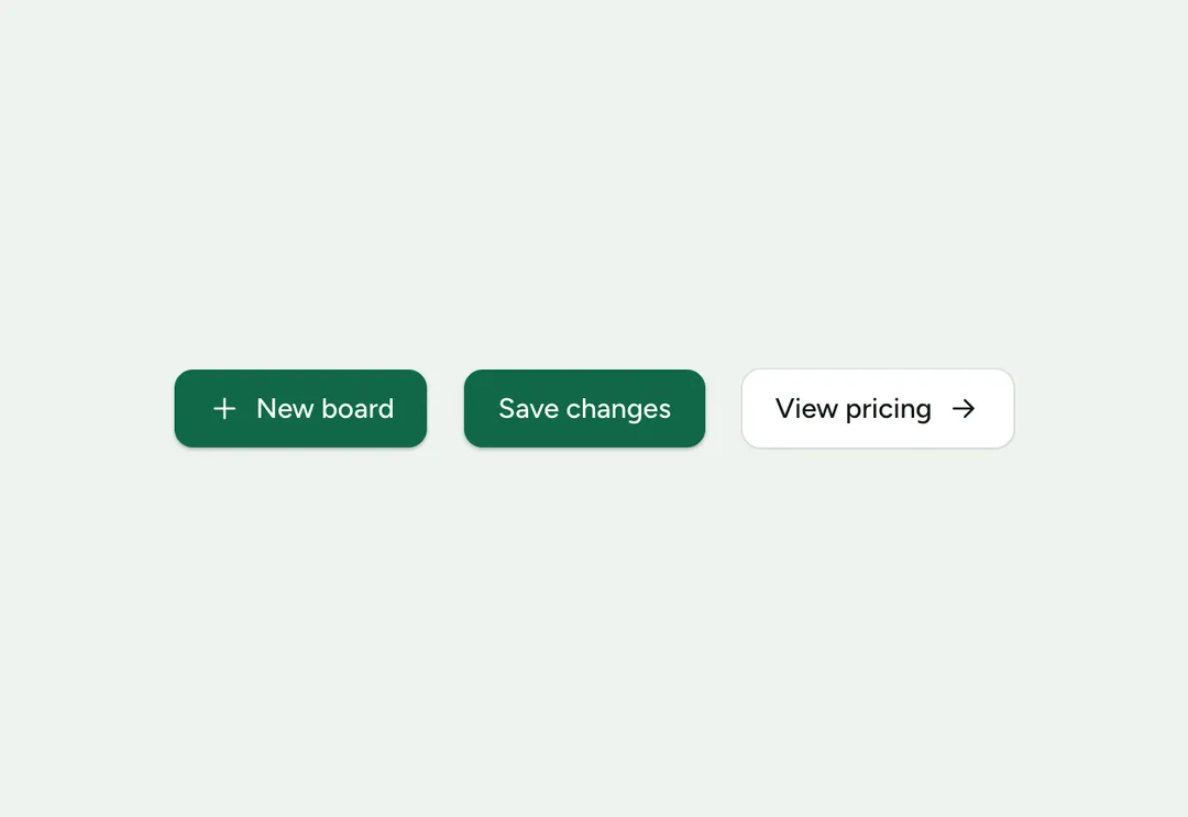
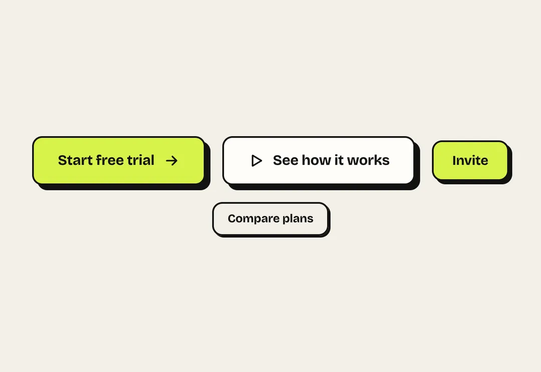
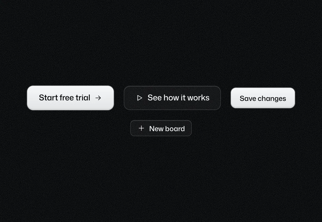
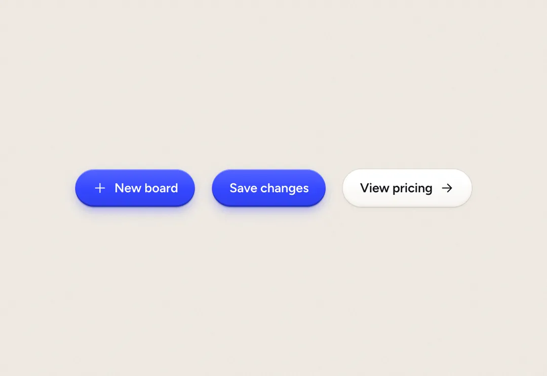
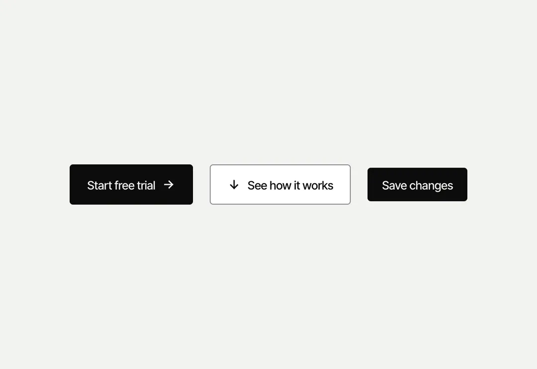
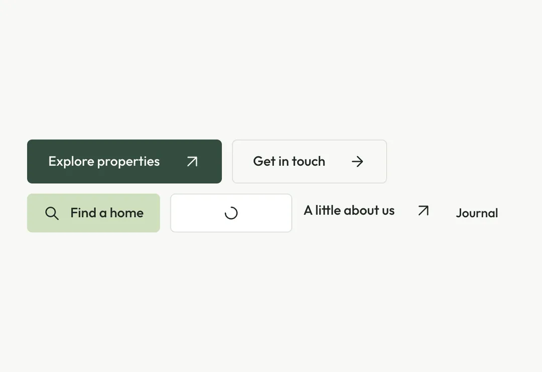
Pill buttons in seven variants and three sizes (40 / 46 / 52 px). primary is the accent pill with a white label; on the accent panel it turns white with an ink label (the main action, one per block). secondary is the lifted pill: white with a hairline on the page, on a photograph and on the footer band, and it turns mist on hover ("Save", "Cancel", the call in the footer). outline is a hairline pill that fills ink on hover, ghost text only, accent the quiet mist pill with accent text ("Add to cart", a soft action on white), destructive for deleting, and link the text link: a line under the label and its arrow that an accent line draws over on hover, while the arrow steps up and right. In a pill the iconEnd arrow sits apart from the label and steps up and right too. Loading shows a thin spinner, keeps the width, sets aria-busy, disables the button and announces loadingLabel. ButtonLink is an <a> with the same look (never disabled). buttonClass(look, className) gives the classes for a router link.
It is part of Aeris: white pages, soft grey cards, one electric blue. The style’s 92 pieces share one set of tokens, type and motion, in a light and a dark theme, so whatever you take from it fits together.
To put it in your project, copy the prompt into Claude Code, OpenAI Codex or Cursor, or add it by hand. The documentation walks through both.
Seven variants, three sizes, a loading state that keeps the width, and a link with the same look.
Seven variants, three sizes, a loading state that keeps the width, and a link with the same look.
Seven variants, three sizes, a loading state that keeps the width, and a link with the same look.
Seven variants, three sizes, a loading state that keeps the width, and a link with the same look.
Seven variants, three sizes, a loading state that keeps the width, and a link with the same look.
Seven variants, three sizes, a loading state that keeps the width, and a link with the same look.
Seven variants, three sizes, a loading state that keeps the width, and a link with the same look.
Seven variants, three sizes, a loading state that keeps the width, and a link with the same look.