Bavaria Animated Background
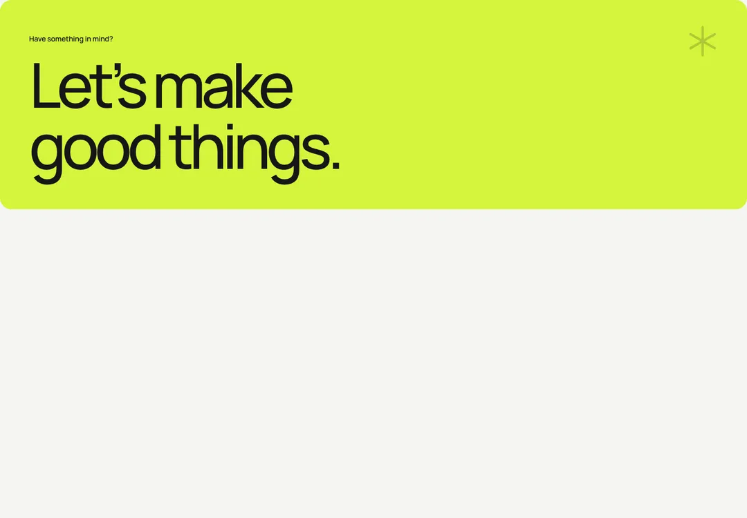
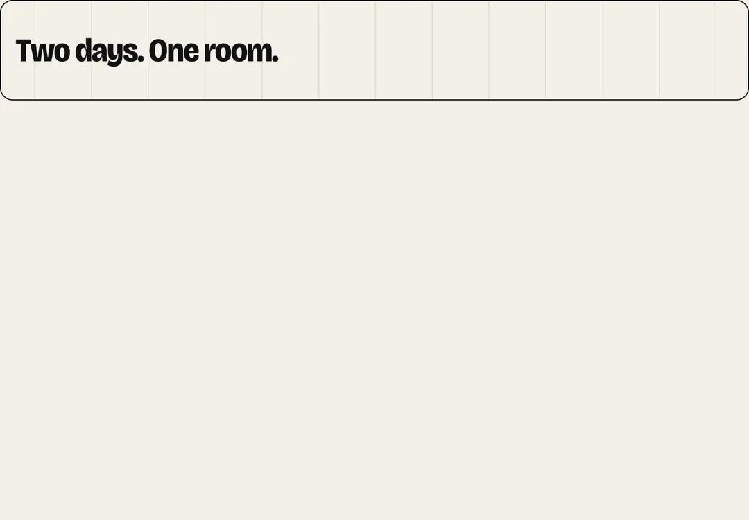
The style's own background, animated behind a section's content without blocking clicks.
AerisMotion
The style's own background, animated behind a section's content without blocking clicks.
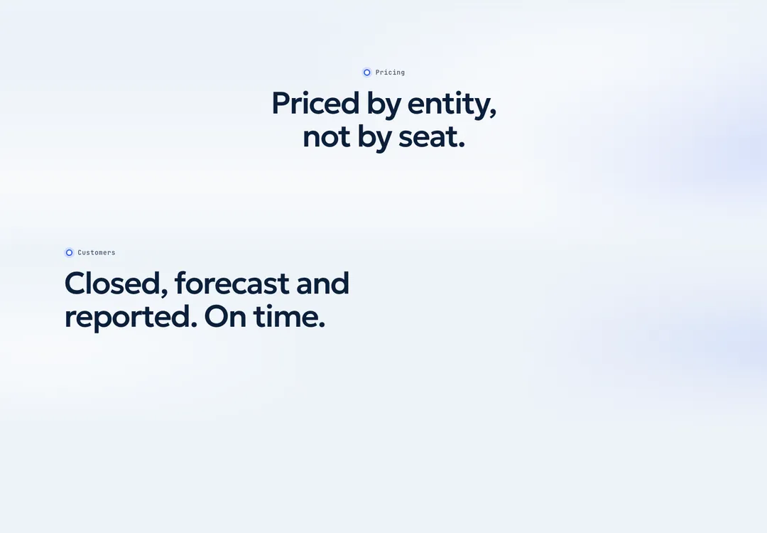
The quiet backdrop of this kit. position="fill" lays the thin airflow arcs of the accent panel at the lower far corner of its positioned parent; position="top" is a pale accent wash over the top of the page that fades out, with the same arcs in its corner, for a hero without a photograph. Put it first inside a relative isolate parent (with overflow-hidden for a panel): it sits behind the content, clipped to the parent, and never takes pointer events. Nothing loops: animated only fades it in once when it comes into view. CTA already draws the arcs on its accent panel, so don't add a Backdrop there.
It is part of Aeris: white pages, soft grey cards, one electric blue. The style’s 92 pieces share one set of tokens, type and motion, in a light and a dark theme, so whatever you take from it fits together.
To put it in your project, copy the prompt into Claude Code, OpenAI Codex or Cursor, or add it by hand. The documentation walks through both.
The style's own background, animated behind a section's content without blocking clicks.
The style's own background, animated behind a section's content without blocking clicks.
The style's own background, animated behind a section's content without blocking clicks.
The style's own background, animated behind a section's content without blocking clicks.
The style's own background, animated behind a section's content without blocking clicks.
The style's own background, animated behind a section's content without blocking clicks.
The style's own background, animated behind a section's content without blocking clicks.
The style's own background, animated behind a section's content without blocking clicks.