Bavaria Listing Slider
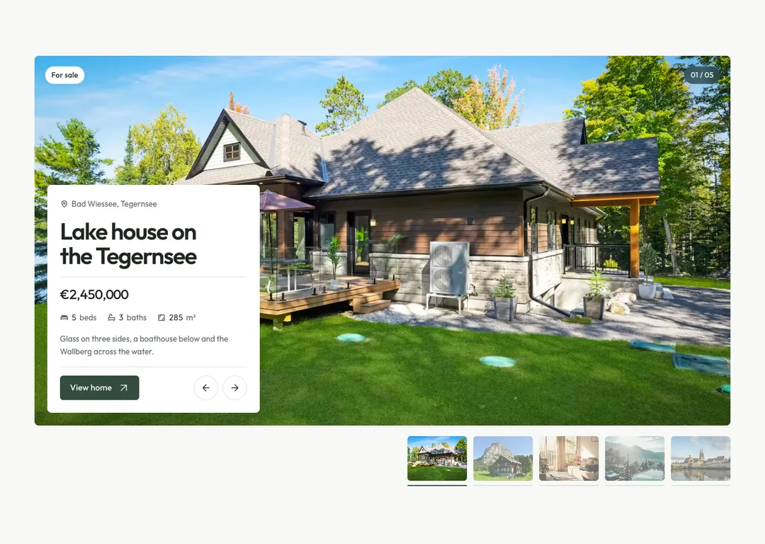
Featured-homes slider whose photo opens like a pair of doors while the price and rooms count up.
10 sliders built on GSAP, each with its own way of changing slide: a curtain of light, columns that step, a wave of surf, a departures board, a ring that turns and cards you throw. Preview each one live, then take it with its install prompt.
Featured-homes slider whose photo opens like a pair of doors while the price and rooms count up.
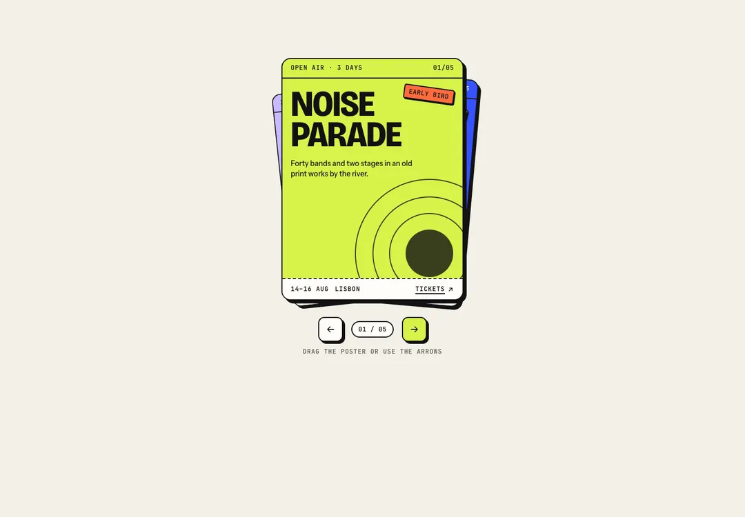
Stack of poster cards: throw the top one aside with a drag or the arrows and the next stamps forward.
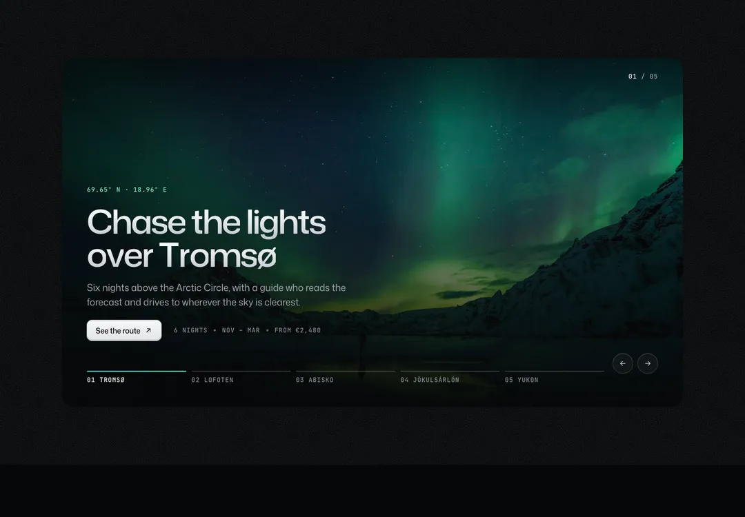
Full-bleed photo slider: a curtain of aurora light crosses the frame and uncovers the next picture.
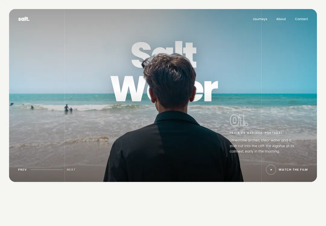
Full-bleed hero whose cut-out subject stands in front of the title; slides change with a wave of surf.
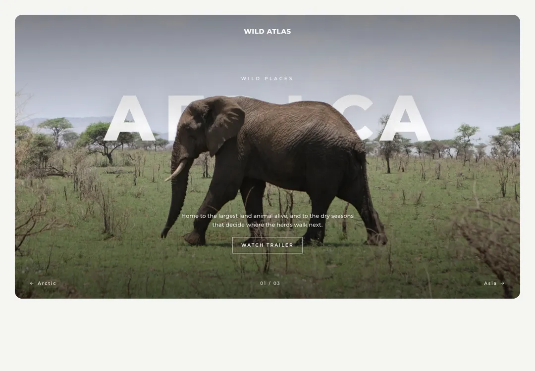
Wildlife hero whose giant title flips letter by letter like a departures board, behind the animal.
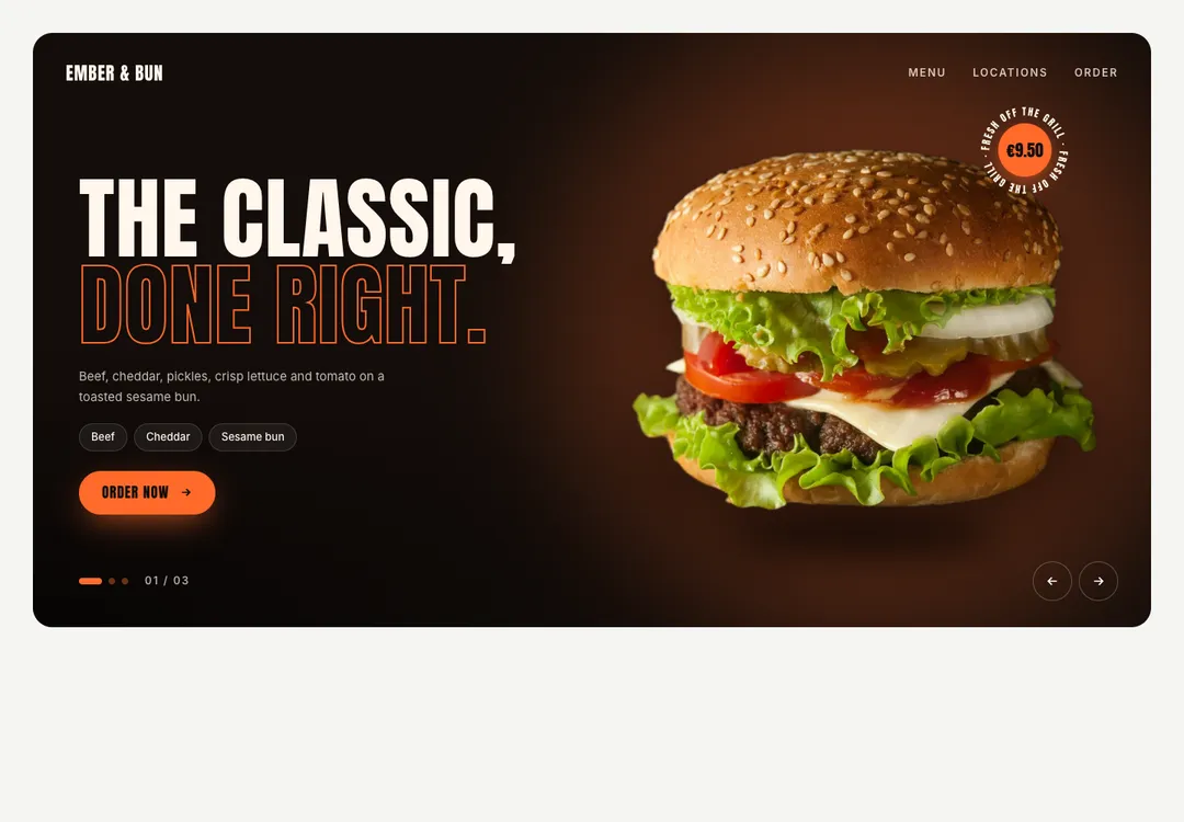
Dark food hero: the product spins in over a coloured glow, with rising sparks and a turning price sticker.
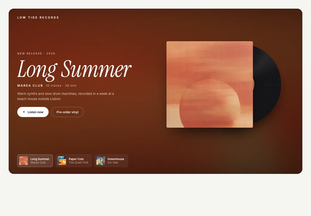
Record hero: the sleeve turns in, its record slides out and spins at 33⅓ over the blurred cover.
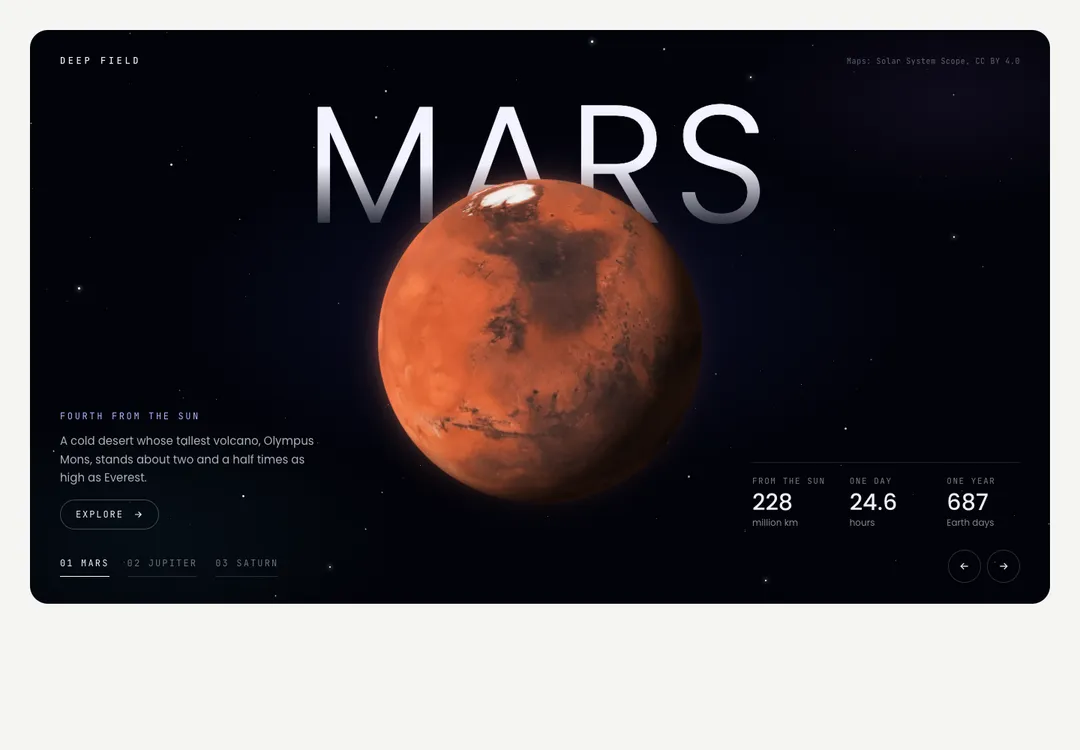
Space hero: 3D planets turn in WebGL, and the camera pans past the stars to the next one.
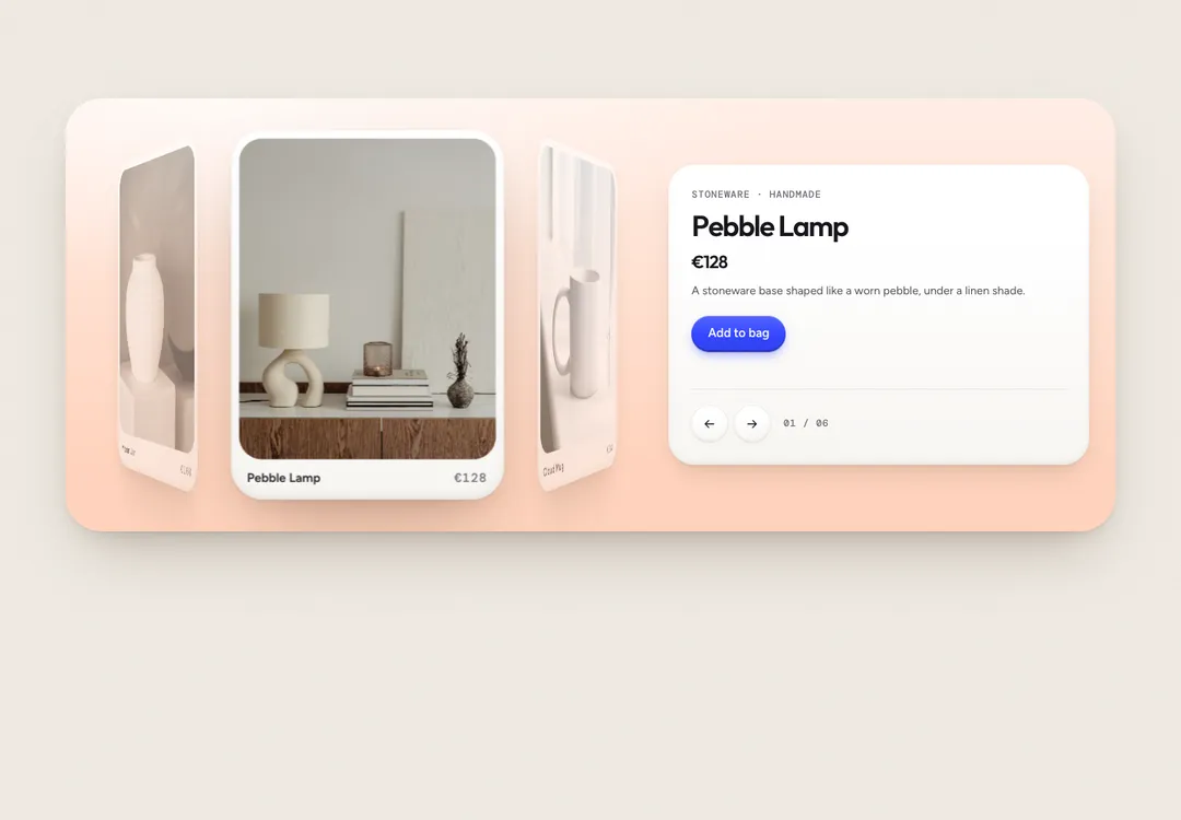
Product cards on a 3D ring that spins with a drag, springs to rest and tints the panel per product.
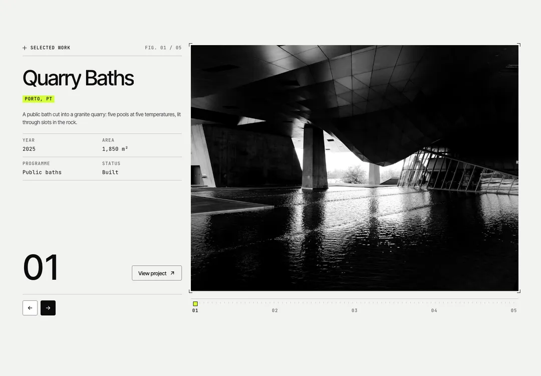
Project slider whose photo is cut into columns that step past each other to show the next one.
These are the only pieces in the catalog that install something: they run on GSAP, so their prompt asks for npm i gsap. All of them answer to swipe, drag, the arrow keys and their own buttons, give every slide a name for screen readers, and change slide without the travel under reduced motion. The ones that play by themselves carry a pause button and stop on hover, on focus and off screen.
Choose by what you have to show. Noir Aurora's Curtain Slider and Bavaria's Listing Slider carry wide photographs: a journey or a hero, and homes whose price counts to the next one. Swiss Tech Mono's Column Slider prints a project index with its specs beside the plate. Neo-Brutal's Swipe Deck suits posters and events to flick through, and Soft Bento's Orbit Carousel turns a ring of products and gives each its own colour. The Showcase collection adds whole heroes with a look of their own: a beach, wildlife, a burger grill, a record label and the planets.
A free account takes 3 new pieces a day: the code, the styles and the install prompt. Pro and Team remove the limit.