Grove Analytics Dashboard
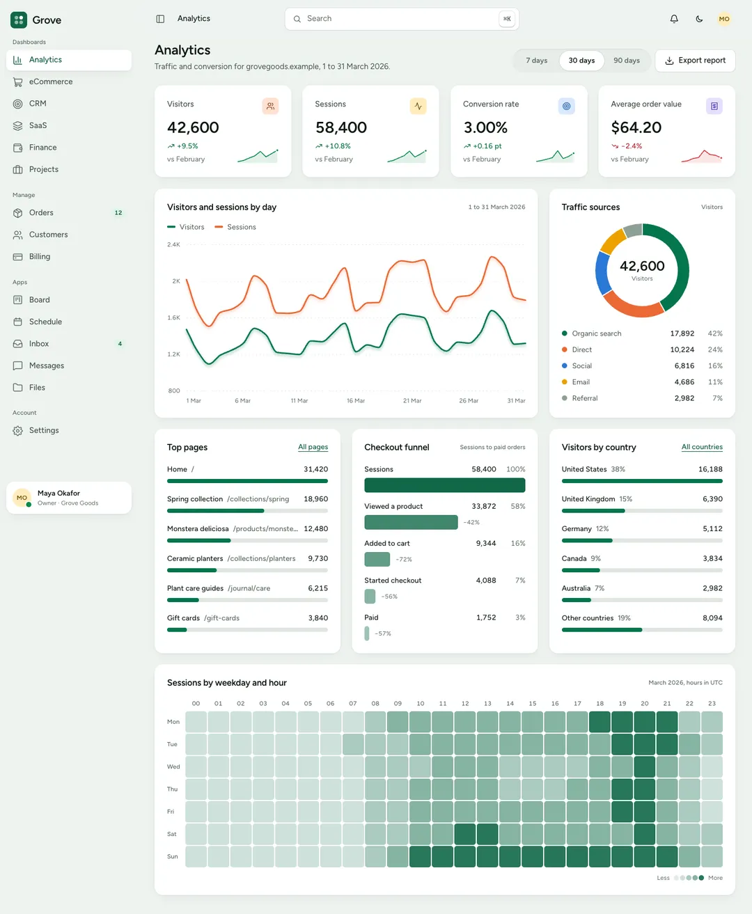
An analytics dashboard: visitor KPIs, a traffic chart, sources, a conversion funnel and a weekday-by-hour heatmap.
Grove is an admin dashboard style for React and Tailwind CSS v4 with 135 pieces: 78 components, 40 blocks and 17 full pages. It was designed light first, on a sage canvas, and has a dark theme of its own.
Grove is a calm look for screens people work in all day. The canvas is a pale sage green and the cards are white, with no border and one soft shadow. Icon chips and avatars come in four pastels: apricot, honey, sky and lilac. One pine green marks the primary action and the current item, and nothing else. Text is set in Figtree in two weights, labels stay in sentence case, and shapes are round without being bubbly. Motion is quiet: a press gives slightly, menus fade in, and nothing bounces.
Beside the components every style has, Grove carries the pieces of an app: a shell with a sidebar that folds to icons, a data table with search, sorting and paging, KPI cards, donut, funnel and heatmap charts, a kanban board that also works from the keyboard, a calendar, chat, an inbox, file cards, an invoice and settings sections. Its full pages are six dashboards (analytics, eCommerce, CRM, SaaS, finance, projects) and the screens around them: orders, customers, billing, a board, a schedule, an inbox, messages, files, settings and sign-in, plus a landing page. It was designed light first, and each piece has a dark theme as well.
An analytics dashboard: visitor KPIs, a traffic chart, sources, a conversion funnel and a weekday-by-hour heatmap.
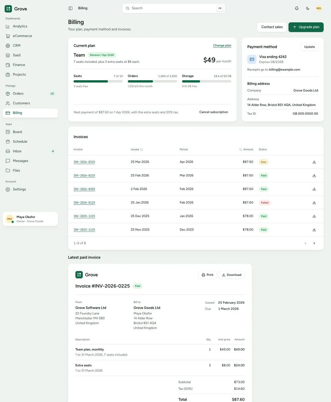
A billing page: the current plan with usage meters, the payment method, past invoices and one invoice in full.
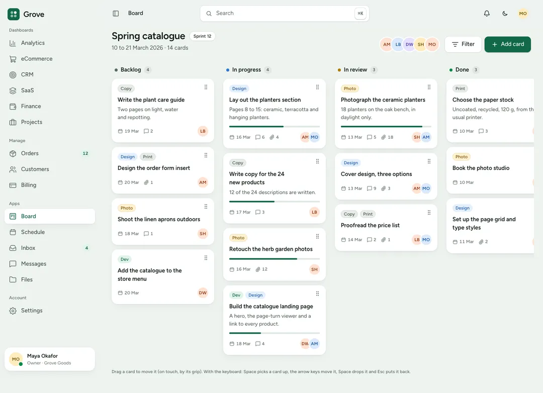
A kanban board page: a sprint in four columns with tags, assignees and due dates on each card.
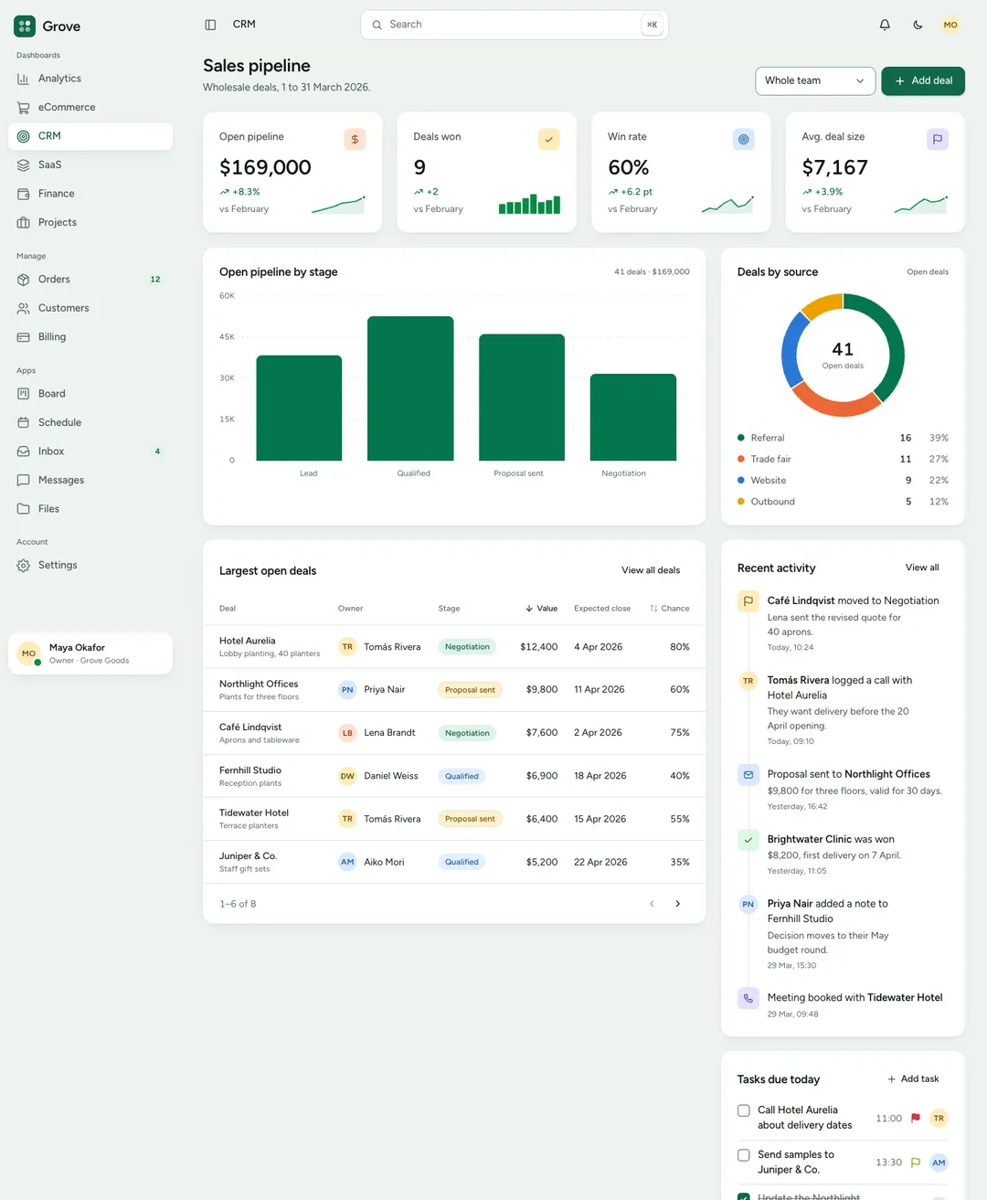
A CRM dashboard: pipeline KPIs, deals by stage, a forecast chart, open deals and recent activity.
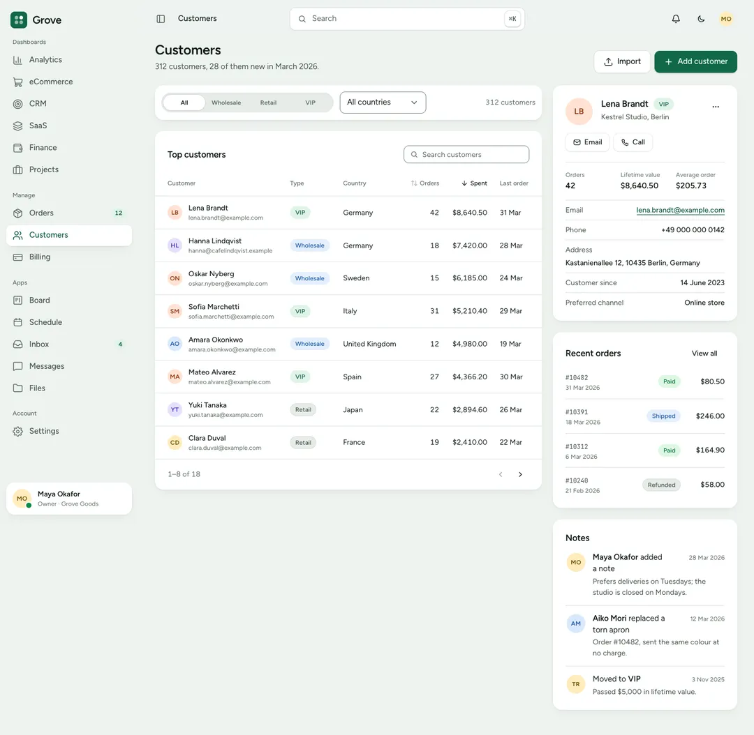
A customers page: a searchable table beside one customer's profile, details and order history.
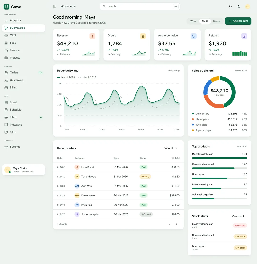
An eCommerce dashboard: revenue and order KPIs, a sales chart, sales by channel, top products and recent orders.
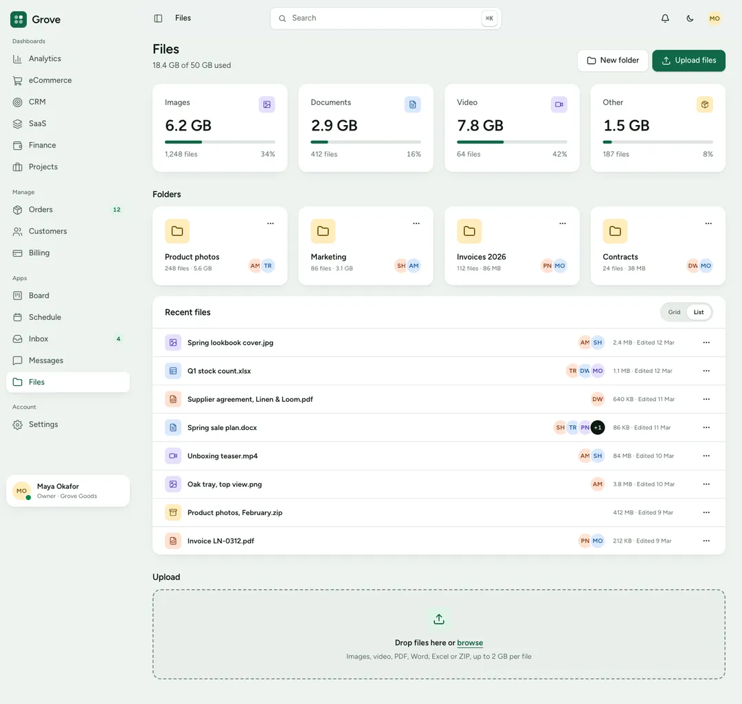
A file manager page: storage use, folders and files as cards, recent files as rows and an upload zone.
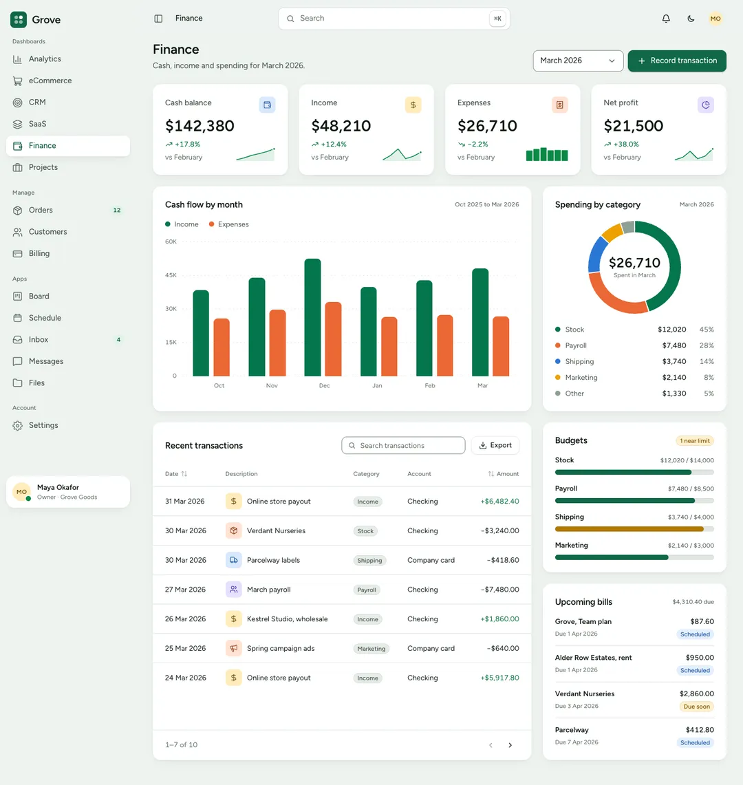
A finance dashboard: balance KPIs, a cash-flow chart, spending by category, budgets and transactions.
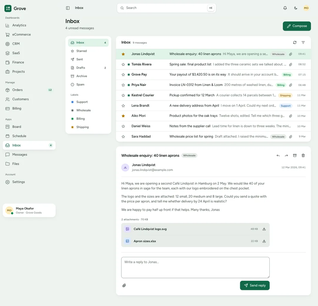
An inbox page: folders, a message list with labels and the open message with its attachments.
Opens the page with its one main heading; media sits beside the copy, below it, or is left out.
Decorative panel behind a hero's mockup and floating cards, able to reach the screen's right edge.
Site header with logo, links and actions; its mobile menu opens before hydration and closes on Esc.
One short announcement as a strip above the navbar or a hero pill; the whole message can be a link.
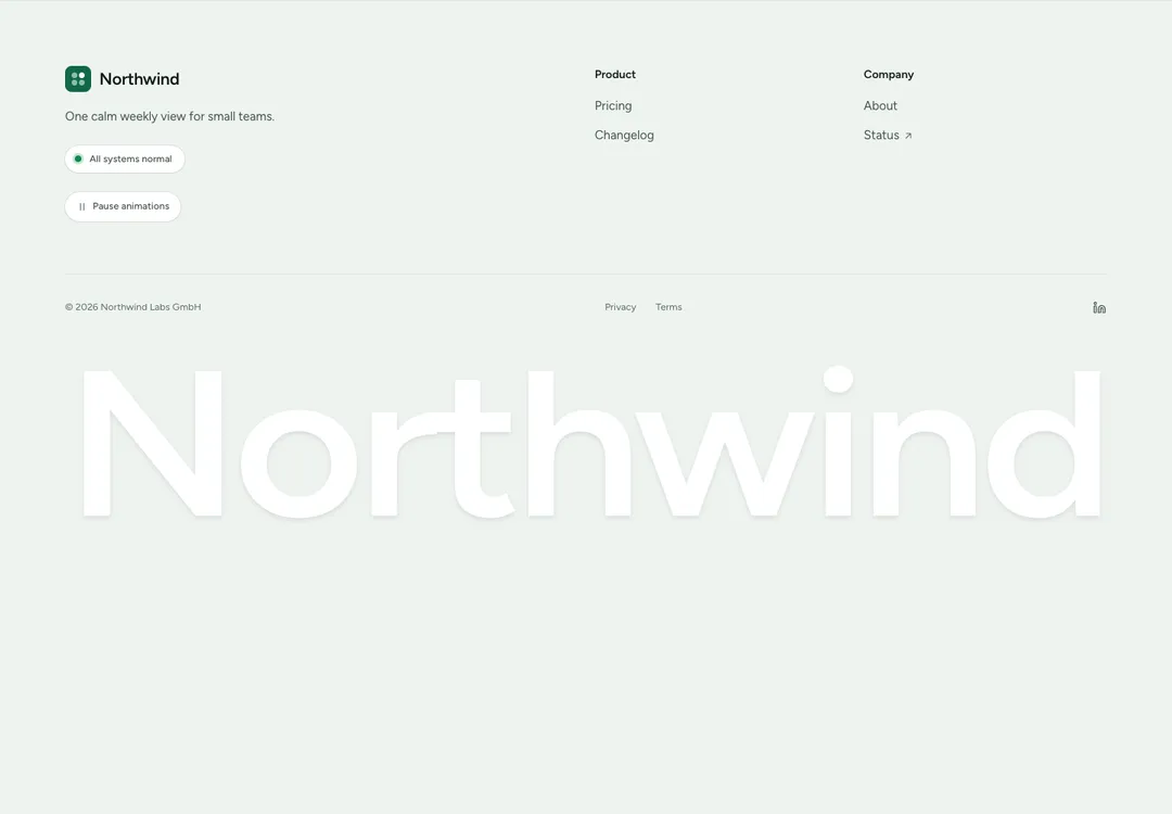
Brand, actions and link columns above a legal row with social links, plus an optional wordmark.
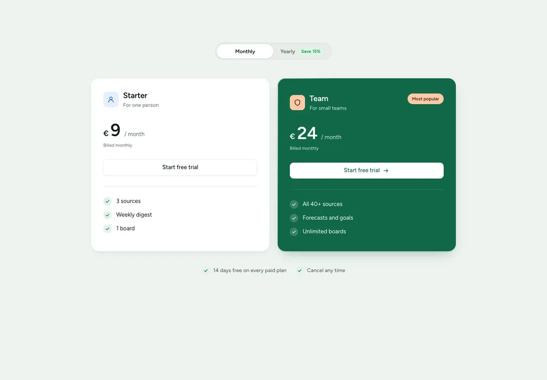
Up to four plans, one featured, with a monthly/yearly price switch that works without JavaScript.
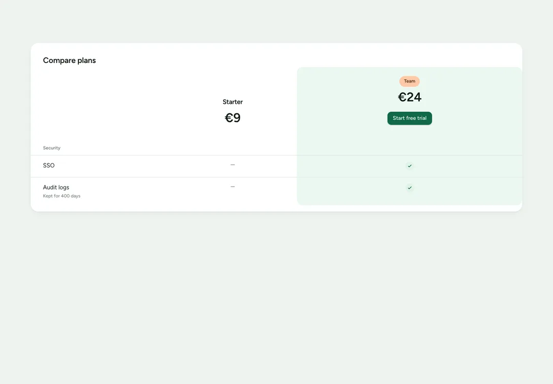
Plans side by side with grouped feature rows; on phones it scrolls with the feature column pinned.
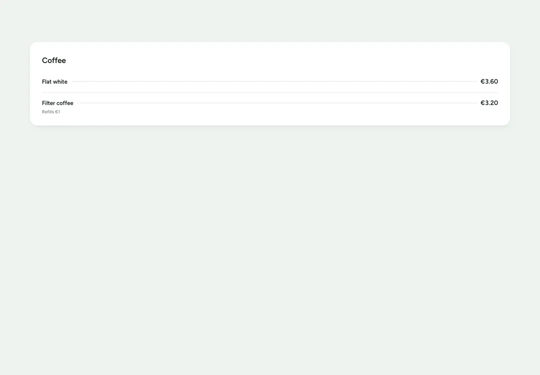
Services or menu items, each name joined to its price by a dotted leader, in one or two columns.
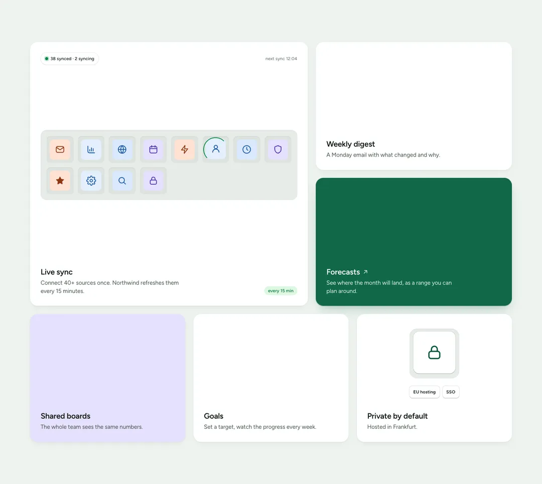
Feature tiles that set their own width and height on a 12-column grid and stack on phones.
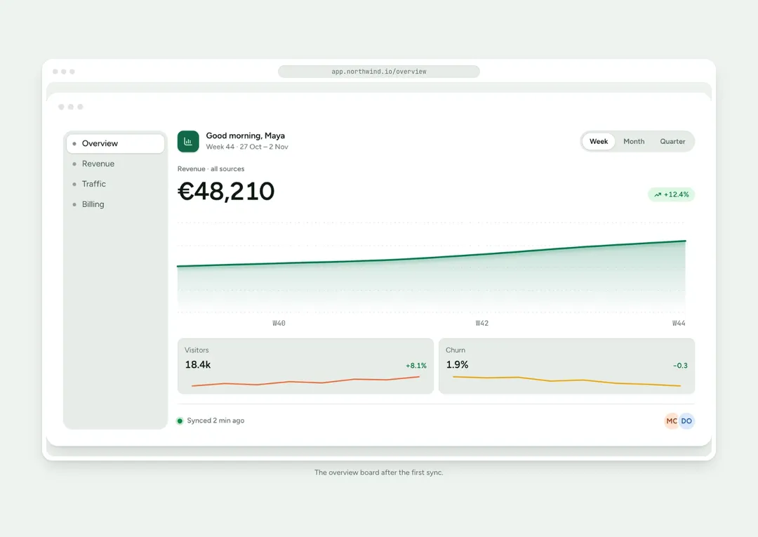
Wraps a screenshot or mockup in a browser, app window or phone frame that screen readers skip.
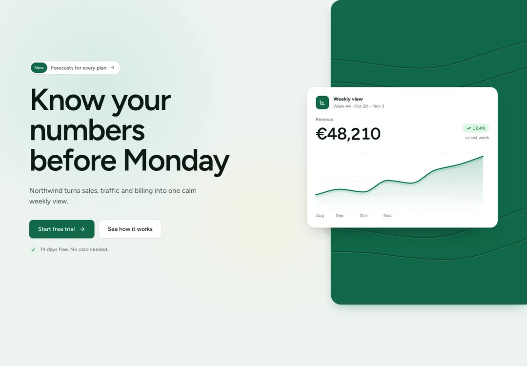
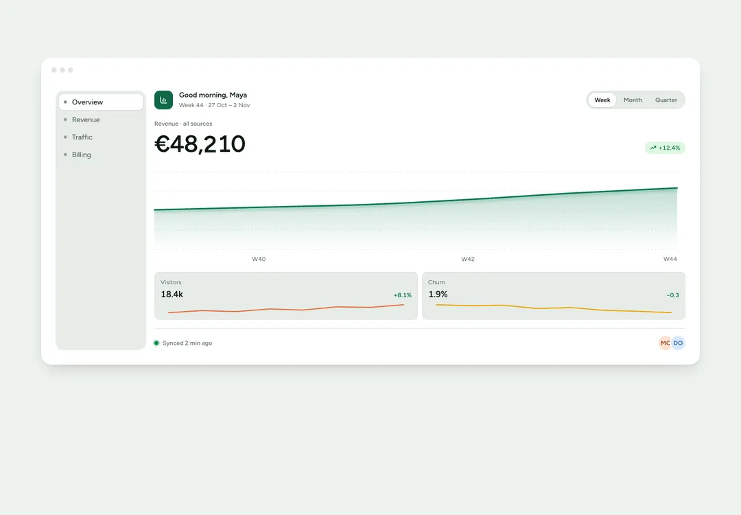
Sample app dashboard for a hero, with tabs, metrics and a chart; it rearranges to fit its column.
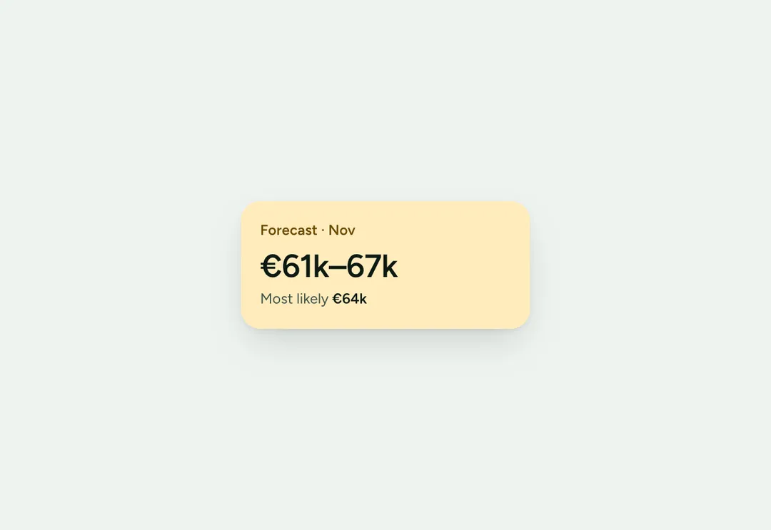
Small card that can drop in on load or drift slowly, made for hero and call-to-action compositions.
Trail of links ending at the current page, with separators hidden from screen readers.
Page links with previous, next and ellipses, reduced to previous, current and next on phones.
Seven variants, three sizes, a loading state that keeps the width, and a link with the same look.
Shows one icon and no text; the label you set is both its accessible name and its native tooltip.
Related buttons in a row or column, marked up as a group and optionally joined edge to edge.
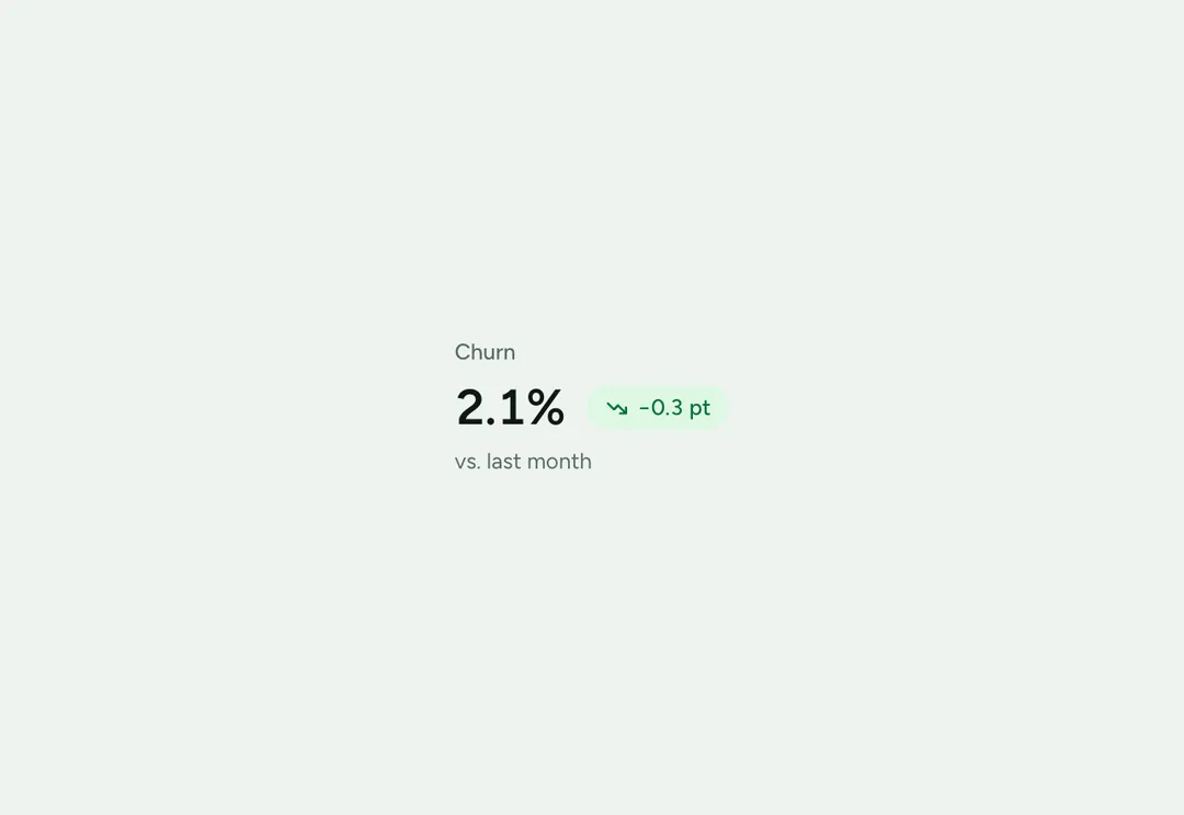
Shows one KPI: label, value, a change tag colored for good or bad news, and a hint.
All 135 pieces, category by category.
Save a favorite or a whole style, and find them in your workspace on any device.