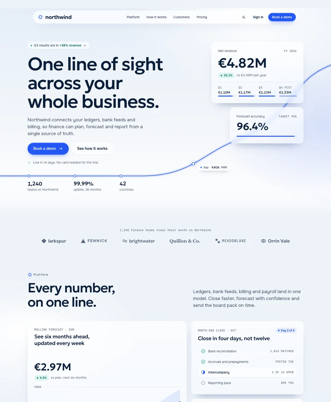
Glass Meridian Landing Page
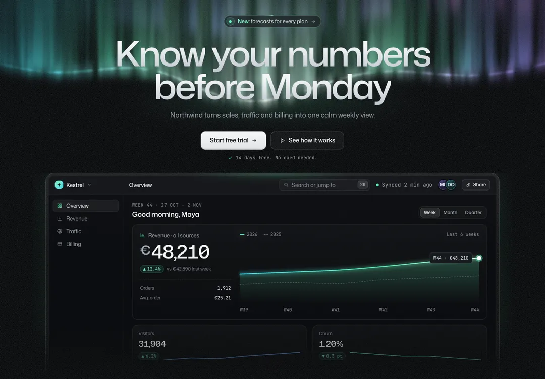
A finance operations SaaS home page: figures on glass cards in the hero, a line that ends at the button, bento, pricing and FAQ.
v0 will generate a hero for you in seconds. If you want a particular one, with its type and spacing already decided, paste it in. Each of these 879 pieces comes as a prompt with the code inside, and the prompt asks v0 to place that code as written.
A free account takes 3 new pieces a day. Pro is $7 a month or $60 a year: no daily limit, the 32 full pages and a whole style in one command. See the plans
Each piece runs on its own page here, in light and dark and at phone width. Decide which one you want before you open v0.
Press Copy prompt, choose v0 and paste the text as a message in your v0 project. Copying needs an account on this site, which is free for 3 new components or blocks a day.
v0’s preview should match the one on the piece’s page. If the fonts differ, the font link from the prompt’s page setup did not reach the layout.
# Hero: Noir Aurora style by MadeByIliyan®
Add this component to my project exactly as given below. The prompt is complete: two files and one block of CSS. Install nothing for it (no UI kit, component library, icon or animation package, no skill).
A finance operations SaaS home page: figures on glass cards in the hero, a line that ends at the button, bento, pricing and FAQ.
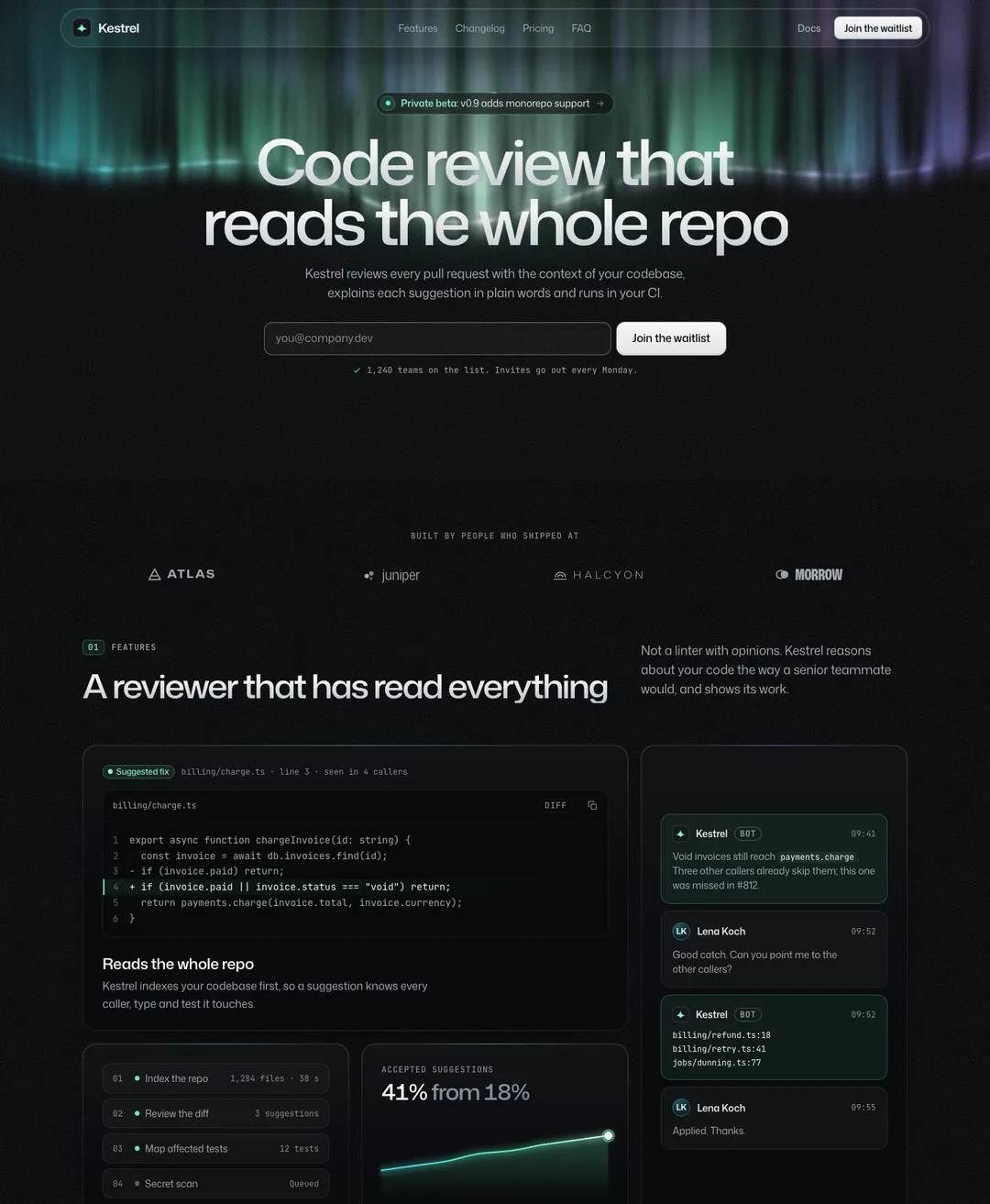
A dark launch page: waitlist form, bento features, changelog timeline, pricing and FAQ.
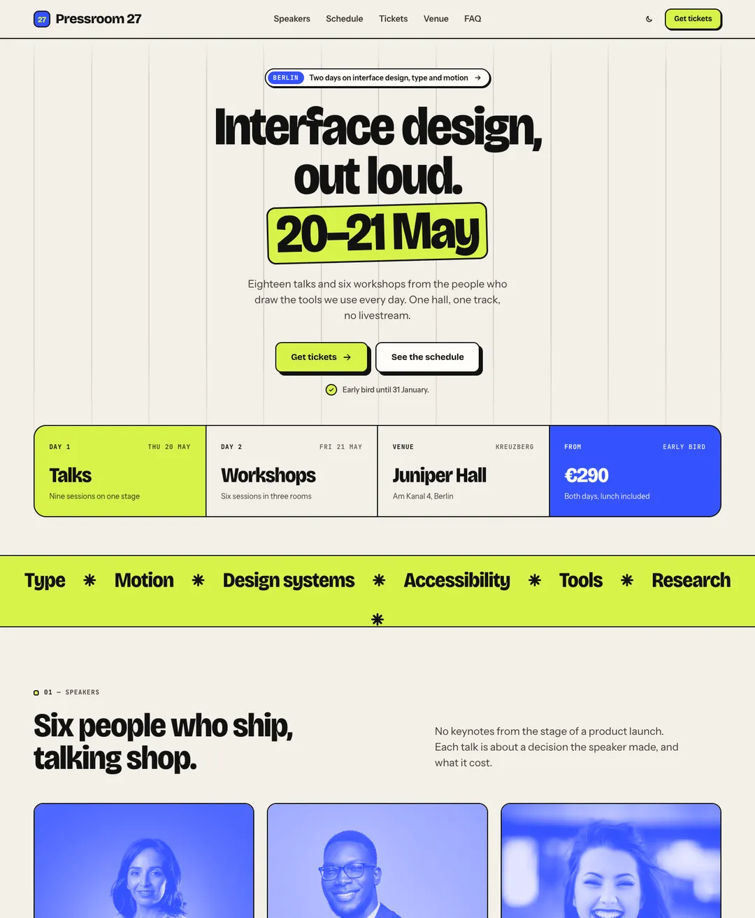
A two-day conference page: speakers, tabbed schedule, tickets, partner logos, venue card and FAQ.
A theme here is a complete style with its own colors and type, drawn for light and for dark. Take your sections from one and they match.
Opens the page with its one main heading; media sits beside the copy, below it, or is left out.
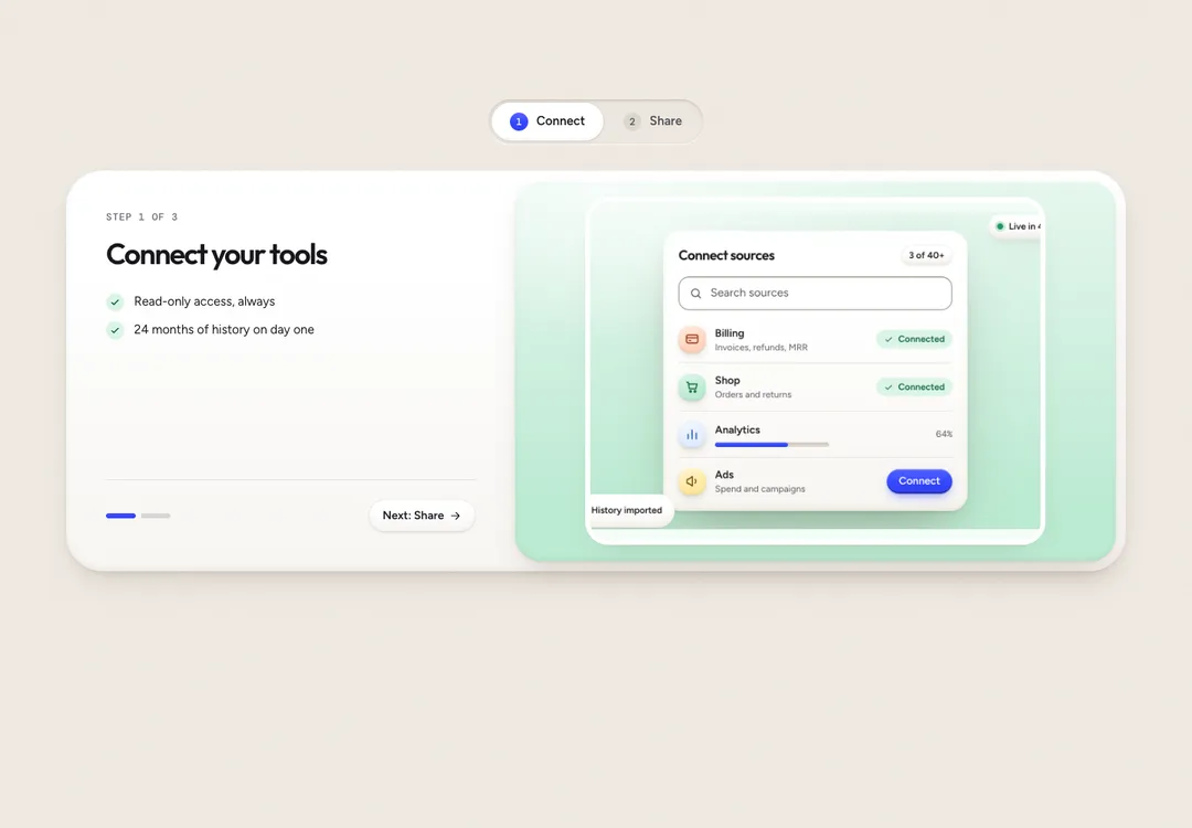
How-it-works tabs with copy and media per tab; optional autoplay stops once someone picks a tab.
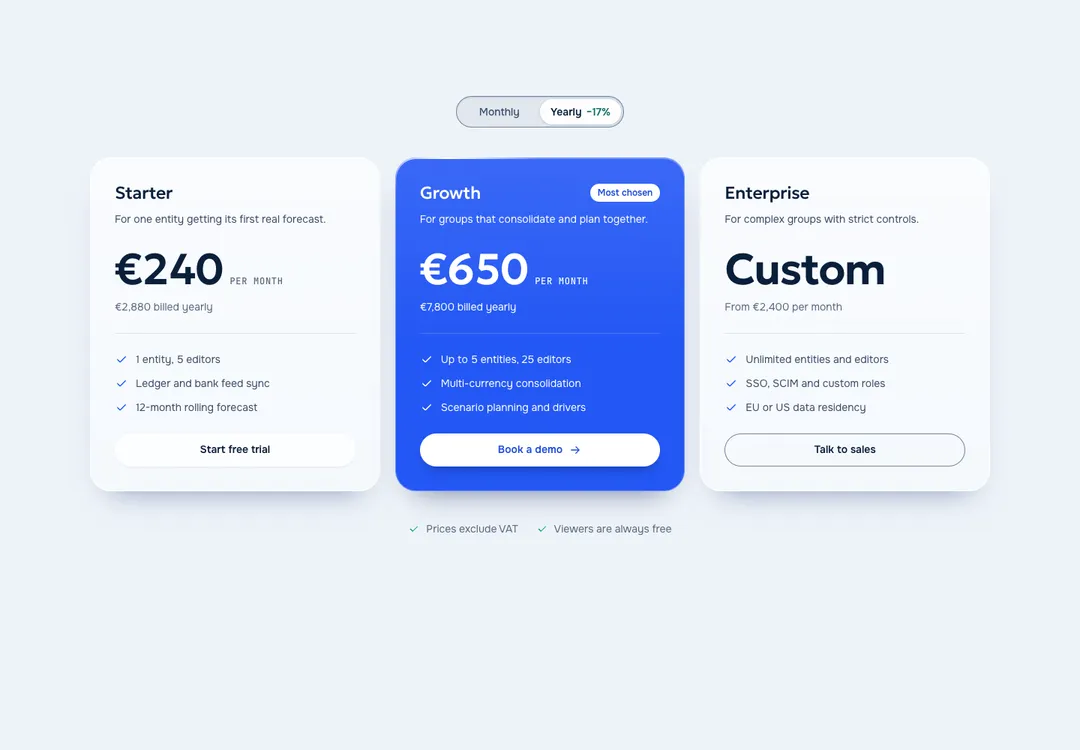
Up to four plans, one featured, with a monthly/yearly price switch that works without JavaScript.
Puts logos in a row, a captioned grid or a scrolling marquee and names each one for screen readers.
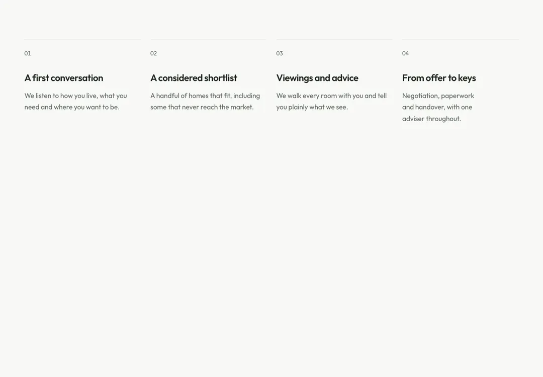
Numbered steps as an ordered list, laid out in columns or as a vertical timeline with markers.
Email field and submit button on one line, stacked on phones; you supply the URL or server action.
First, Tailwind. The CSS in a prompt is written for Tailwind CSS v4 and goes below @import "tailwindcss"; in the global stylesheet. Open that file. If it starts with @tailwind base, the project is on v3, and the block will not work until the project moves to v4. Ask v0 for that upgrade on its own before you paste a component.
Second, the page base. A style sets the canvas, the text color and the body font for the whole page. On a landing page built from one style, that is the point. If the page also holds shadcn/ui components, their theme and this one both style the body, and you will have to pick one.
In a Next.js project the prompt also adds suppressHydrationWarning to the html element. That is intended, because the theme attribute can change before React loads.
v0 is a trademark of its owner. MadeByIliyan® has no connection to it and claims no endorsement from its maker.
No. Each piece is one source file with its own tokens. It imports from react, in a few cases from react-dom, and needs neither shadcn/ui nor an icon package.
Yes. A full page is a single prompt, and the page is its default export. There are 32, with a landing page in each style. Full pages come with Pro and Team.
The prompt asks for the code to be copied without rewriting or restyling. If v0 changed it anyway, send the prompt again and say so, or copy the file from the piece’s Code tab over v0’s version.
A free account takes 3 new components or blocks a day, each with its code, its styles and its prompt. Pro and Team remove the limit and open the full pages.