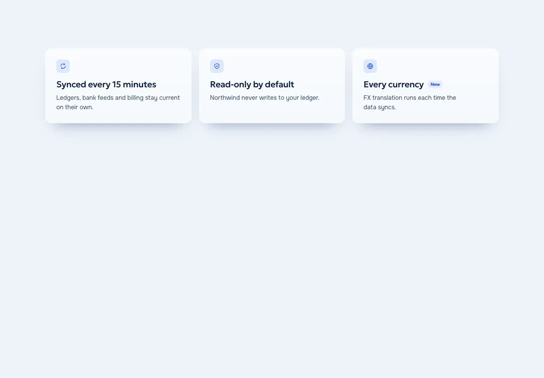
Glass Meridian Feature Grid
Icon, title and text items in two to four columns, shown as cards, plain or between rules.
Left to choose, a coding agent reaches for safe defaults: grey cards and a blue button. Give Codex a designed piece and it has something specific to build with. Each of these 879 runs live on its page and comes as one prompt with the code inside.
A free account takes 3 new pieces a day. Pro is $7 a month or $60 a year: no daily limit, the 32 full pages and a whole style in one command. See the plans
On the piece’s page press Copy prompt, then Codex. You need an account for this. The free one takes 3 new components or blocks a day, and a piece you took before does not count again.
That can be the Codex CLI in a terminal or Codex in your editor. The prompt carries the code, so Codex has nothing to fetch.
Expect one new .tsx file, a longer global stylesheet and a few new lines in the document head. Run the app, then swap the sample content for yours.
# FeatureGrid: Glass Meridian style by MadeByIliyan®
Add this component to my project exactly as given below. The prompt is complete: two files and one block of CSS. Install nothing for it (no UI kit, component library, icon or animation package, no skill).
Icon, title and text items in two to four columns, shown as cards, plain or between rules.
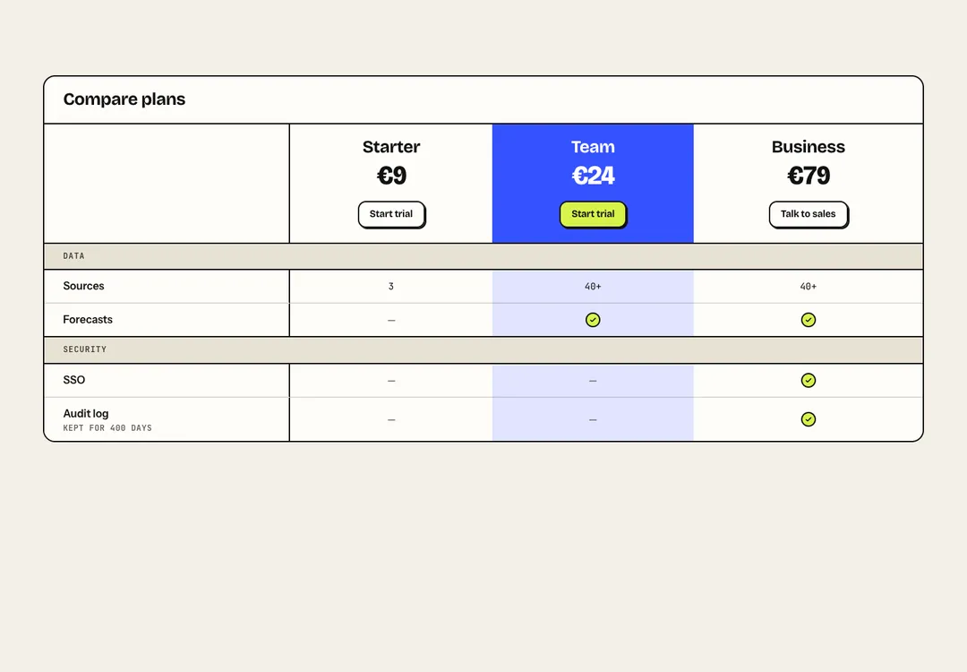
Plans side by side with grouped feature rows; on phones it scrolls with the feature column pinned.
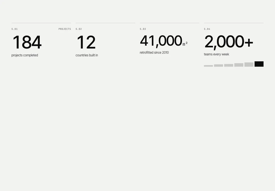
Key figures that roll or count up above their labels, set plain, on cards or between rules.
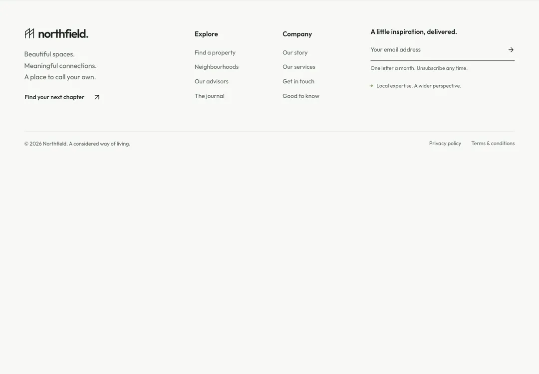
Brand, actions and link columns above a legal row with social links, plus an optional wordmark.
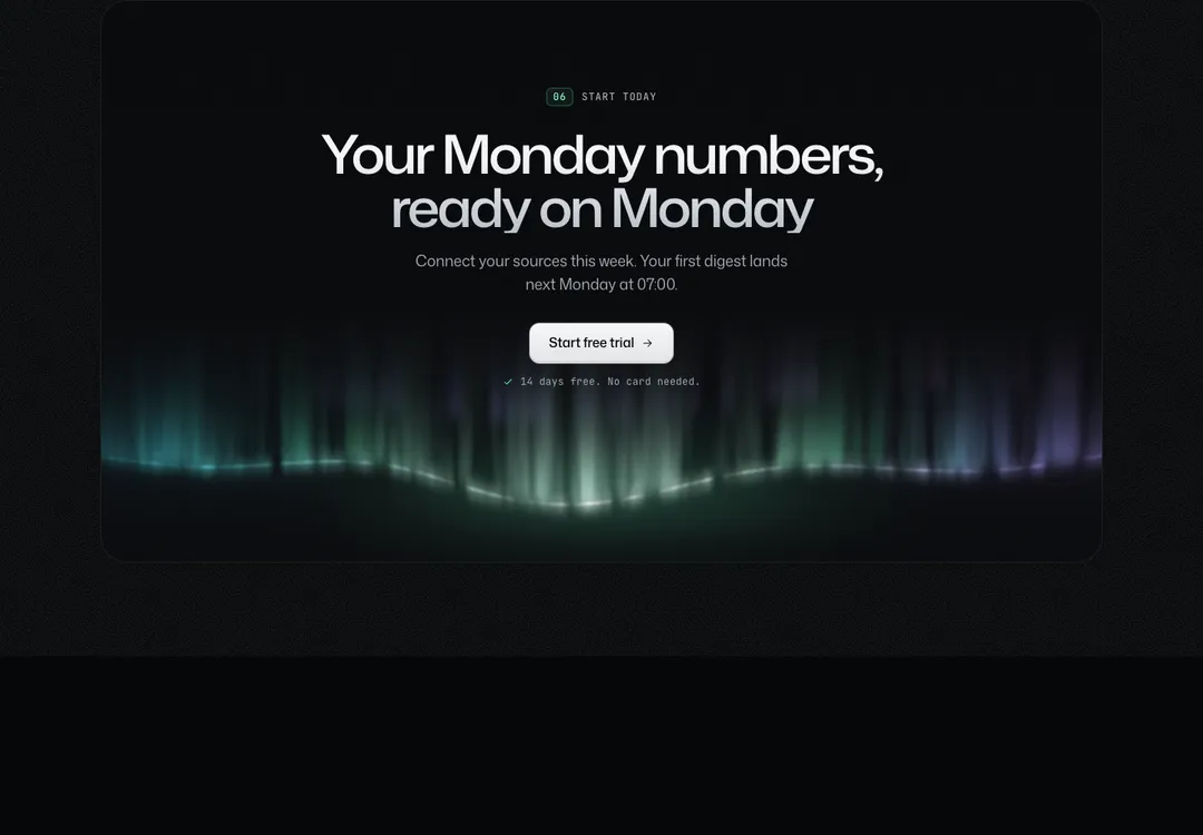
Closes a page with a heading, actions and a note, as a boxed panel or with no box at all.
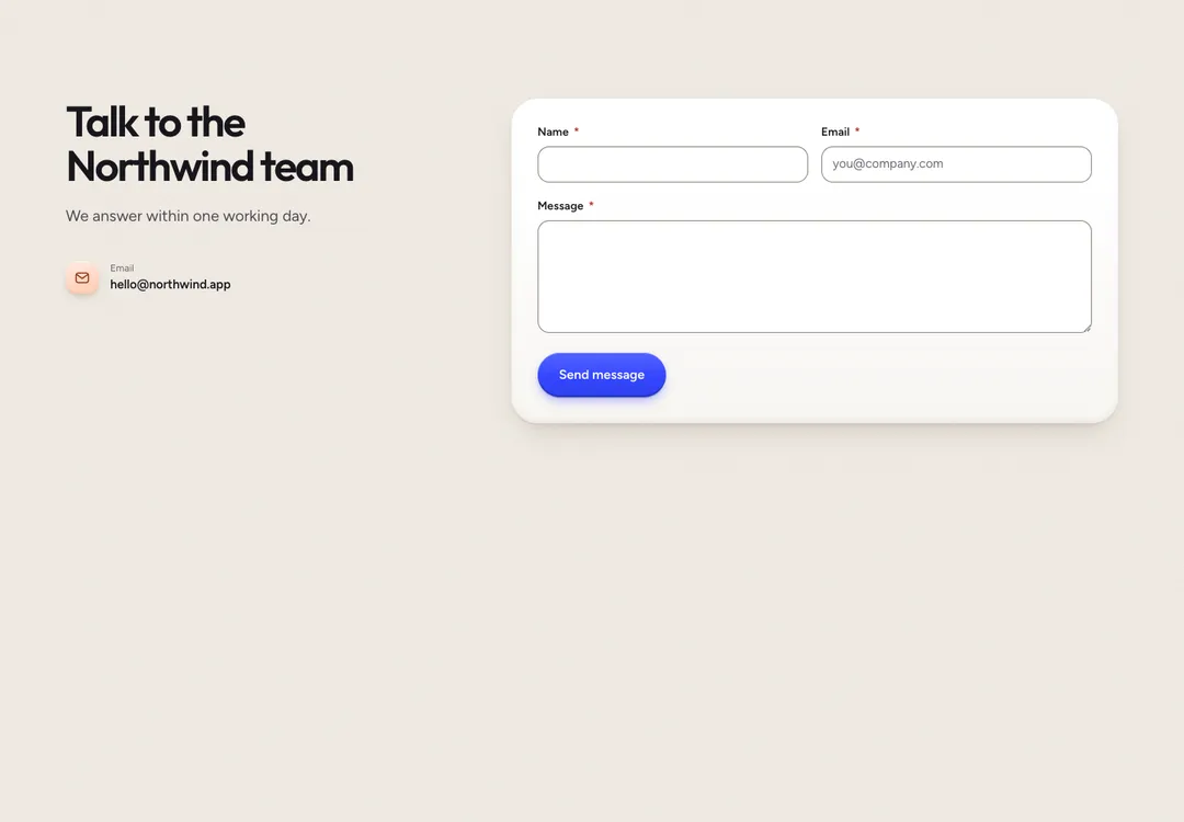
Contact details such as address, phone and hours beside a form requiring name, email and message.
A theme here is a complete style with its own colors and type, drawn for light and for dark. Take your sections from one and they match.
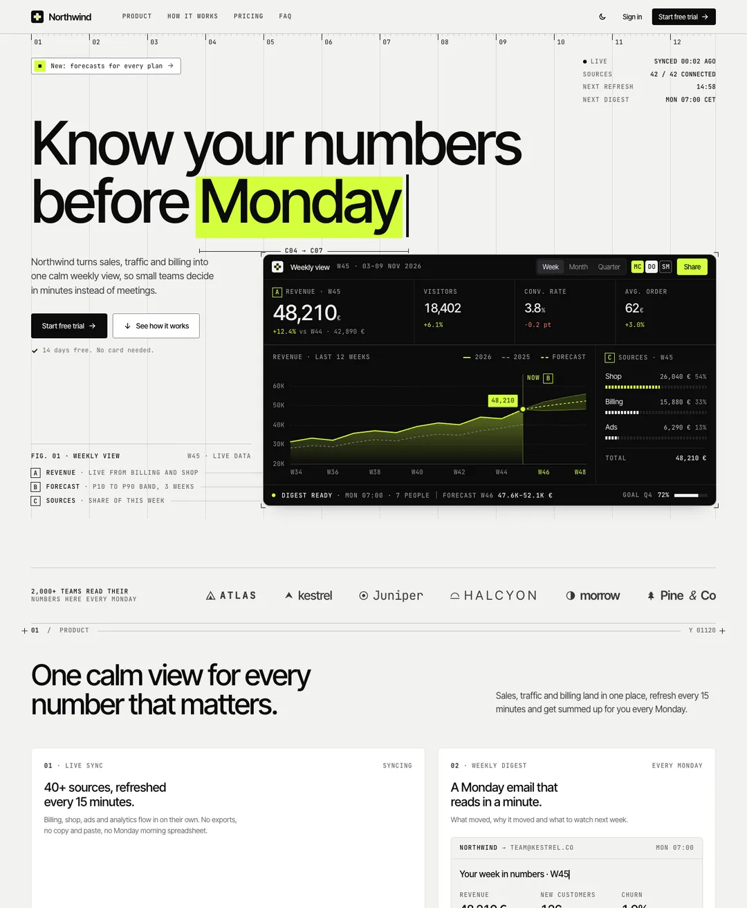
A SaaS landing page on a visible grid: dashboard hero, bento features, pricing and FAQ.
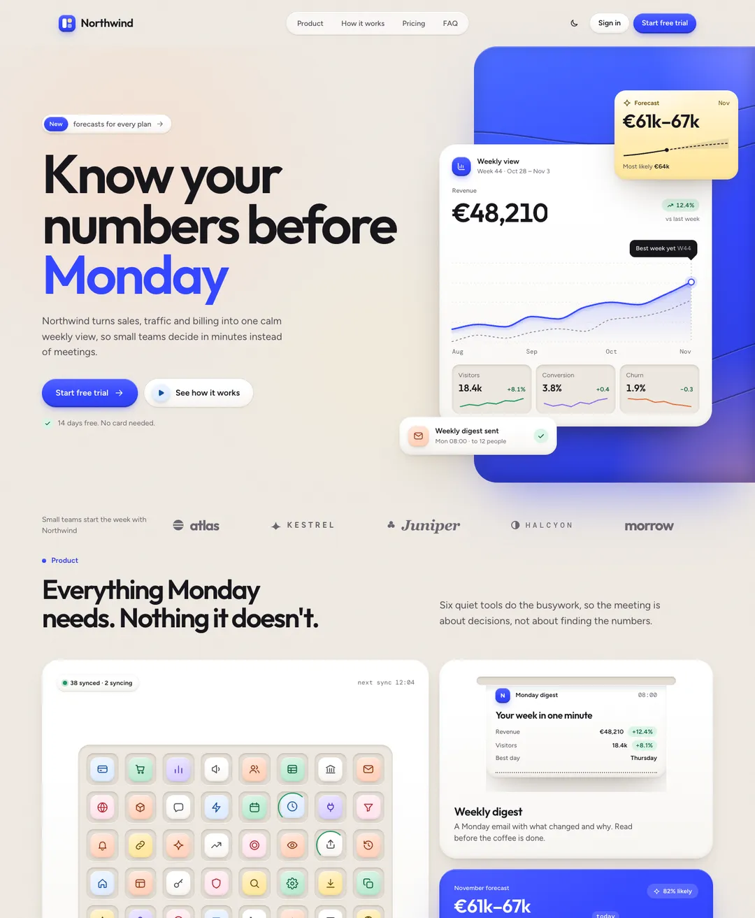
A SaaS landing page: dashboard on a blue stage, bento features, testimonials, pricing and FAQ.
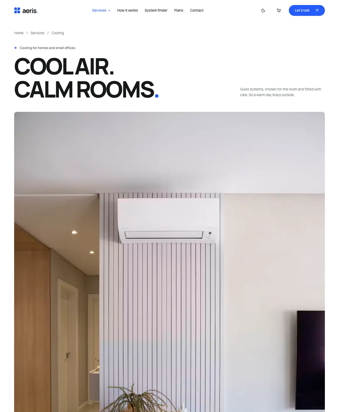
The page of one service: facts, a process in steps, a system finder, a before and after, plans and a service area check.
Start with one section, say the hero from Noir Aurora. Its prompt creates src/components/noir-aurora/hero.tsx and adds that style’s tokens to your stylesheet.
Then take the navbar, the pricing section and the footer from the same style. Each prompt tells Codex to merge its CSS into the block that is already there and to add only what is missing. Four prompts later you still have one set of tokens, and the sections match because they read the same ones.
Your AGENTS.md stays in charge of the project’s conventions. The prompt keeps to its own files.
Codex is a trademark of its owner. MadeByIliyan® has no connection to it and claims no endorsement from its maker.
Yes. It is text, so it works wherever Codex has your project open. There is one prompt per piece and no separate version for each tool.
Yes. A full page is one prompt, and Codex renders its default export as the page. There are 32 of them, with sample copy for you to replace. They come with Pro and Team, while components and blocks are open to a free account.
React 18 or newer and Tailwind CSS v4, in a TypeScript project. The catalog is built and previewed on React 19 and Tailwind CSS 4.3.
A free account takes 3 new components or blocks a day, each with its code, its styles and its prompt. Pro and Team remove the limit and open the full pages.