Noir Aurora Modal Dialog
Native dialog element that traps focus and closes on Esc, shown as a bottom sheet on small screens.
You already have the editor open, so this takes about a minute. Copy the prompt for a piece, paste it into Cursor’s agent and read the result as a diff: one new file and some added CSS.
A free account takes 3 new pieces a day. Pro is $7 a month or $60 a year: no daily limit, the 32 full pages and a whole style in one command. See the plans
Its page runs the real component. Resize it to 375 px, switch to dark, tab through it.
Press Copy prompt, then Cursor. Copying puts the piece in your library and needs an account. Free accounts take 3 new components or blocks a day.
Open the chat, check that it is set to Agent, and paste. In a mode that only answers questions, Cursor describes the change and does not make it.
You will see a new file under src/components and additions to your global stylesheet. Accept them, run the dev server and replace the sample content.
# Dialog: Noir Aurora style by MadeByIliyan®
Add this component to my project exactly as given below. The prompt is complete: one file and one block of CSS. Install nothing for it (no UI kit, component library, icon or animation package, no skill).
Native dialog element that traps focus and closes on Esc, shown as a bottom sheet on small screens.
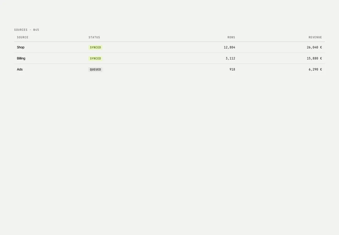
Columns and rows in a focusable scroll region, so wide tables scroll inside it on phones.
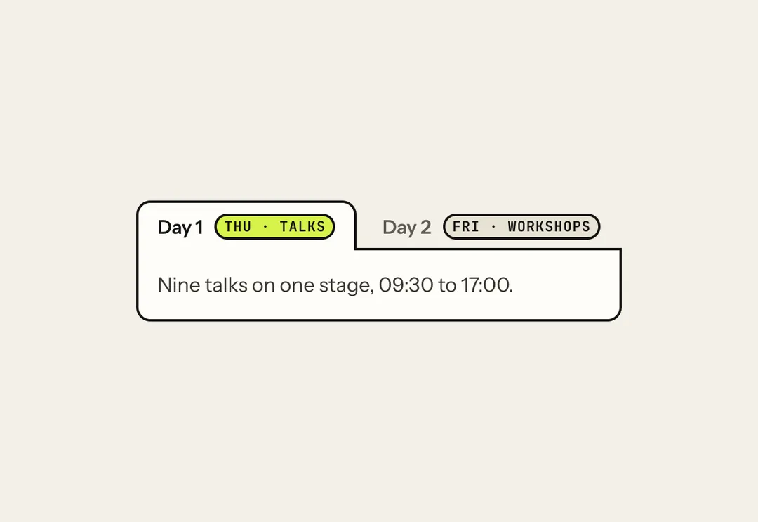
Tabbed panels driven by arrow, Home and End keys; on phones the tab list scrolls sideways.
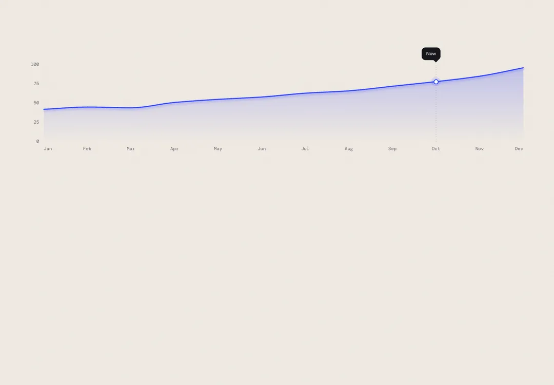
Plots lines, areas or bars in SVG with HTML labels, so text never stretches as the width changes.
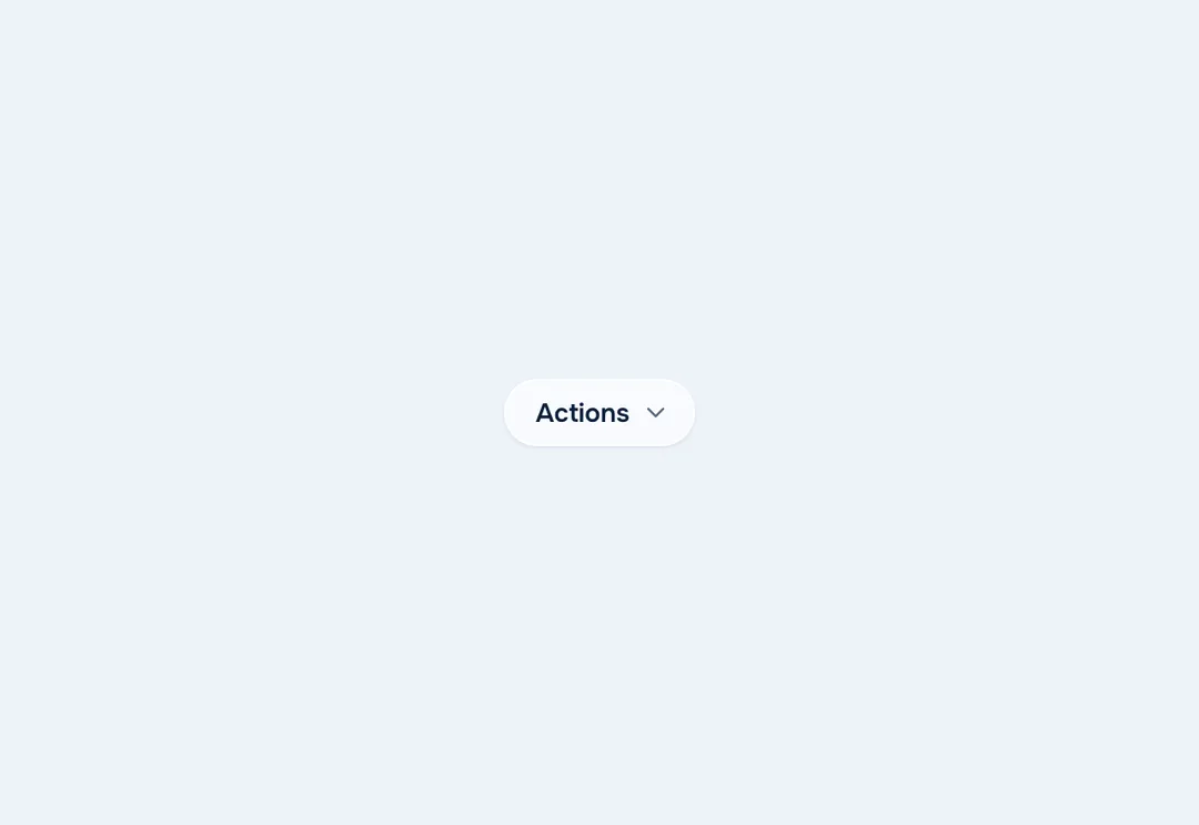
Menu button with actions, links, groups and shortcut hints, navigated by arrow keys and typeahead.
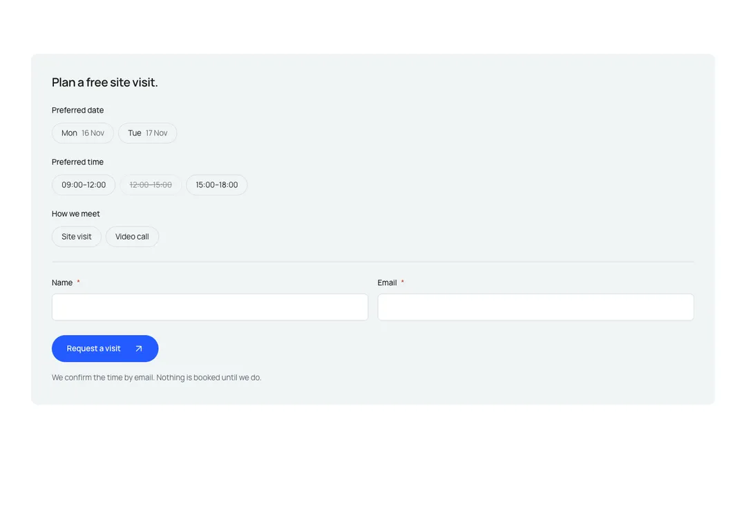
Reservation form that works without JavaScript, with date, time and party-size or service choices.
A theme here is a complete style with its own colors and type, drawn for light and for dark. Take your sections from one and they match.
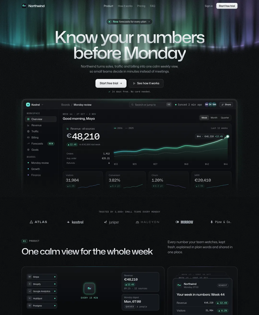
A dark SaaS landing page under an aurora: dashboard hero, bento features, pricing and FAQ.
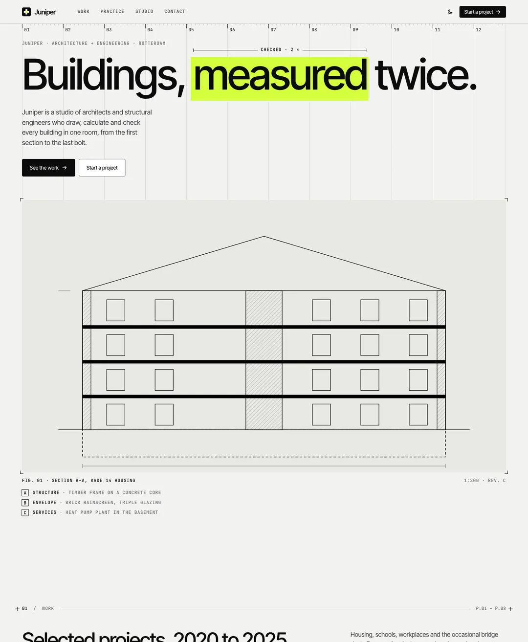
An architecture studio page: projects, drawings, services, team and a contact form.
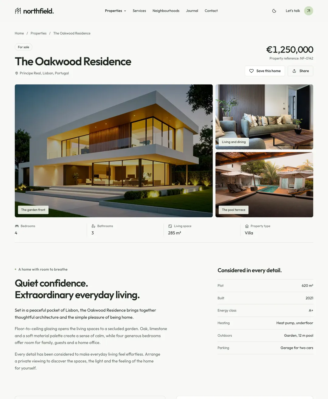
The page of one home: mosaic gallery, facts, mortgage calculator, viewing request, the area and similar homes.
The editor is open anyway, so adding a piece by hand is a fair option. On the piece’s page, the Code tab holds the .tsx file and the Styles tab holds the block of CSS that goes below the Tailwind import. Save one, paste the other.
Two things are only in the prompt. The first is the page setup: a data-theme attribute on the html element and the style’s Google Fonts link. The second concerns pieces marked “2 files”. They use their style’s motion runtime, a second file you add once per project. Without it the piece still renders, but its scroll reveals and loops stay still.
When the agent does the work, your project rules apply as usual.
Cursor is a trademark of its owner. MadeByIliyan® has no connection to it and claims no endorsement from its maker.
No. The prompt is text you paste into the chat. This site does not connect to Cursor and holds no key for it.
Start with the stylesheet. The block of CSS has to sit below @import "tailwindcss"; in the file your app loads. Then check that the html element has its data-theme attribute and that the font link is in the head.
In both. The prompt has a short branch for each where the setup differs, such as where the motion runtime starts.
A free account takes 3 new components or blocks a day, each with its code, its styles and its prompt. Pro and Team remove the limit and open the full pages.