Bavaria Icon Button
Shows one icon and no text; the label you set is both its accessible name and its native tooltip.
Shows one icon and no text; the label you set is both its accessible name and its native tooltip.
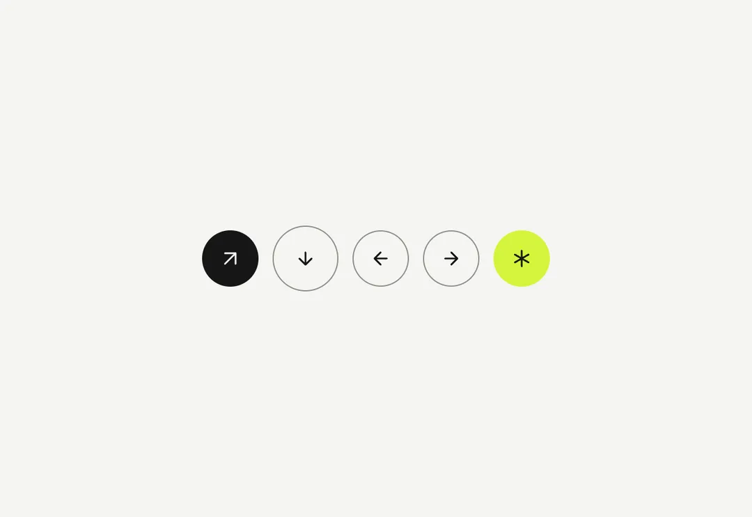
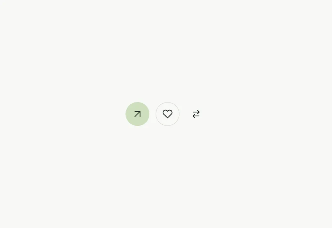
Round, icon-only button. label is the accessible name and the native tooltip. Takes the Button variants, sizes and loading: primary is the accent circle, accent the mist chip, outline the hairline circle (the arrows of a slider, the favourite button), ghost a bare icon (the cart and the account in the navbar); the two quiet ones fill mist on hover.
It is part of Aeris: white pages, soft grey cards, one electric blue. The style’s 92 pieces share one set of tokens, type and motion, in a light and a dark theme, so whatever you take from it fits together.
To put it in your project, copy the prompt into Claude Code, OpenAI Codex or Cursor, or add it by hand. The documentation walks through both.
Shows one icon and no text; the label you set is both its accessible name and its native tooltip.
Shows one icon and no text; the label you set is both its accessible name and its native tooltip.
Shows one icon and no text; the label you set is both its accessible name and its native tooltip.
Shows one icon and no text; the label you set is both its accessible name and its native tooltip.
Shows one icon and no text; the label you set is both its accessible name and its native tooltip.
Shows one icon and no text; the label you set is both its accessible name and its native tooltip.
Shows one icon and no text; the label you set is both its accessible name and its native tooltip.
Shows one icon and no text; the label you set is both its accessible name and its native tooltip.