Neo-Brutal Landing Page
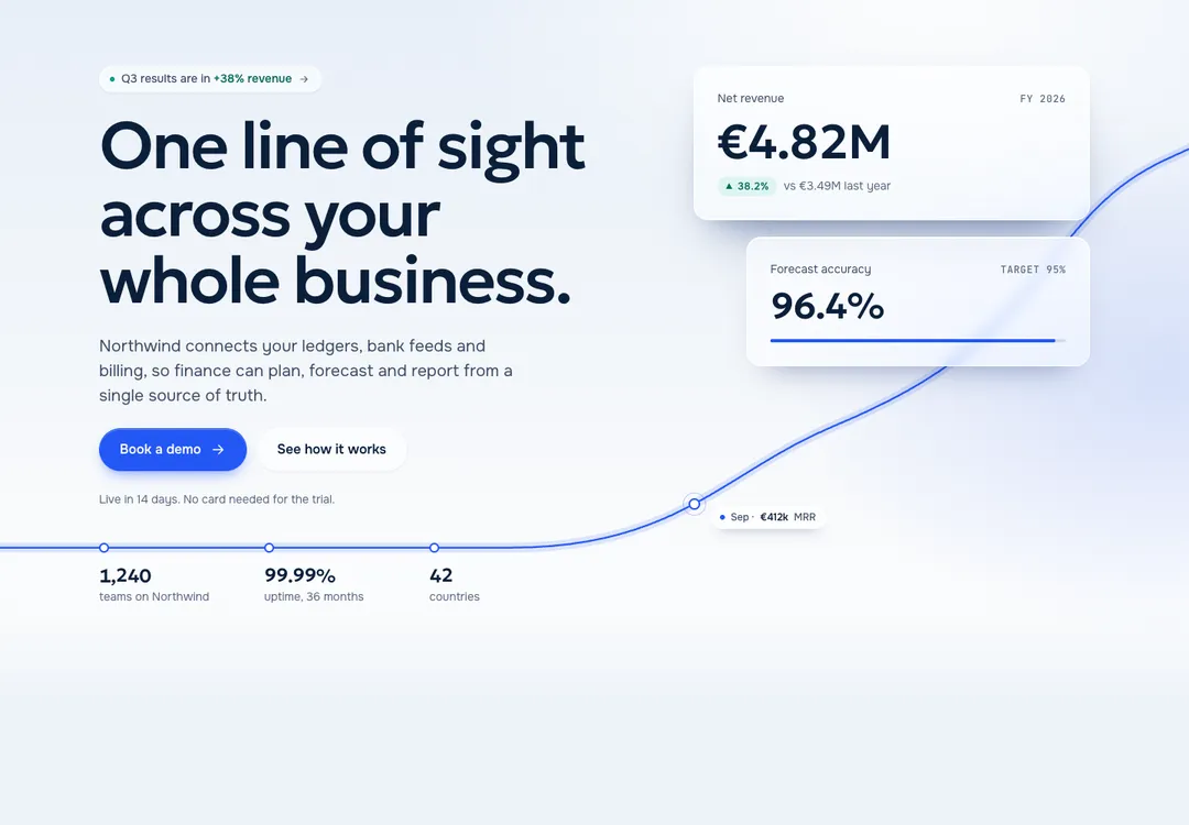
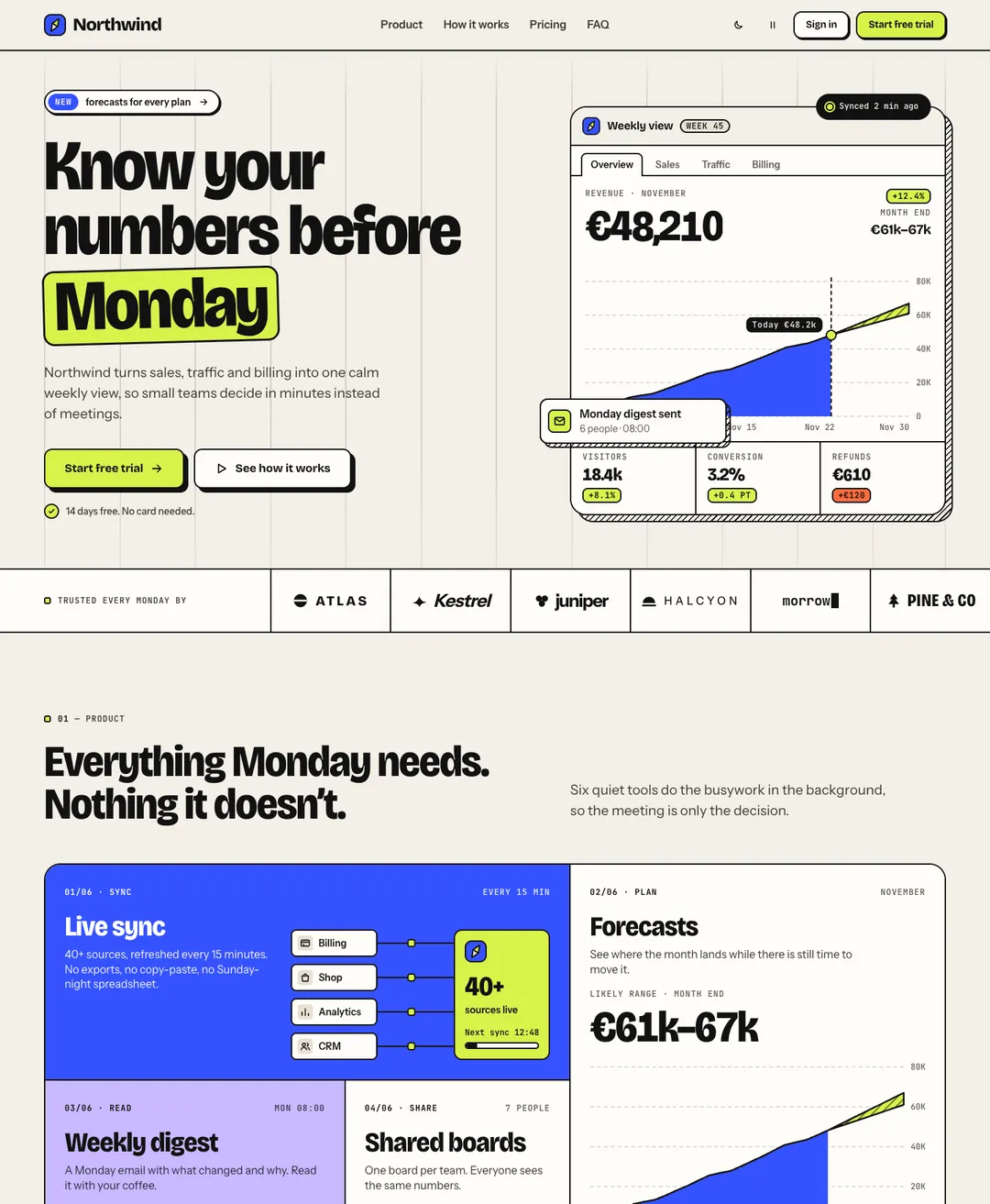
A SaaS landing page on warm paper: dashboard hero, bento features, testimonials, pricing and FAQ.
Bolt.new gets an app running in the browser in a couple of minutes. For the interface, paste in a section that was designed as part of a set, then go back to prompting Bolt for the logic.
A free account takes 3 new pieces a day. Pro is $7 a month or $60 a year: no daily limit, the 32 full pages and a whole style in one command. See the plans
Open the piece, try it, then press Copy prompt and choose Bolt.new. That needs an account. The free one takes 3 new components or blocks a day.
Send the prompt as it is. It lists the file to create, the CSS to add and the setup for the page, with the code for each.
Once Bolt has written the files, its preview should show the piece as it looks on this site. Then ask for your own text and pictures.
# FeatureGrid: Neo-Brutal style by MadeByIliyan®
Add this component to my project exactly as given below. The prompt is complete: two files and one block of CSS. Install nothing for it (no UI kit, component library, icon or animation package, no skill).
A SaaS landing page on warm paper: dashboard hero, bento features, testimonials, pricing and FAQ.
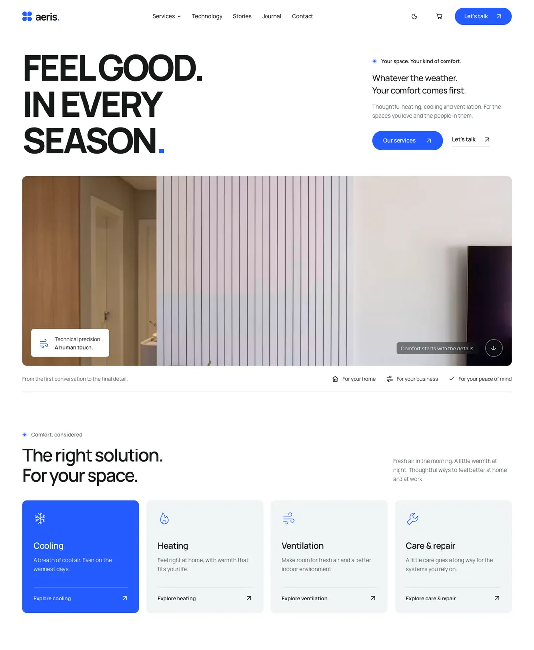
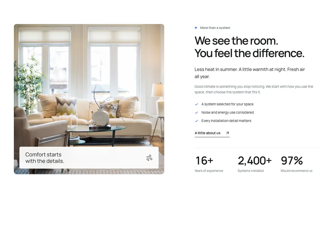
A heating and cooling company home page: capital headline over a wide photo, service cards, a climate dial and a journal.
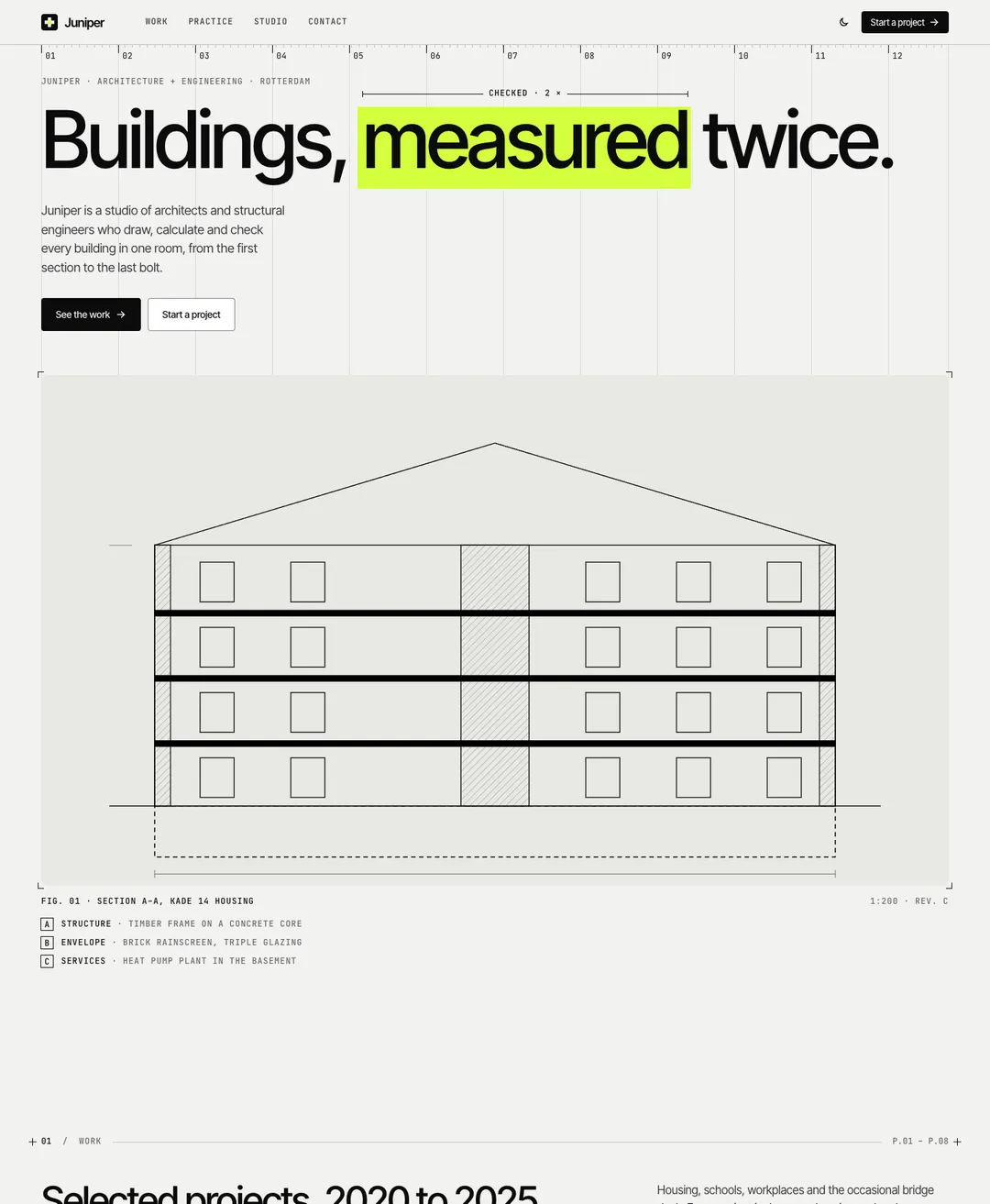
An architecture studio page: projects, drawings, services, team and a contact form.
A theme here is a complete style with its own colors and type, drawn for light and for dark. Take your sections from one and they match.
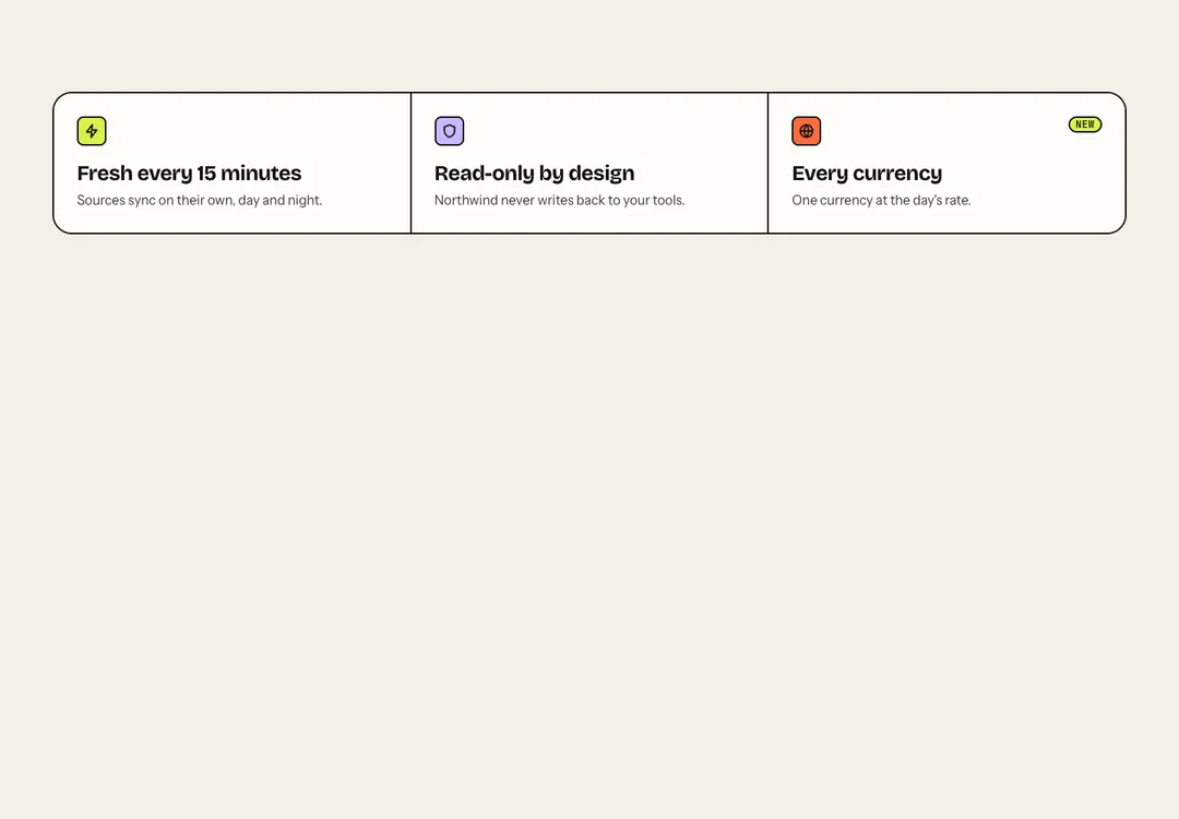
Icon, title and text items in two to four columns, shown as cards, plain or between rules.
Opens the page with its one main heading; media sits beside the copy, below it, or is left out.
One feature in depth: heading, text, points and actions beside an image or mockup, on either side.
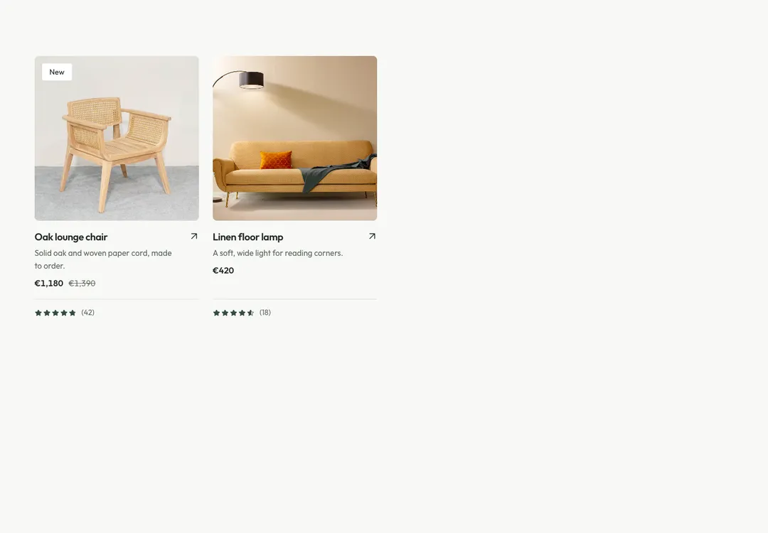
Shop cards with image, badge, rating, price and a crossed-out old price, two columns on phones.
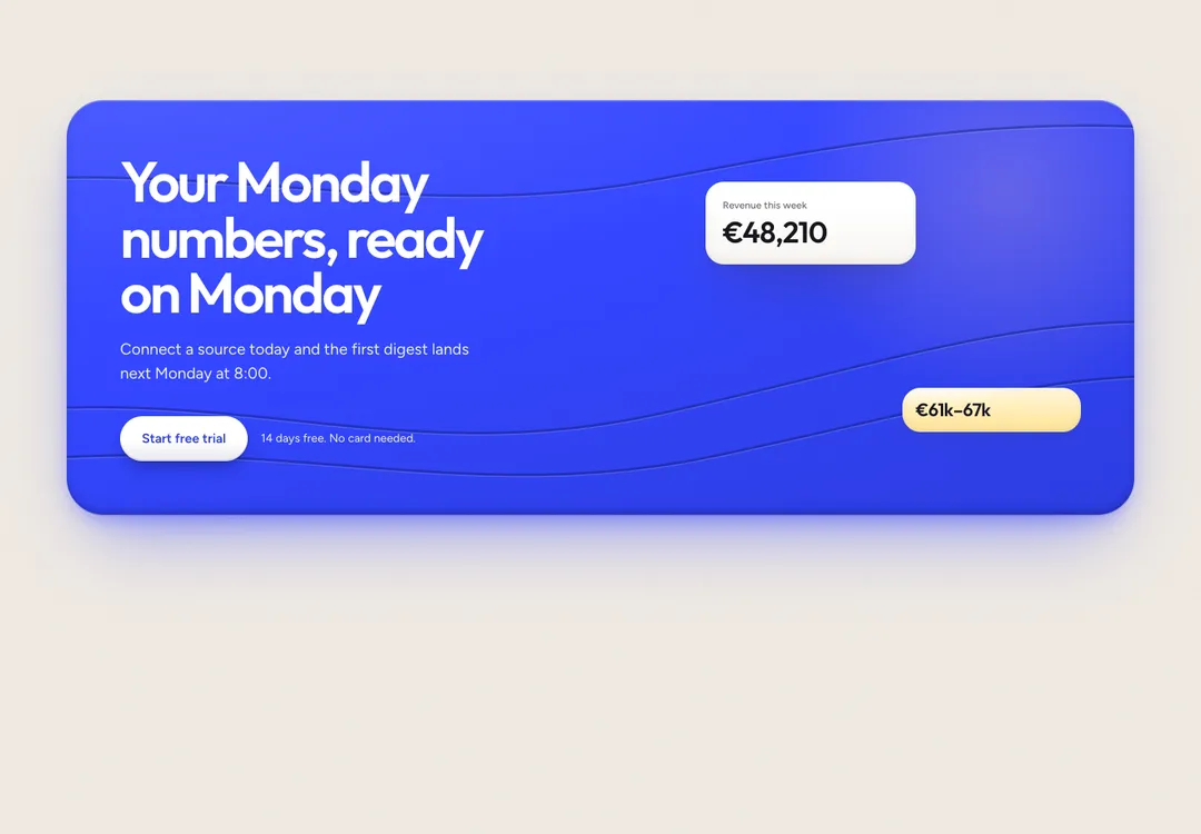
Closes a page with a heading, actions and a note, as a boxed panel or with no box at all.
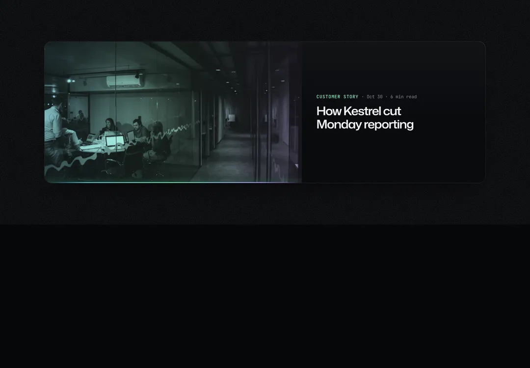
Posts in a grid, a list or a featured layout; each card is one link and works without an image.
It adds a .tsx file under src/components, a block of CSS in the main stylesheet and a font link in the page’s head. It adds no packages unless the piece is a slider, which asks for GSAP. The components import from react, a few of them from react-dom as well, and the prompt opens by saying what Bolt should install.
Pieces with motion are marked “2 files”. The second file is the style’s runtime, which plays scroll reveals and pauses loops that are off screen. You add it once per project. In a Vite project the prompt has Bolt call boot() in main.tsx, before createRoot.
The project has to be on Tailwind CSS v4. If Bolt set it up with v3, ask for the upgrade before you paste.
Bolt.new is a trademark of its owner. MadeByIliyan® has no connection to it and claims no endorsement from its maker.
No. The project needs React 18 or newer, TypeScript and Tailwind CSS v4, and the prompt adds nothing to package.json.
It works, and it shows. Each style sets the page’s canvas, text color and body font, so two of them compete. The styles share the same core sections, a hero, a navbar, pricing and a footer among them, so you can stay inside one.
Each of the 10 styles has one. There are also pages for a service business, a property listing, an event, a product launch and a design studio. A full page is one prompt and comes with Pro and Team.
A free account takes 3 new components or blocks a day, each with its code, its styles and its prompt. Pro and Team remove the limit and open the full pages.