Aeris Button
Seven variants, three sizes, a loading state that keeps the width, and a link with the same look.
Seven variants, three sizes, a loading state that keeps the width, and a link with the same look.
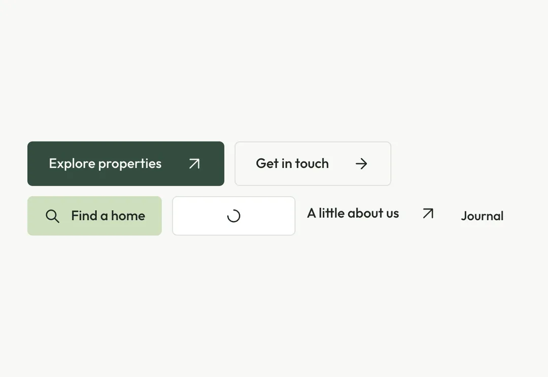
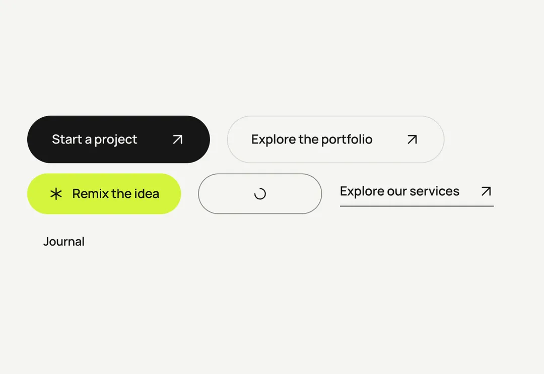
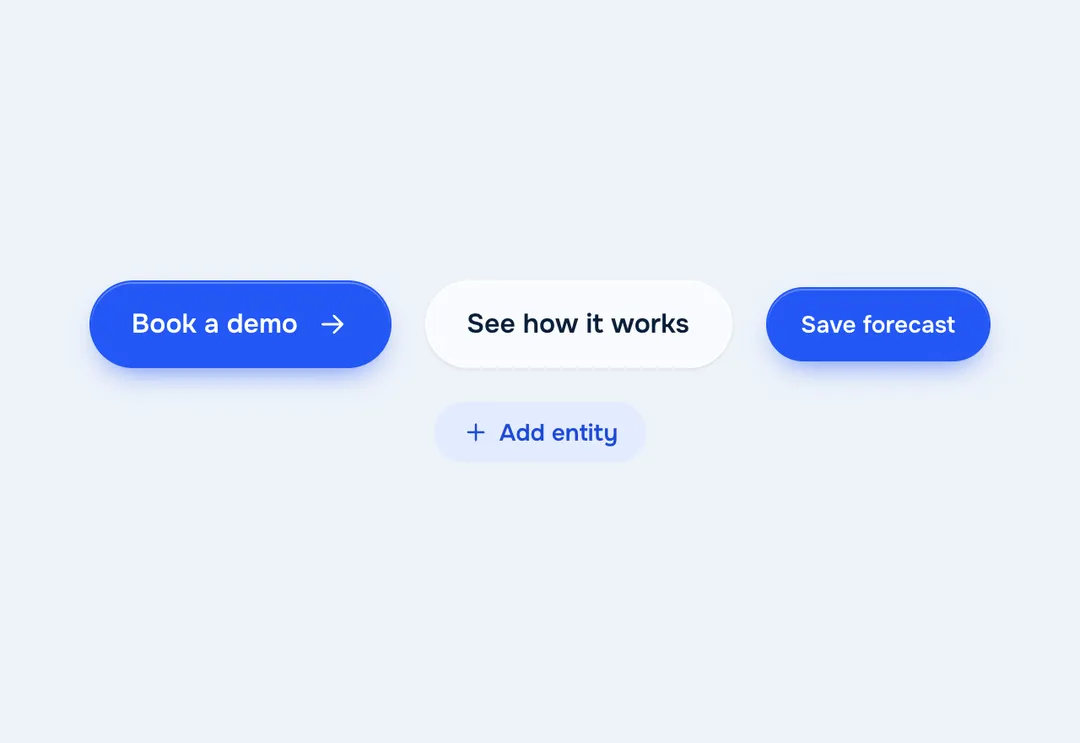
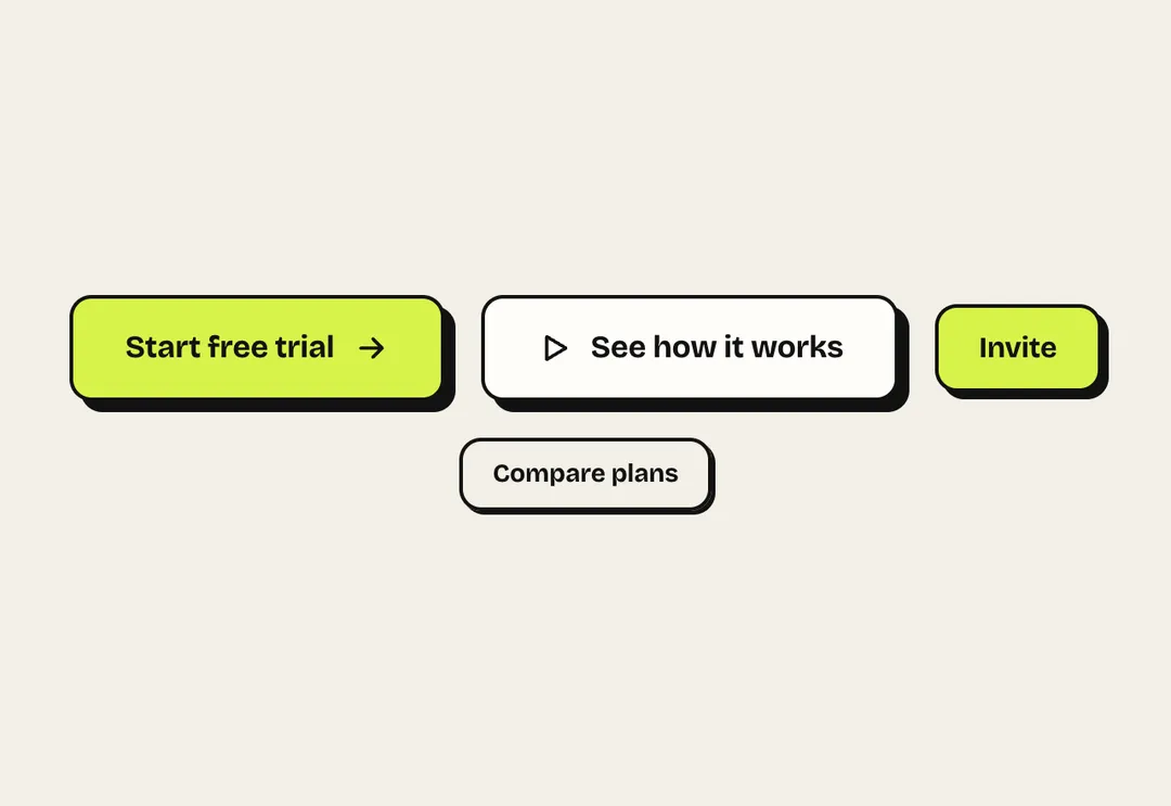
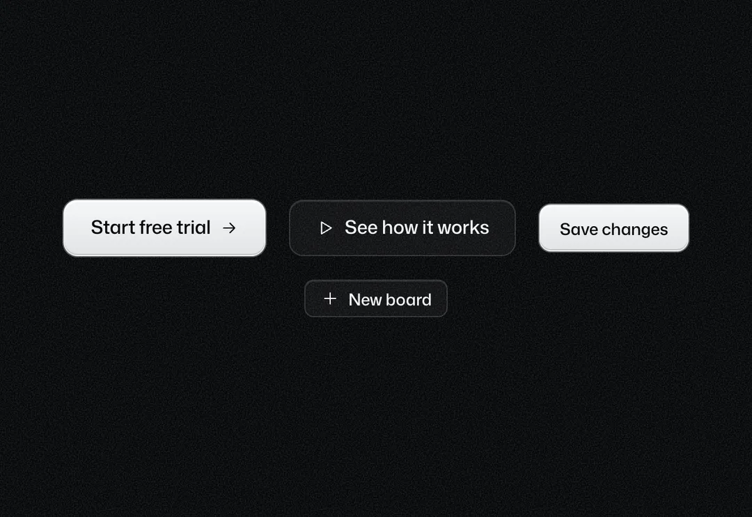
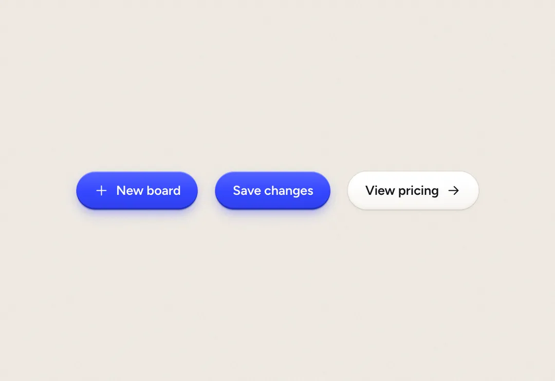
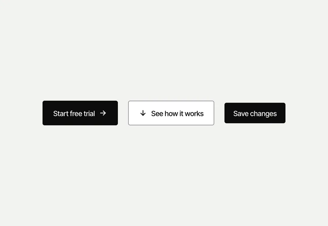
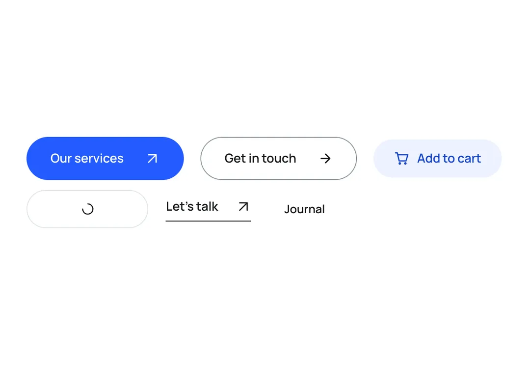
Buttons in seven variants and three sizes (34, 42 and 50 px); every one gives slightly when pressed and rises 1 px on hover. primary is the pine green button (one per view on an app screen; on the pine block it turns into the white button with green text), secondary white, accent soft green, outline a ring for busy surfaces, ghost text only, destructive red, link underlined text. Loading shows a spinner, keeps the width, sets aria-busy, disables the button and announces loadingLabel. ButtonLink is an <a> with the same look (never disabled). buttonClass(look, className) gives the classes for a router link.
It is part of Grove: white cards on sage, pastel chips, pine green. The style’s 135 pieces share one set of tokens, type and motion, in a light and a dark theme, so whatever you take from it fits together.
To put it in your project, copy the prompt into Claude Code, OpenAI Codex or Cursor, or add it by hand. The documentation walks through both.
Seven variants, three sizes, a loading state that keeps the width, and a link with the same look.
Seven variants, three sizes, a loading state that keeps the width, and a link with the same look.
Seven variants, three sizes, a loading state that keeps the width, and a link with the same look.
Seven variants, three sizes, a loading state that keeps the width, and a link with the same look.
Seven variants, three sizes, a loading state that keeps the width, and a link with the same look.
Seven variants, three sizes, a loading state that keeps the width, and a link with the same look.
Seven variants, three sizes, a loading state that keeps the width, and a link with the same look.
Seven variants, three sizes, a loading state that keeps the width, and a link with the same look.