Aeris Dropdown Menu
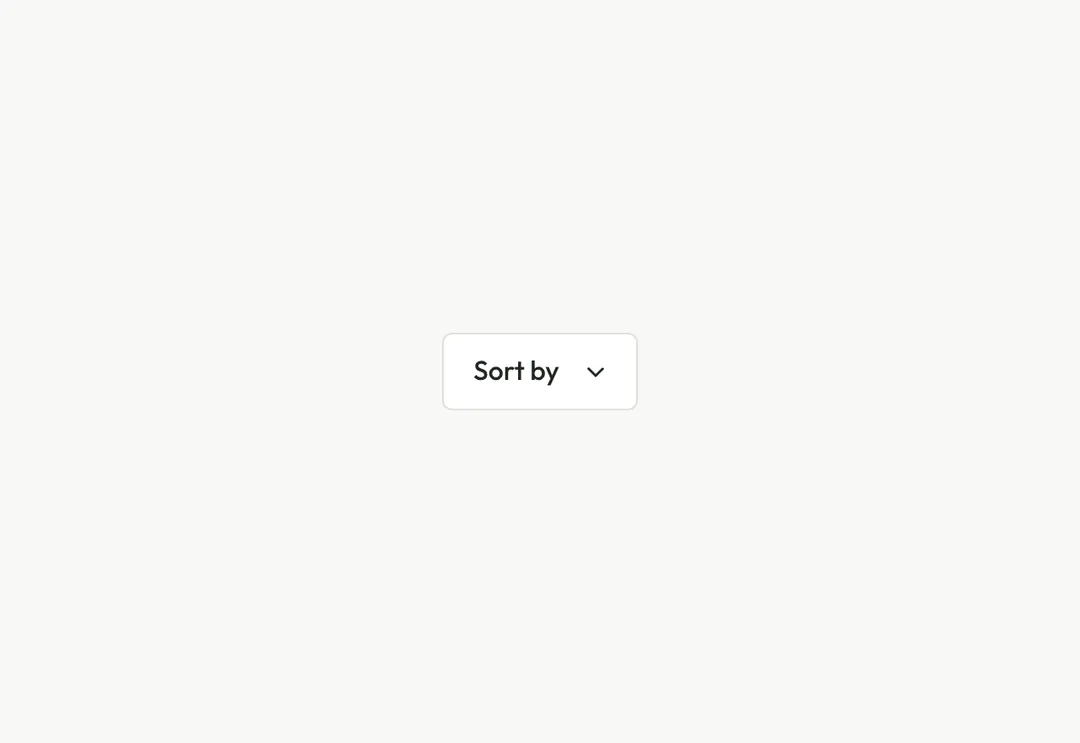
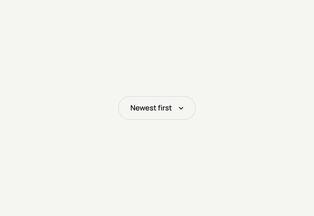
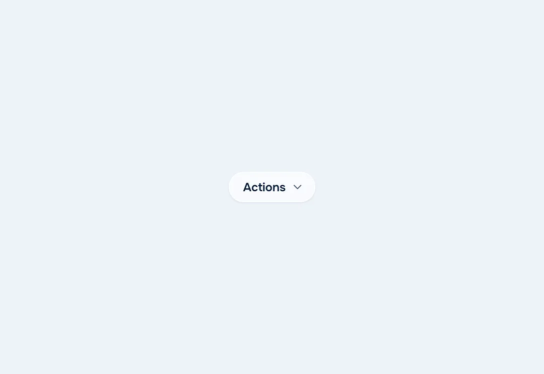
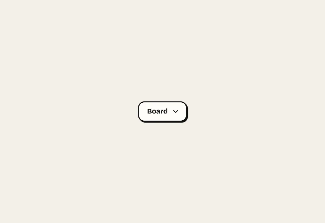
Menu button with actions, links, groups and shortcut hints, navigated by arrow keys and typeahead.
Menu button with actions, links, groups and shortcut hints, navigated by arrow keys and typeahead.
A menu button built from items: actions, links, separators, headings (which start a labelled group) and shortcuts. Opens with click, Enter, Space or the arrow keys; arrows, Home, End and typeahead move; Esc, Tab and outside clicks close; it stays inside the viewport. Links render as <a role="menuitem">. Client component.
It is part of Grove: white cards on sage, pastel chips, pine green. The style’s 135 pieces share one set of tokens, type and motion, in a light and a dark theme, so whatever you take from it fits together.
To put it in your project, copy the prompt into Claude Code, OpenAI Codex or Cursor, or add it by hand. The documentation walks through both.
Menu button with actions, links, groups and shortcut hints, navigated by arrow keys and typeahead.
Menu button with actions, links, groups and shortcut hints, navigated by arrow keys and typeahead.
Menu button with actions, links, groups and shortcut hints, navigated by arrow keys and typeahead.
Menu button with actions, links, groups and shortcut hints, navigated by arrow keys and typeahead.
Menu button with actions, links, groups and shortcut hints, navigated by arrow keys and typeahead.
Menu button with actions, links, groups and shortcut hints, navigated by arrow keys and typeahead.
Menu button with actions, links, groups and shortcut hints, navigated by arrow keys and typeahead.
Menu button with actions, links, groups and shortcut hints, navigated by arrow keys and typeahead.