Aeris Feature Grid
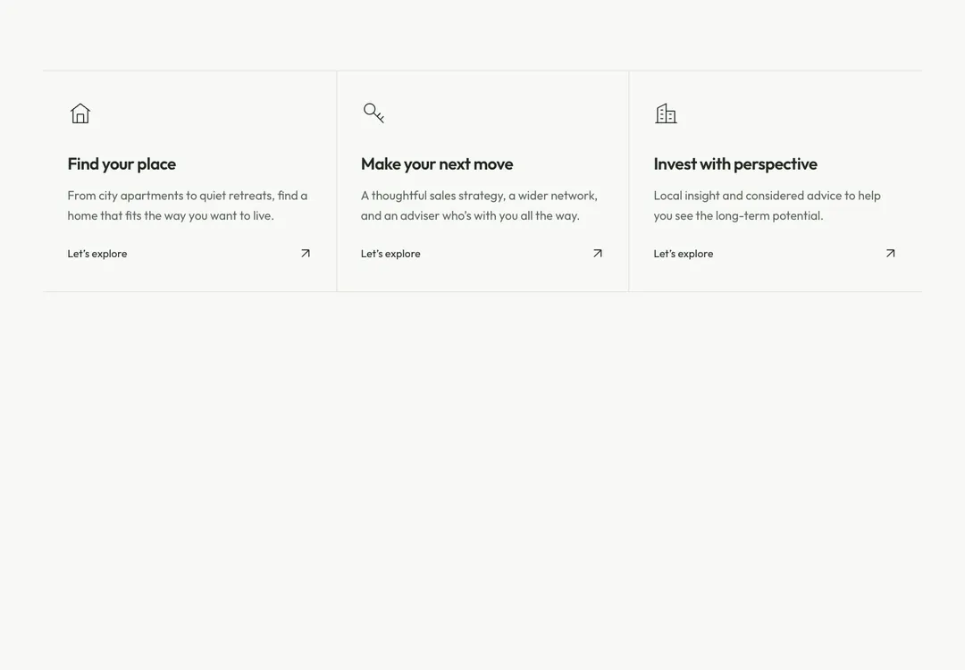
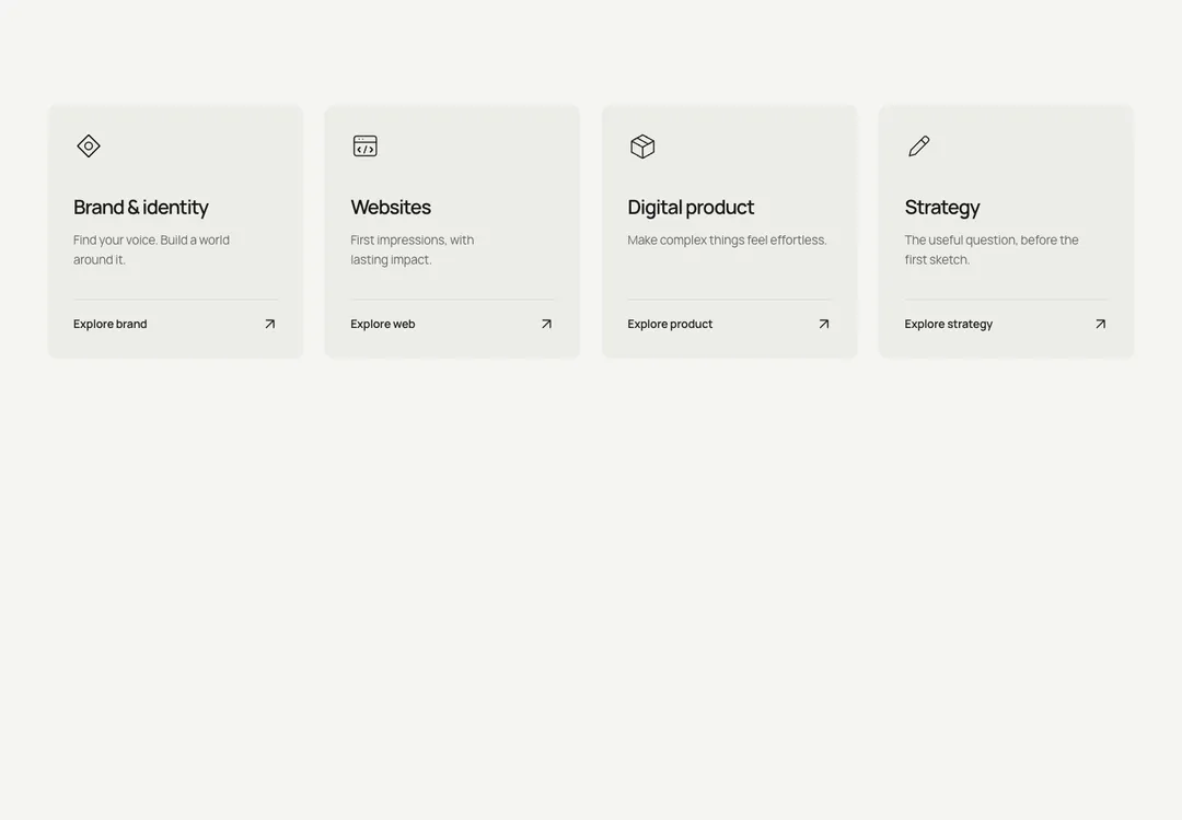
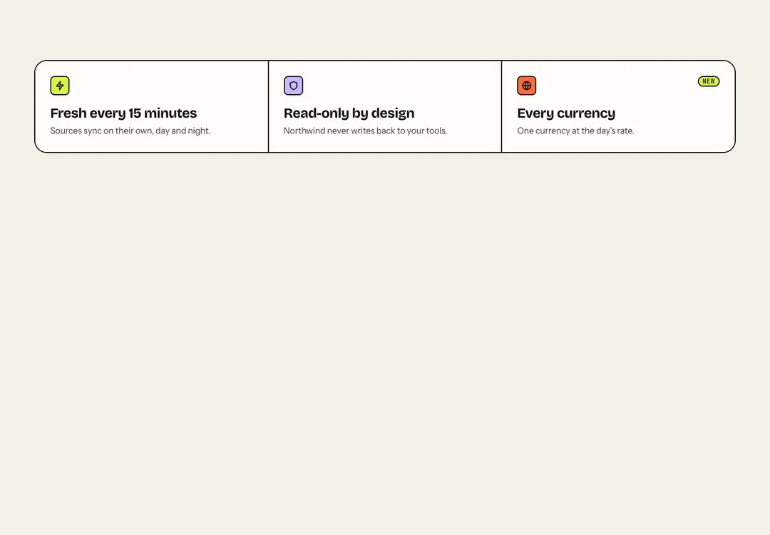
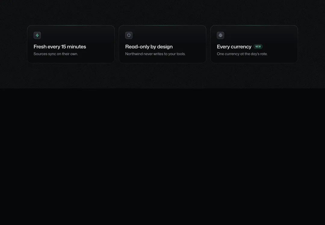
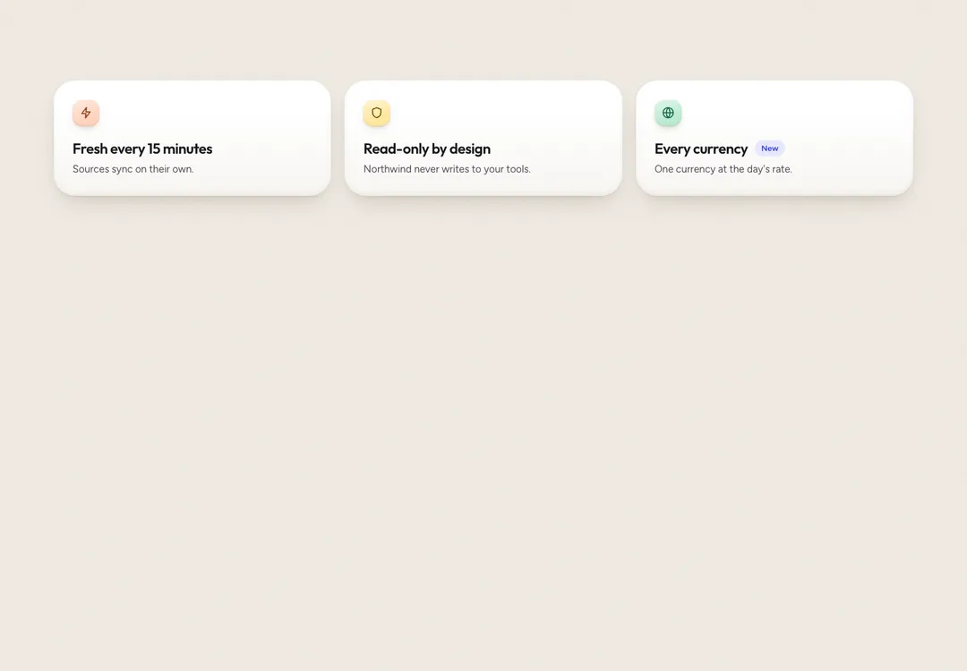
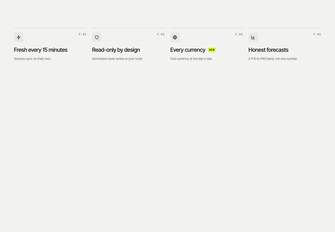
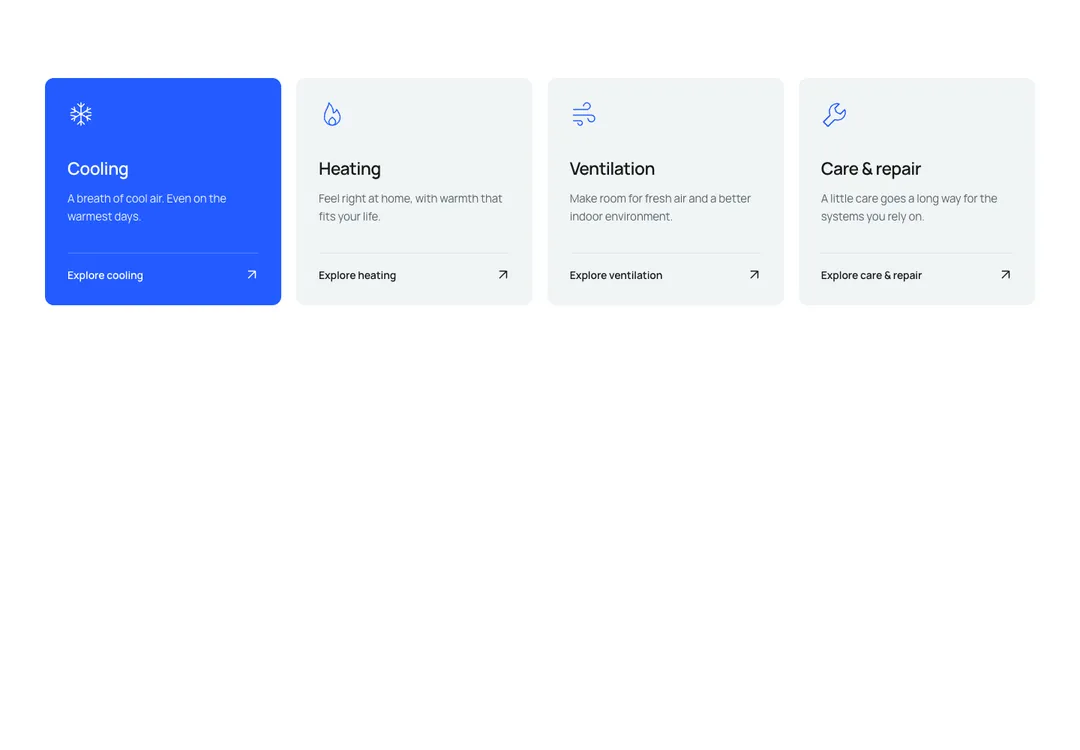
Icon, title and text items in two to four columns, shown as cards, plain or between rules.
GroveMotion
Icon, title and text items in two to four columns, shown as cards, plain or between rules.
Icon, title (h3) and text items in 2 to 4 columns: on tiles that lift on hover, plain, or between hairline rules. One column on phones, two at md.
It is part of Grove: white cards on sage, pastel chips, pine green. The style’s 135 pieces share one set of tokens, type and motion, in a light and a dark theme, so whatever you take from it fits together.
To put it in your project, copy the prompt into Claude Code, OpenAI Codex or Cursor, or add it by hand. The documentation walks through both.
Icon, title and text items in two to four columns, shown as cards, plain or between rules.
Icon, title and text items in two to four columns, shown as cards, plain or between rules.
Icon, title and text items in two to four columns, shown as cards, plain or between rules.
Icon, title and text items in two to four columns, shown as cards, plain or between rules.
Icon, title and text items in two to four columns, shown as cards, plain or between rules.
Icon, title and text items in two to four columns, shown as cards, plain or between rules.
Icon, title and text items in two to four columns, shown as cards, plain or between rules.
Icon, title and text items in two to four columns, shown as cards, plain or between rules.