Aeris Feature Grid
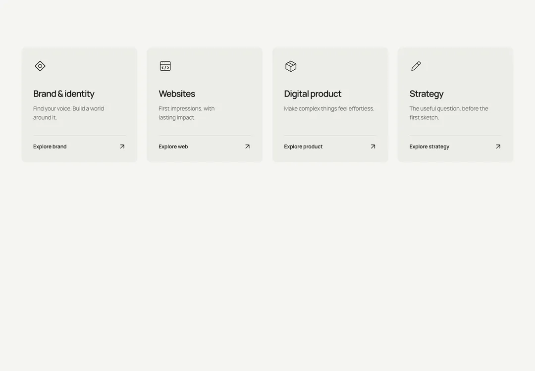
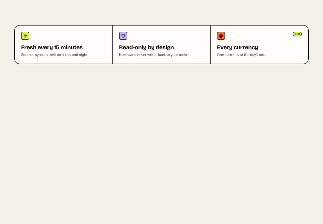
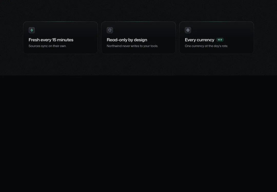
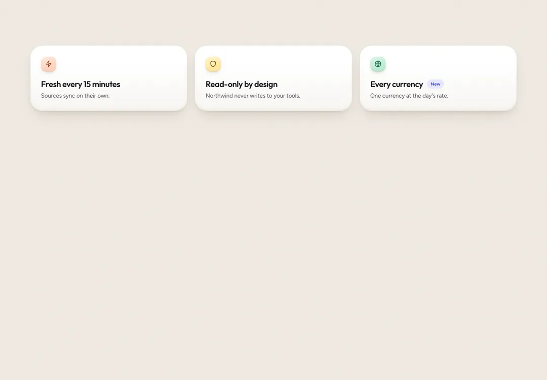
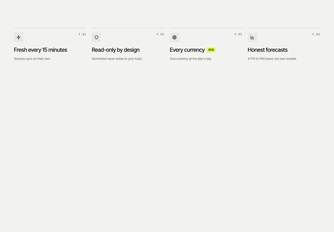
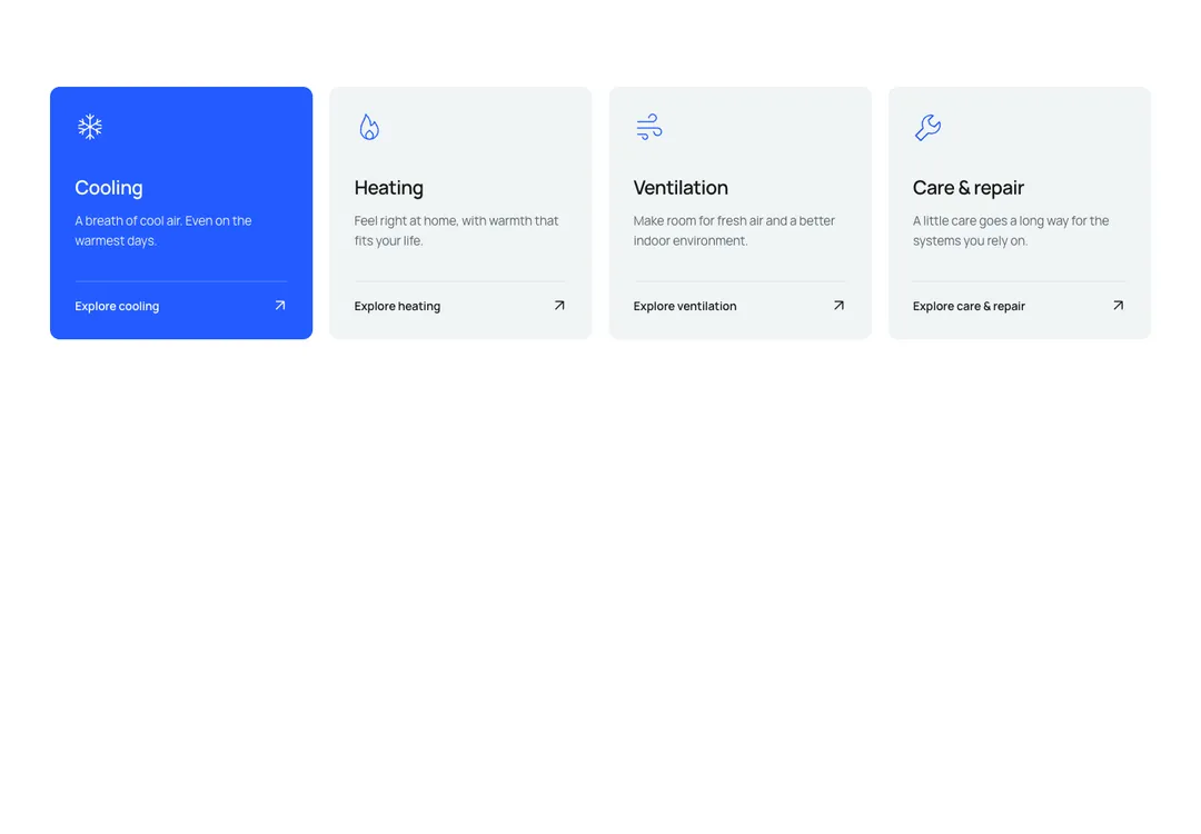
Icon, title and text items in two to four columns, shown as cards, plain or between rules.
BavariaMotion
Icon, title and text items in two to four columns, shown as cards, plain or between rules.
A thin line icon (38 px), a title (h3) and text in 2 to 4 columns. rules is the template's service grid: cells divided by hairlines with a rule above and below, no fill, a cell that turns white under the pointer when it links. plain sets each item under its own top rule (the principles of an about page). cards puts them on white hairline cards. An item with href is one stretched link on its title and ends in a row with linkLabel at the left and the ↗ arrow at the far right, which steps up and right on hover. Three columns sit side by side from md; four go two-up first; phones show one column. The badge is a small sage tag beside the title.
It is part of Bavaria: chalk pages, architectural photos, sage and forest green. The style’s 93 pieces share one set of tokens, type and motion, in a light and a dark theme, so whatever you take from it fits together.
To put it in your project, copy the prompt into Claude Code, OpenAI Codex or Cursor, or add it by hand. The documentation walks through both.
Icon, title and text items in two to four columns, shown as cards, plain or between rules.
Icon, title and text items in two to four columns, shown as cards, plain or between rules.
Icon, title and text items in two to four columns, shown as cards, plain or between rules.
Icon, title and text items in two to four columns, shown as cards, plain or between rules.
Icon, title and text items in two to four columns, shown as cards, plain or between rules.
Icon, title and text items in two to four columns, shown as cards, plain or between rules.
Icon, title and text items in two to four columns, shown as cards, plain or between rules.
Icon, title and text items in two to four columns, shown as cards, plain or between rules.