Aeris Feature Grid
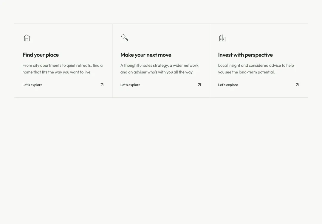
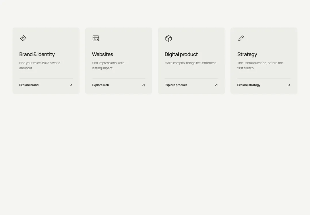
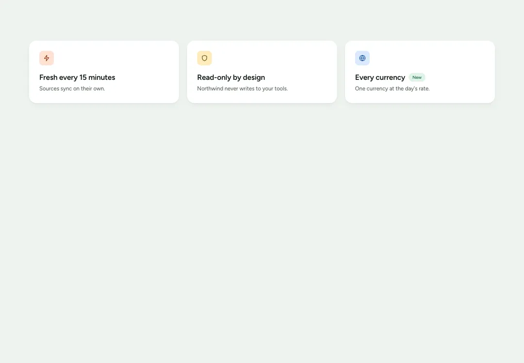
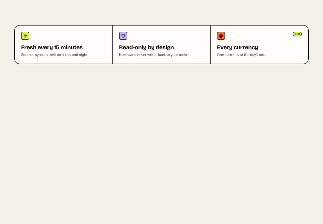
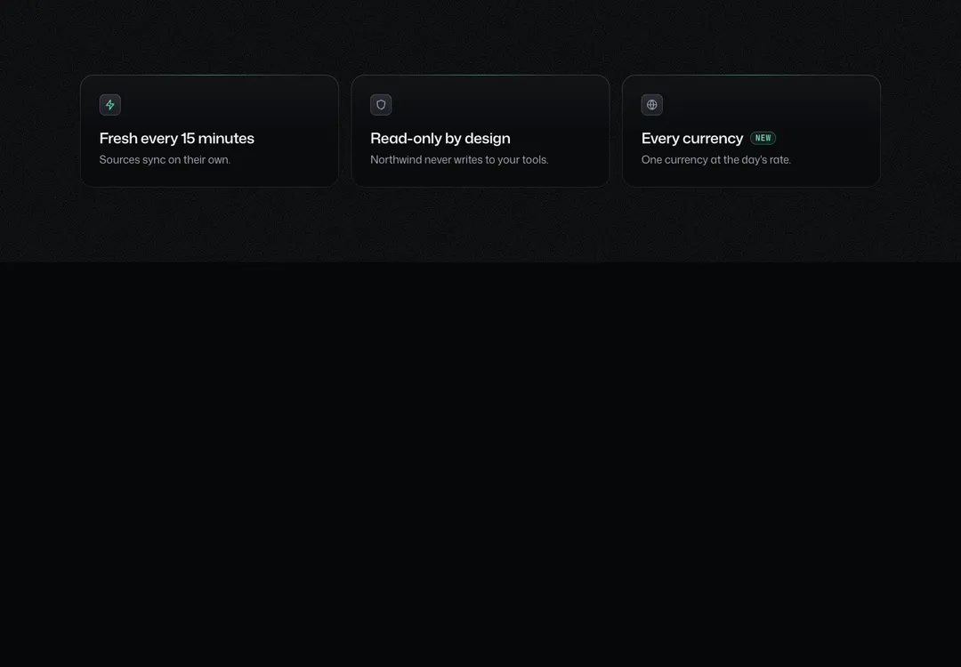
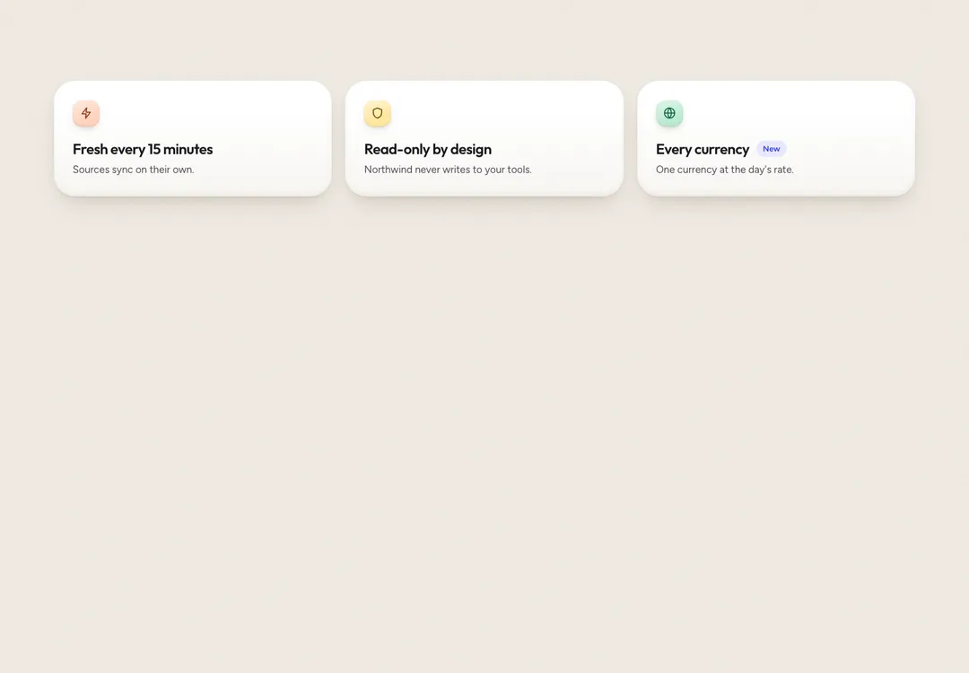
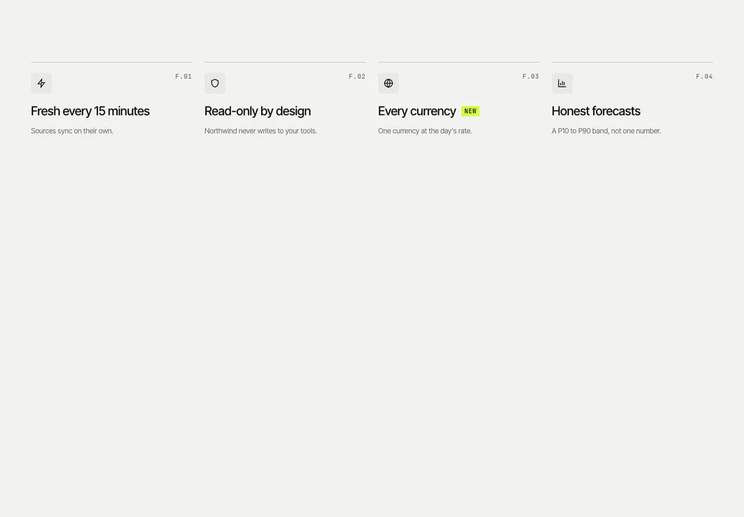
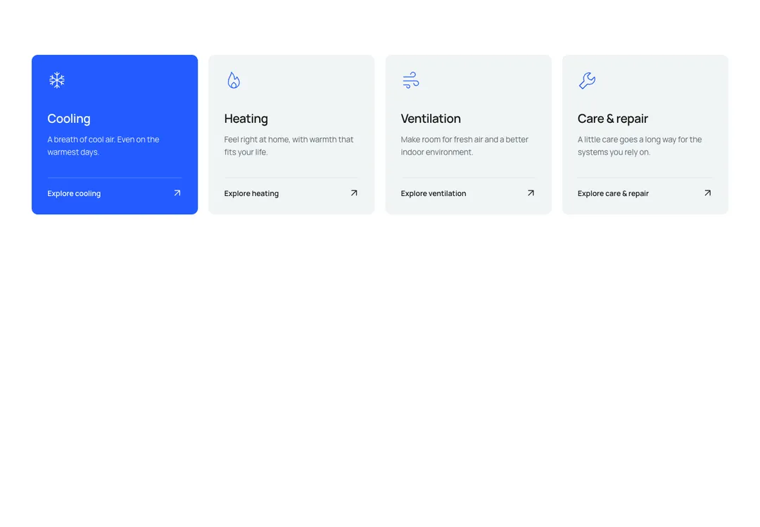
Icon, title and text items in two to four columns, shown as cards, plain or between rules.
Glass MeridianMotion
Icon, title and text items in two to four columns, shown as cards, plain or between rules.
Icon, title (h3) and text items in 2 to 4 columns: on glass panes, plain, or between hairline rules. The icon sits in a chip, blue on a sky tint. One column on phones, two at md. A linked card lifts and its edge brightens.
It is part of Glass Meridian: daylight sky, frosted glass, one blue line. The style’s 92 pieces share one set of tokens, type and motion, in a light and a dark theme, so whatever you take from it fits together.
To put it in your project, copy the prompt into Claude Code, OpenAI Codex or Cursor, or add it by hand. The documentation walks through both.
Icon, title and text items in two to four columns, shown as cards, plain or between rules.
Icon, title and text items in two to four columns, shown as cards, plain or between rules.
Icon, title and text items in two to four columns, shown as cards, plain or between rules.
Icon, title and text items in two to four columns, shown as cards, plain or between rules.
Icon, title and text items in two to four columns, shown as cards, plain or between rules.
Icon, title and text items in two to four columns, shown as cards, plain or between rules.
Icon, title and text items in two to four columns, shown as cards, plain or between rules.
Icon, title and text items in two to four columns, shown as cards, plain or between rules.