Aeris Product Grid
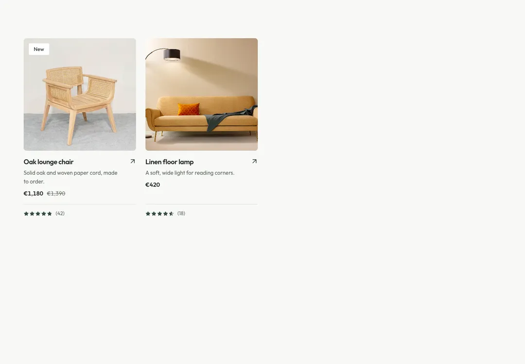
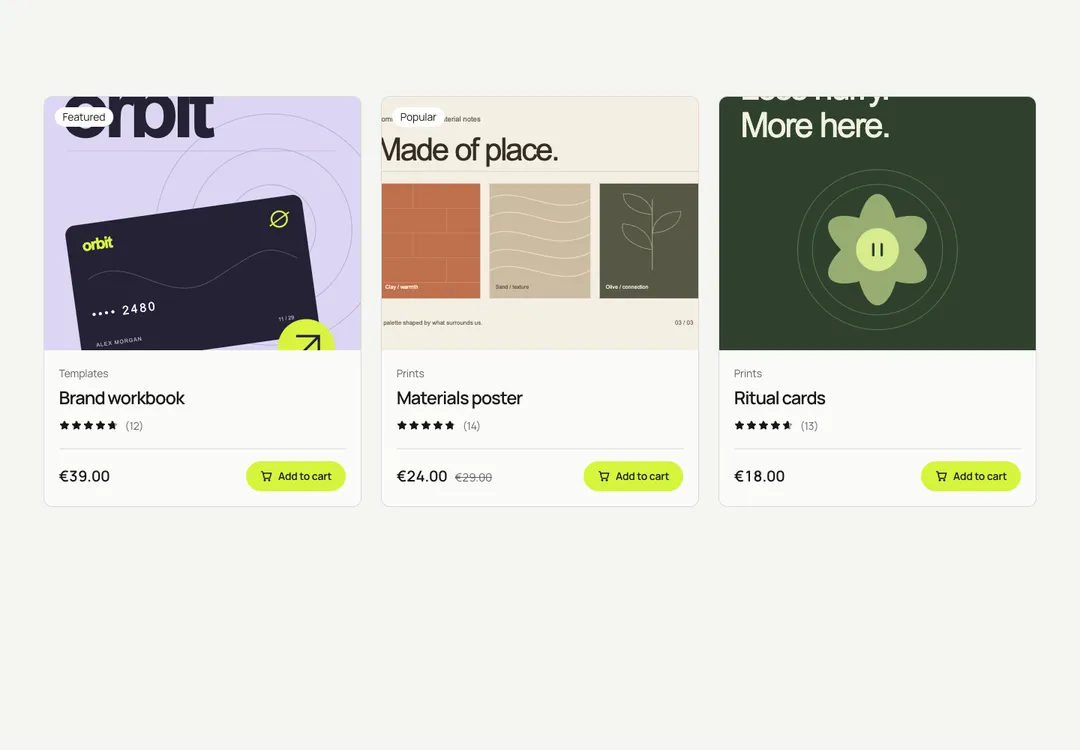
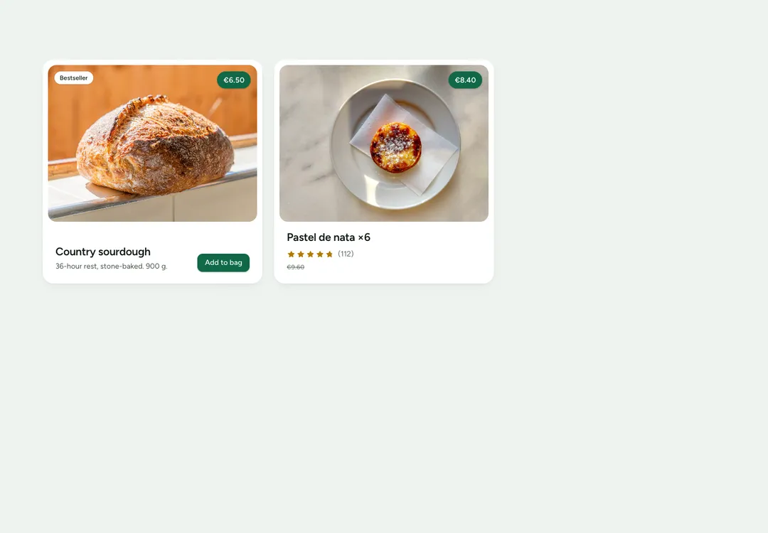
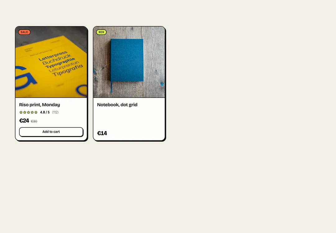
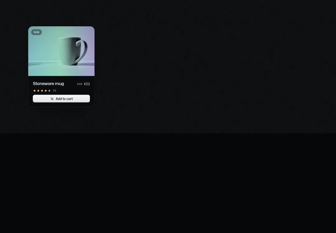
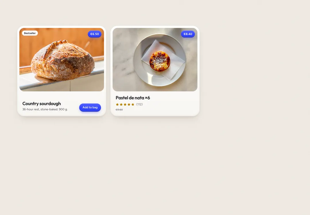
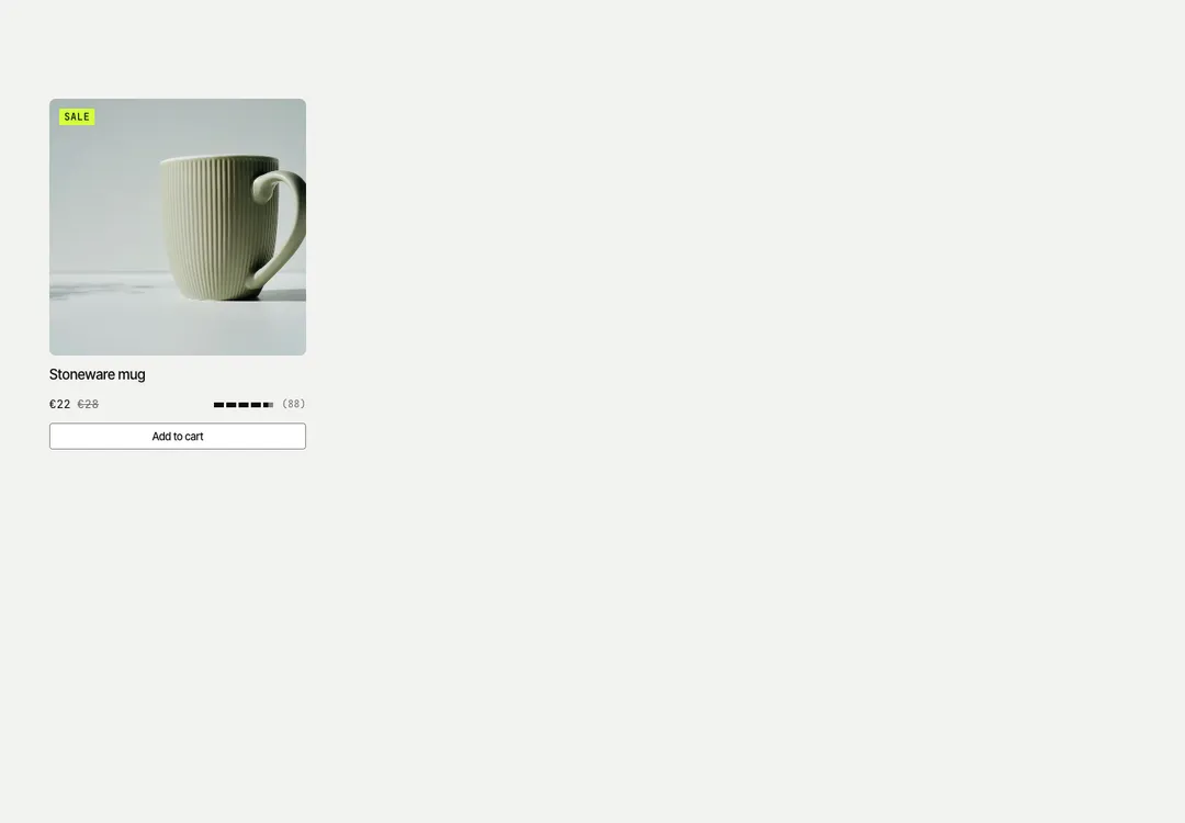
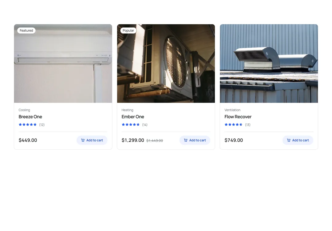
Shop cards with image, badge, rating, price and a crossed-out old price, two columns on phones.
Glass MeridianMotion
Shop cards with image, badge, rating, price and a crossed-out old price, two columns on phones.
Shop cards: a framed square image (graded, zooms on hover) with a frosted badge, the name (one link that covers the card), description, a rating in the kit's blue, the price as a figure and a struck old price with screen-reader text. A cta renders as a separate glass button above the card link. ProductGrid shows two columns on phones.
It is part of Glass Meridian: daylight sky, frosted glass, one blue line. The style’s 92 pieces share one set of tokens, type and motion, in a light and a dark theme, so whatever you take from it fits together.
To put it in your project, copy the prompt into Claude Code, OpenAI Codex or Cursor, or add it by hand. The documentation walks through both.
Shop cards with image, badge, rating, price and a crossed-out old price, two columns on phones.
Shop cards with image, badge, rating, price and a crossed-out old price, two columns on phones.
Shop cards with image, badge, rating, price and a crossed-out old price, two columns on phones.
Shop cards with image, badge, rating, price and a crossed-out old price, two columns on phones.
Shop cards with image, badge, rating, price and a crossed-out old price, two columns on phones.
Shop cards with image, badge, rating, price and a crossed-out old price, two columns on phones.
Shop cards with image, badge, rating, price and a crossed-out old price, two columns on phones.
Shop cards with image, badge, rating, price and a crossed-out old price, two columns on phones.