Aeris Blog Cards
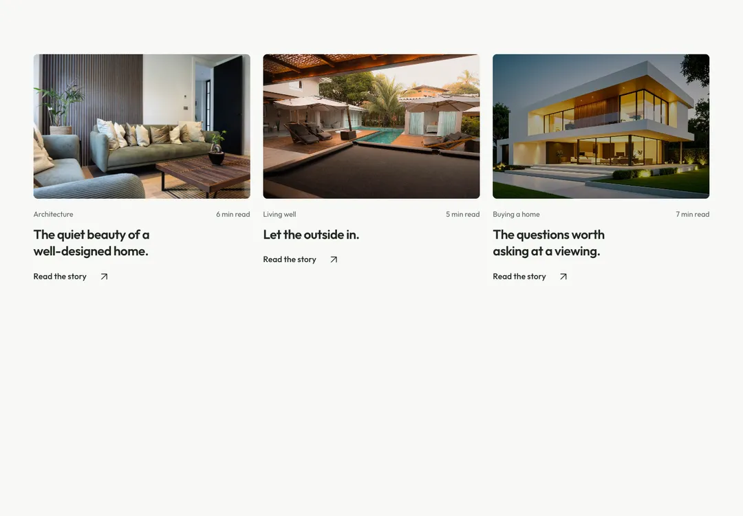
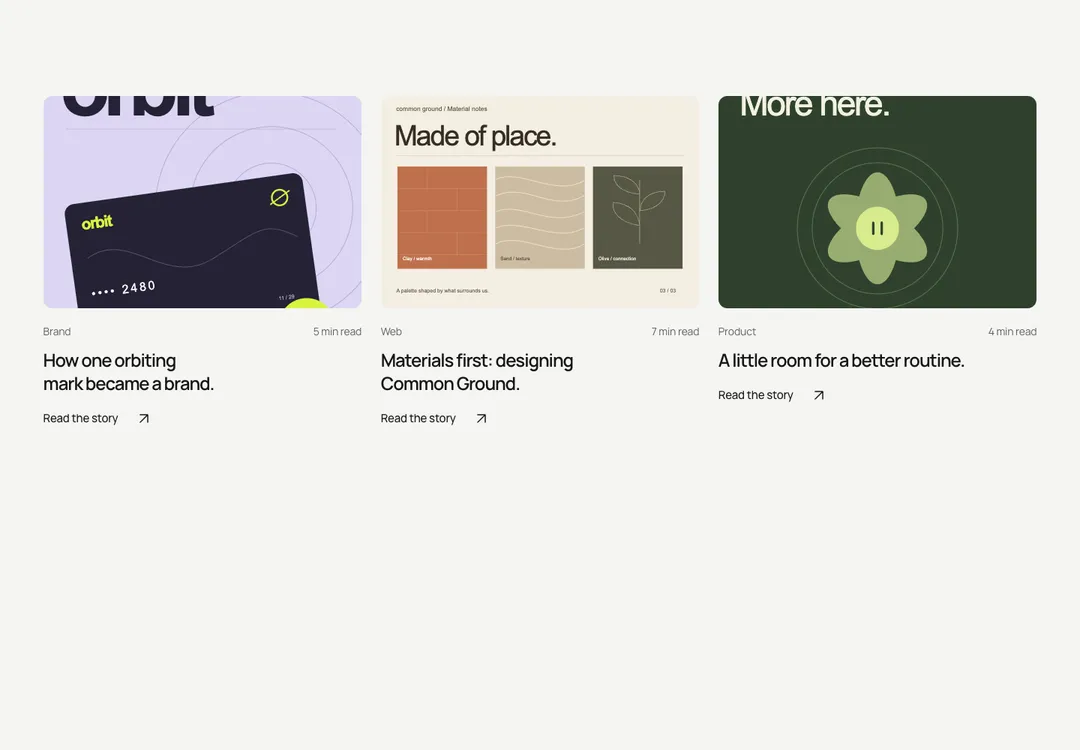
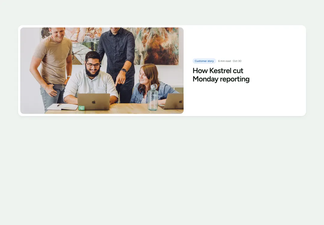
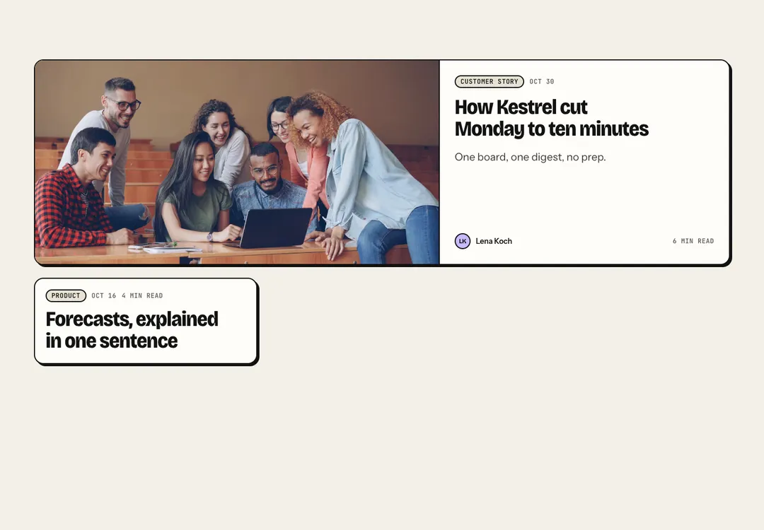
Posts in a grid, a list or a featured layout; each card is one link and works without an image.
Glass MeridianMotion
Posts in a grid, a list or a featured layout; each card is one link and works without an image.
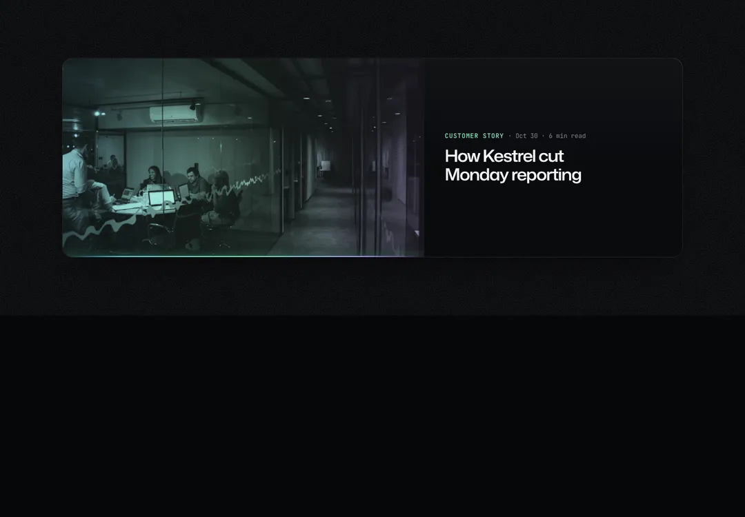
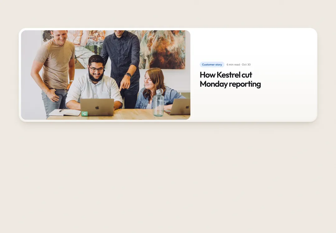
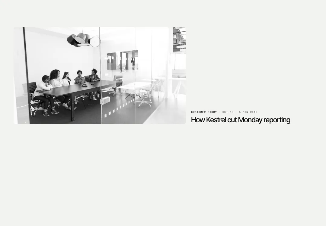
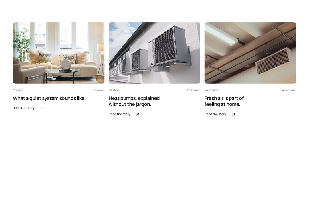
Blog posts as glass cards in a grid, a list or a featured layout (the first post large and full width). Date and read time are one data caption, the category a quiet badge. Each post is an article with one link on its title that covers the card; the card lifts on hover and the focus ring draws on it. A post without an image becomes a text card with a larger title.
It is part of Glass Meridian: daylight sky, frosted glass, one blue line. The style’s 92 pieces share one set of tokens, type and motion, in a light and a dark theme, so whatever you take from it fits together.
To put it in your project, copy the prompt into Claude Code, OpenAI Codex or Cursor, or add it by hand. The documentation walks through both.
Posts in a grid, a list or a featured layout; each card is one link and works without an image.
Posts in a grid, a list or a featured layout; each card is one link and works without an image.
Posts in a grid, a list or a featured layout; each card is one link and works without an image.
Posts in a grid, a list or a featured layout; each card is one link and works without an image.
Posts in a grid, a list or a featured layout; each card is one link and works without an image.
Posts in a grid, a list or a featured layout; each card is one link and works without an image.
Posts in a grid, a list or a featured layout; each card is one link and works without an image.
Posts in a grid, a list or a featured layout; each card is one link and works without an image.