Aeris Select
The browser's own select with a chevron and no custom dropdown, so its picker works on phones.
The browser's own select with a chevron and no custom dropdown, so its picker works on phones.
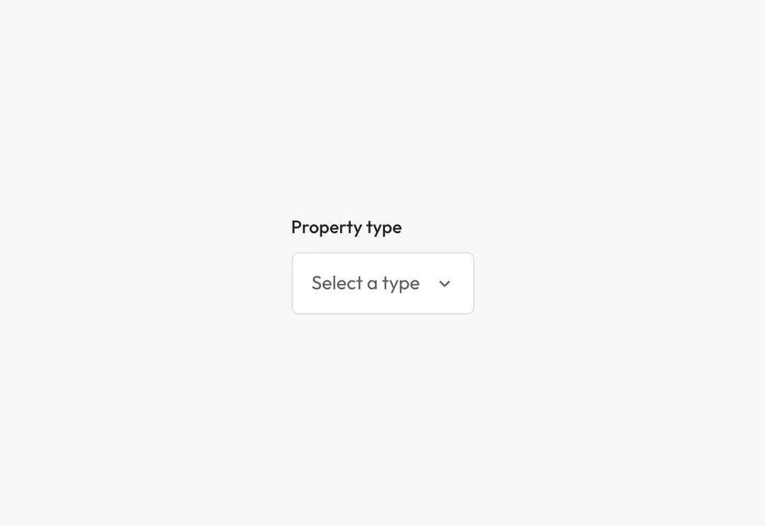
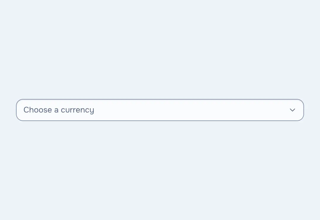
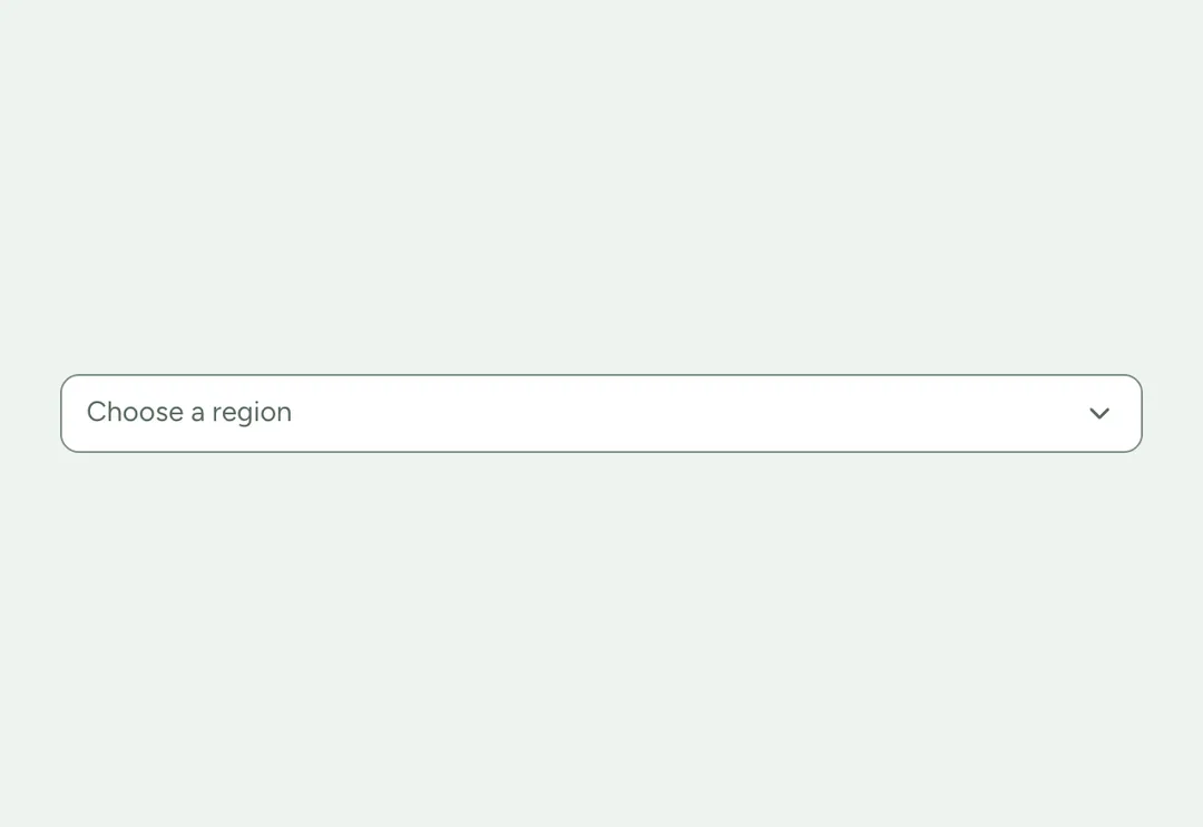
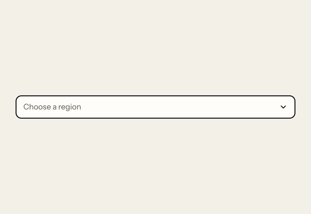
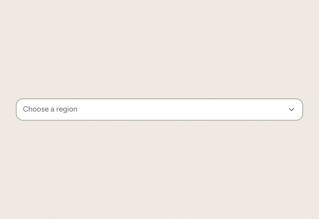
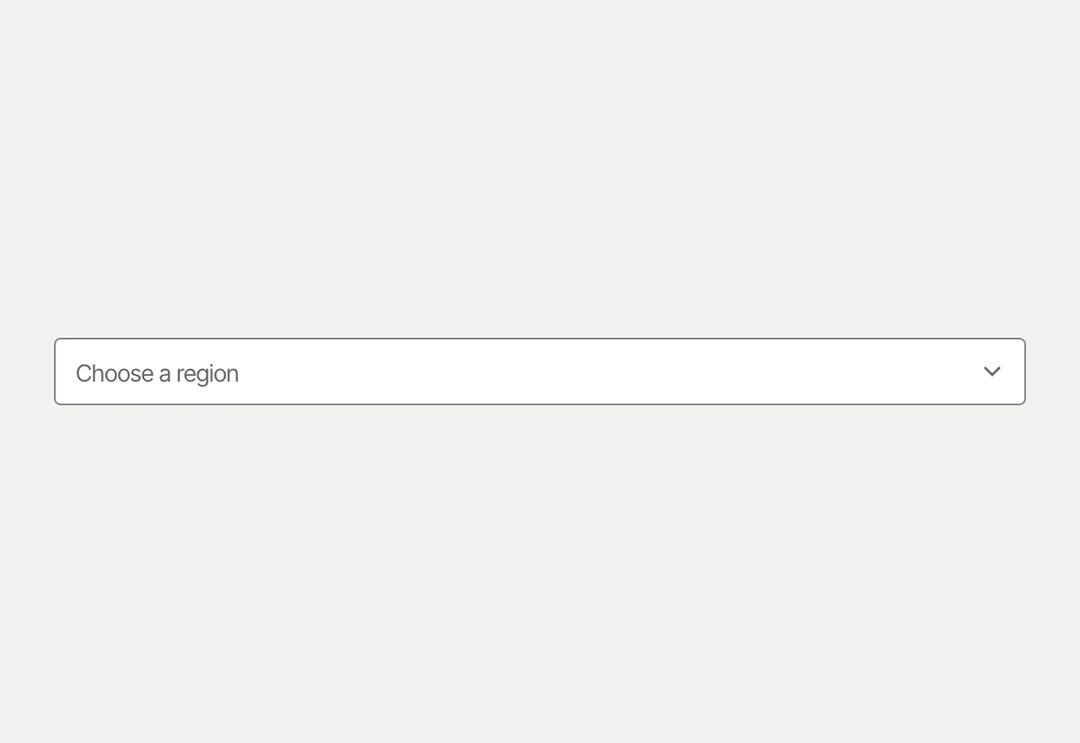
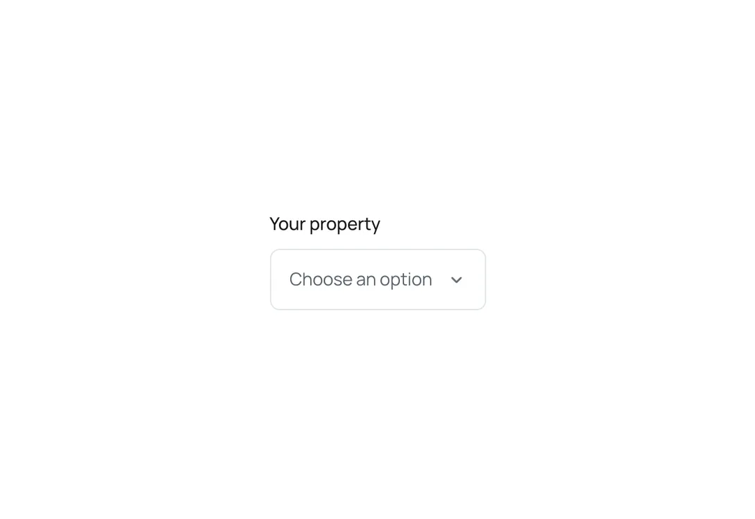
Native select in the same paper hairline box as Input, with a thin caret at the end; the placeholder shows in muted text. No custom listbox: the browser's picker stays accessible and works on phones.
It is part of Form & Field: warm paper, ink pills, one lime. The style’s 91 pieces share one set of tokens, type and motion, in a light and a dark theme, so whatever you take from it fits together.
To put it in your project, copy the prompt into Claude Code, OpenAI Codex or Cursor, or add it by hand. The documentation walks through both.
The browser's own select with a chevron and no custom dropdown, so its picker works on phones.
The browser's own select with a chevron and no custom dropdown, so its picker works on phones.
The browser's own select with a chevron and no custom dropdown, so its picker works on phones.
The browser's own select with a chevron and no custom dropdown, so its picker works on phones.
The browser's own select with a chevron and no custom dropdown, so its picker works on phones.
The browser's own select with a chevron and no custom dropdown, so its picker works on phones.
The browser's own select with a chevron and no custom dropdown, so its picker works on phones.
The browser's own select with a chevron and no custom dropdown, so its picker works on phones.