Aeris Text Input
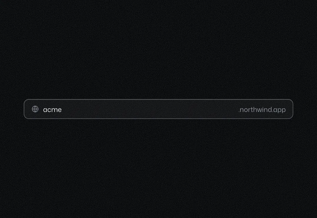
Single-line field with an optional icon or text on either side; focus marks the whole box.
Single-line field with an optional icon or text on either side; focus marks the whole box.
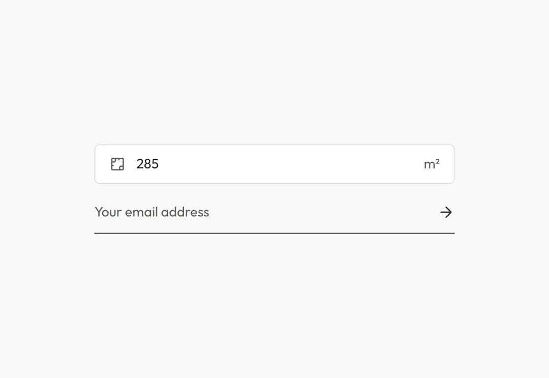
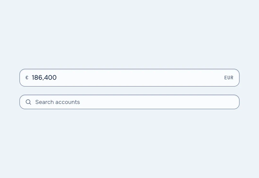
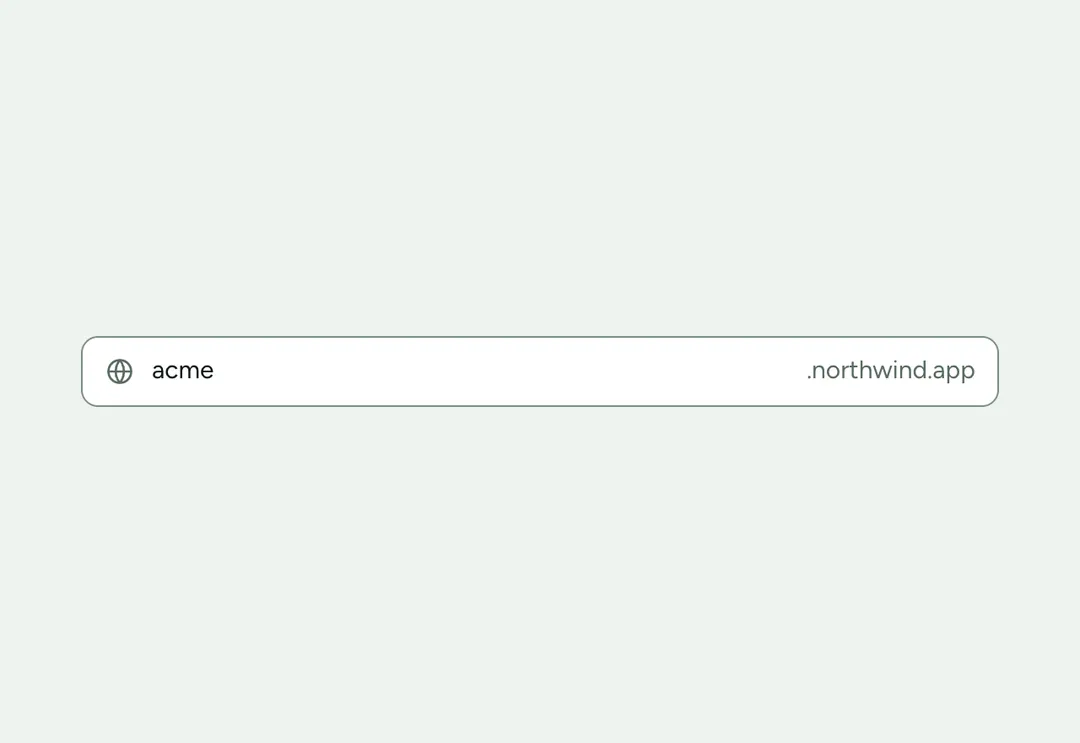
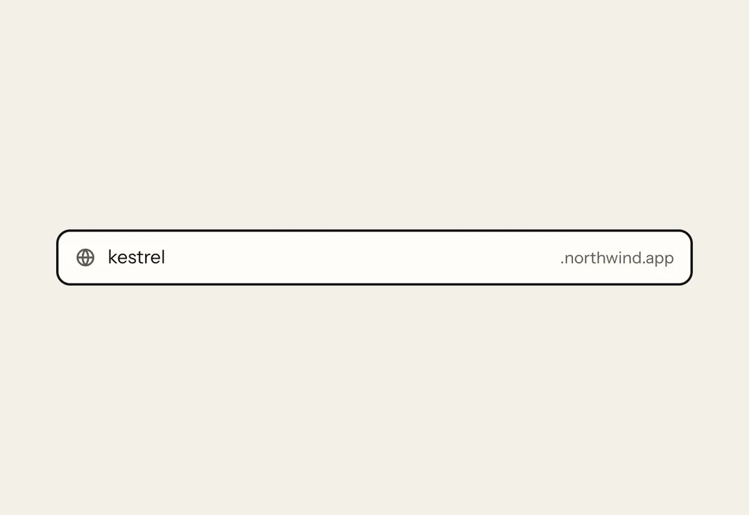
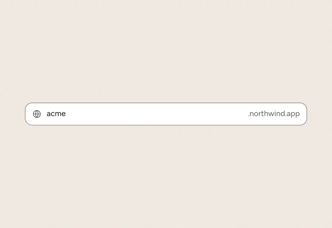
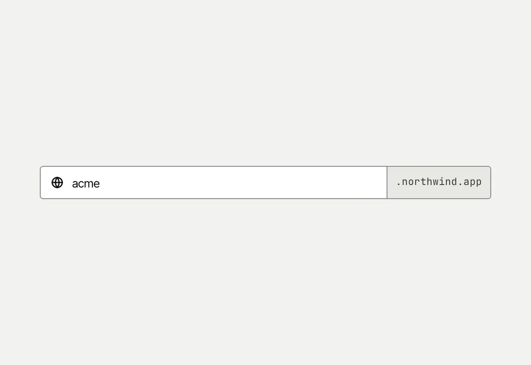
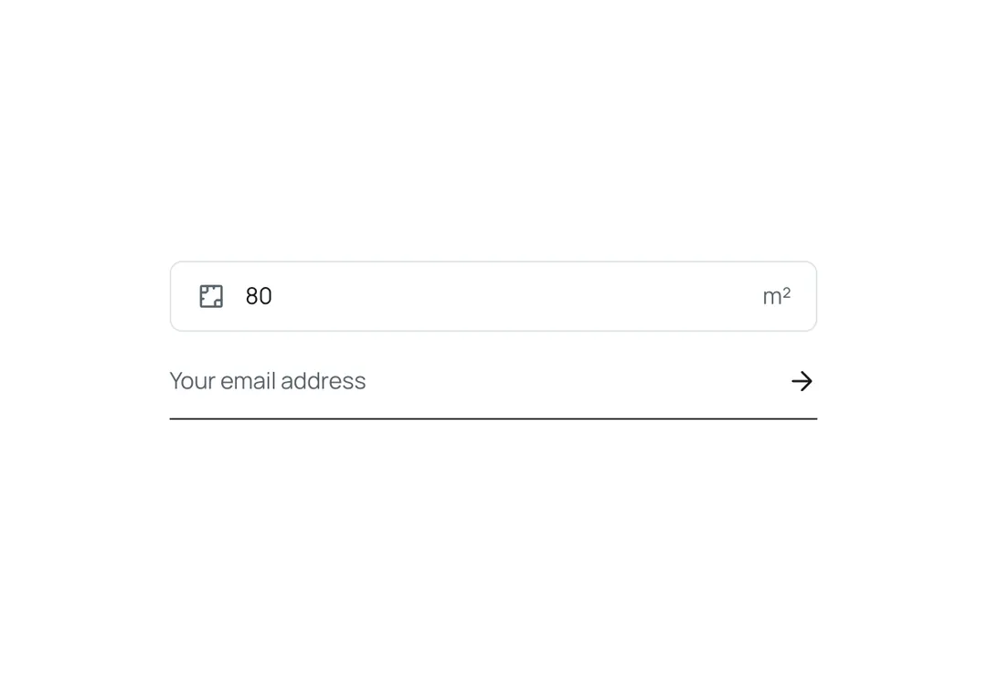
Text input in a paper hairline box with 8 px corners and 15 px text, with optional leading and trailing adornments (an icon, a unit). On a soft panel the paper box stands off the grey; the hairline firms up on hover; on focus the border takes the accent with a pale ring around the box; an invalid field has a red border. underline is the single-rule field of a newsletter: no box, one ink line under the value, the submit arrow in trailing.
It is part of Form & Field: warm paper, ink pills, one lime. The style’s 91 pieces share one set of tokens, type and motion, in a light and a dark theme, so whatever you take from it fits together.
To put it in your project, copy the prompt into Claude Code, OpenAI Codex or Cursor, or add it by hand. The documentation walks through both.
Single-line field with an optional icon or text on either side; focus marks the whole box.
Single-line field with an optional icon or text on either side; focus marks the whole box.
Single-line field with an optional icon or text on either side; focus marks the whole box.
Single-line field with an optional icon or text on either side; focus marks the whole box.
Single-line field with an optional icon or text on either side; focus marks the whole box.
Single-line field with an optional icon or text on either side; focus marks the whole box.
Single-line field with an optional icon or text on either side; focus marks the whole box.
Single-line field with an optional icon or text on either side; focus marks the whole box.