Aeris Feature Section with Image
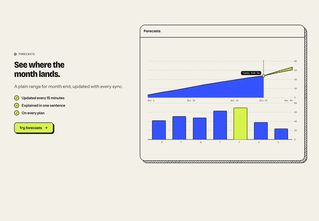
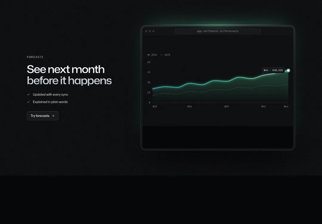
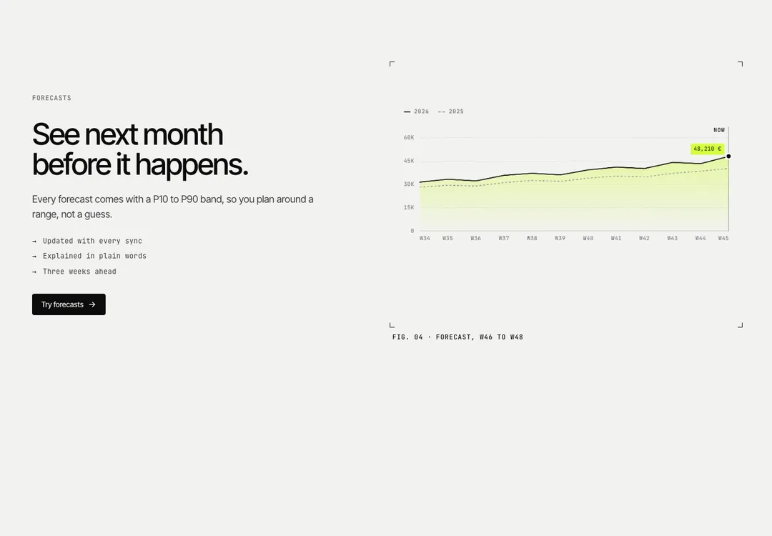
One feature in depth: heading, text, points and actions beside an image or mockup, on either side.
Form & FieldMotion
One feature in depth: heading, text, points and actions beside an image or mockup, on either side.
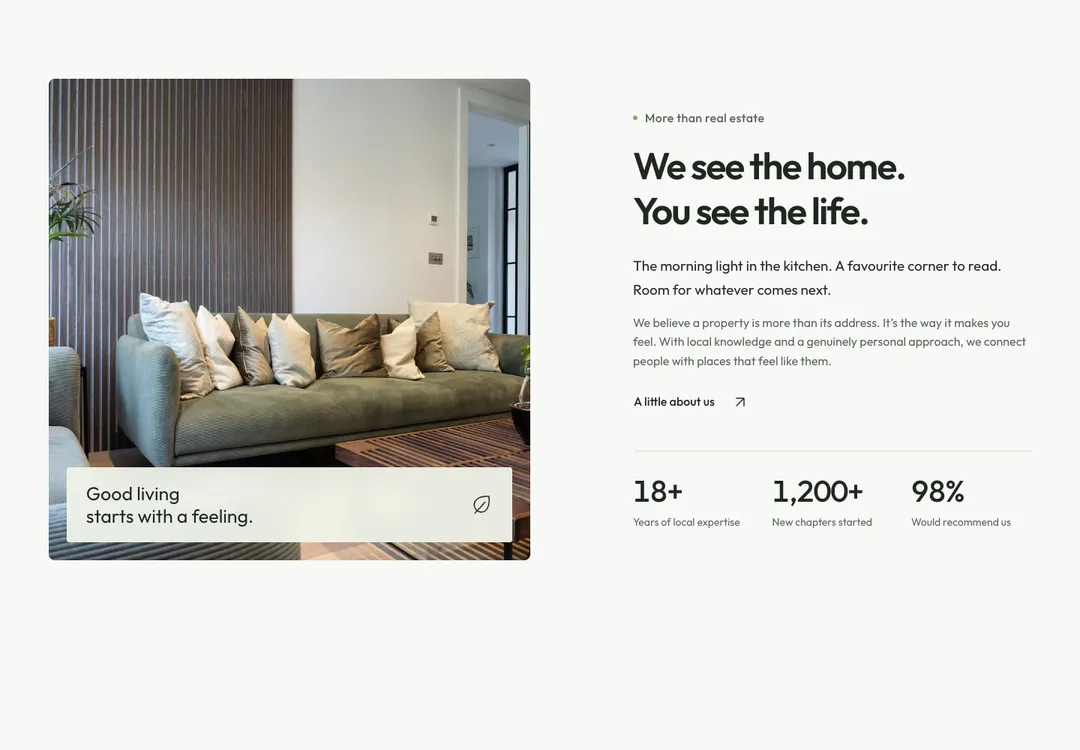
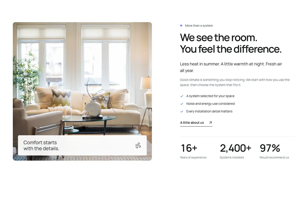
A picture beside its story, the theme's studio band: the eyebrow, a title of two short sentences (a muted word at the end reads well), a lead sentence in ink, the text, points behind checks and actions (usually one secondary pill with the ↗ arrow) on 5 columns, the media on 6: the studio moodboard, a project picture, a Media. note lays a short line over the foot of a picture on white glass; an icon after the words sits at its far end. stats adds two or three figures under a rule below the copy, counting up once. Stacks under lg with the text first; reverse puts the media on the left at lg.
It is part of Form & Field: warm paper, ink pills, one lime. The style’s 91 pieces share one set of tokens, type and motion, in a light and a dark theme, so whatever you take from it fits together.
To put it in your project, copy the prompt into Claude Code, OpenAI Codex or Cursor, or add it by hand. The documentation walks through both.
One feature in depth: heading, text, points and actions beside an image or mockup, on either side.
One feature in depth: heading, text, points and actions beside an image or mockup, on either side.
One feature in depth: heading, text, points and actions beside an image or mockup, on either side.
One feature in depth: heading, text, points and actions beside an image or mockup, on either side.
One feature in depth: heading, text, points and actions beside an image or mockup, on either side.
One feature in depth: heading, text, points and actions beside an image or mockup, on either side.
One feature in depth: heading, text, points and actions beside an image or mockup, on either side.
One feature in depth: heading, text, points and actions beside an image or mockup, on either side.