Aeris Tabs
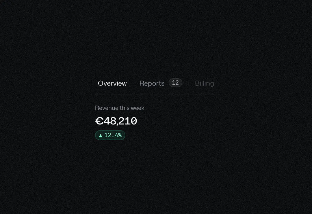
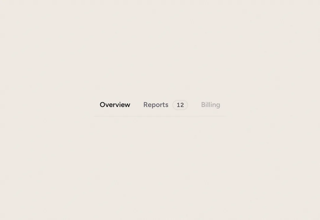
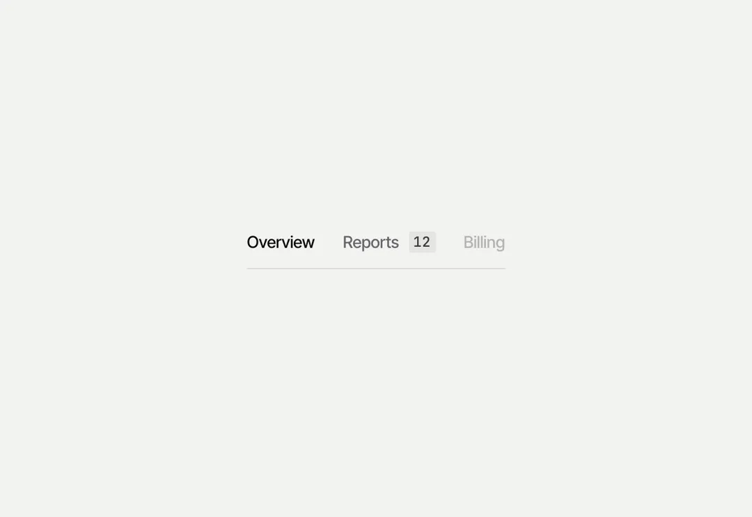
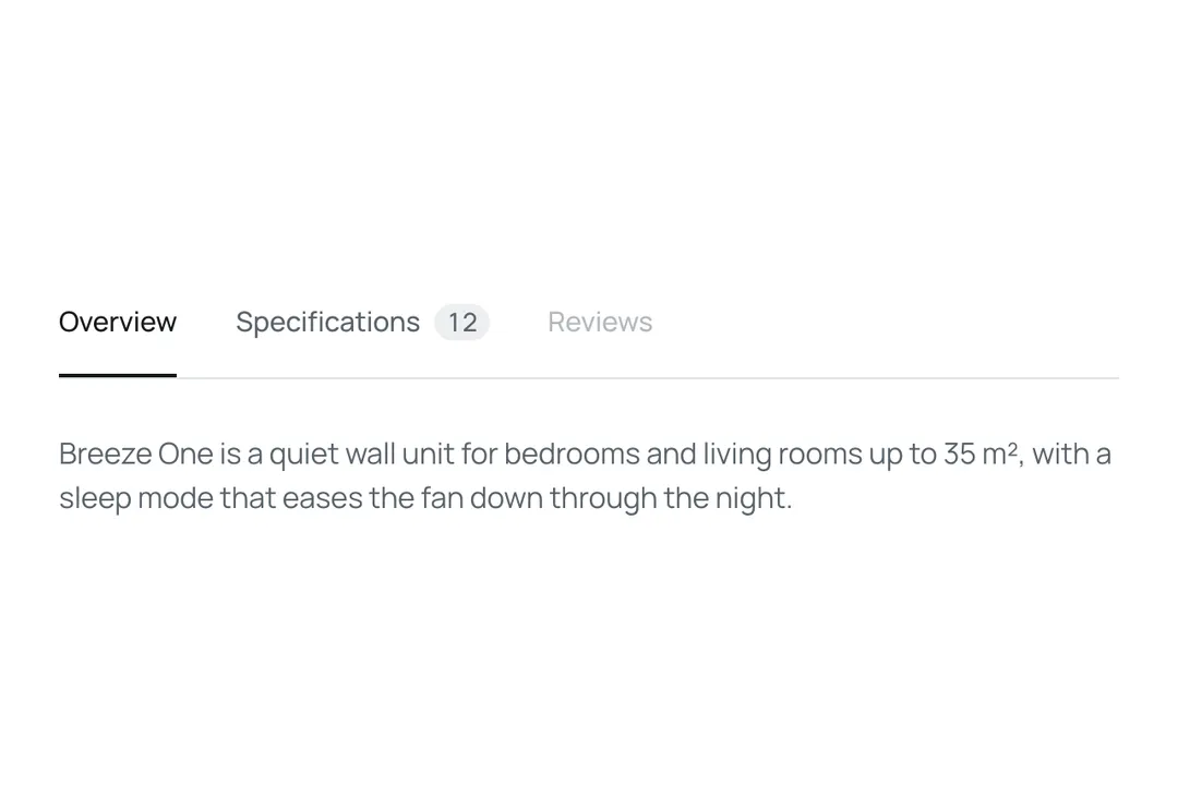
Tabbed panels driven by arrow, Home and End keys; on phones the tab list scrolls sideways.
Tabbed panels driven by arrow, Home and End keys; on phones the tab list scrolls sideways.
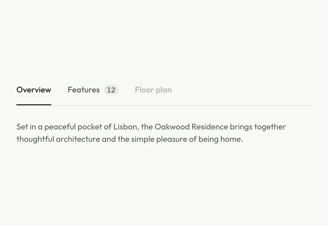
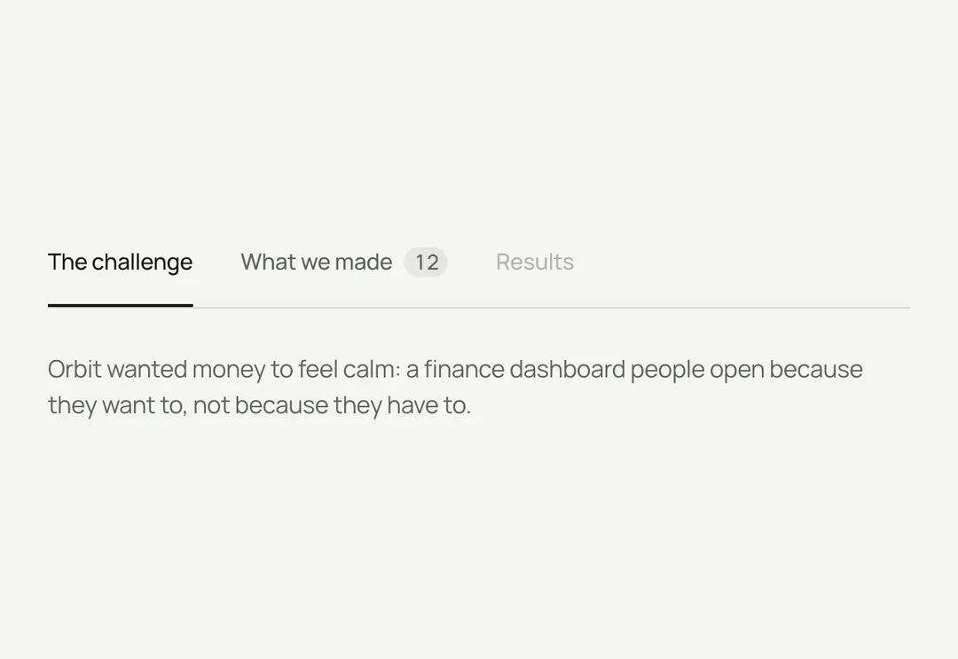
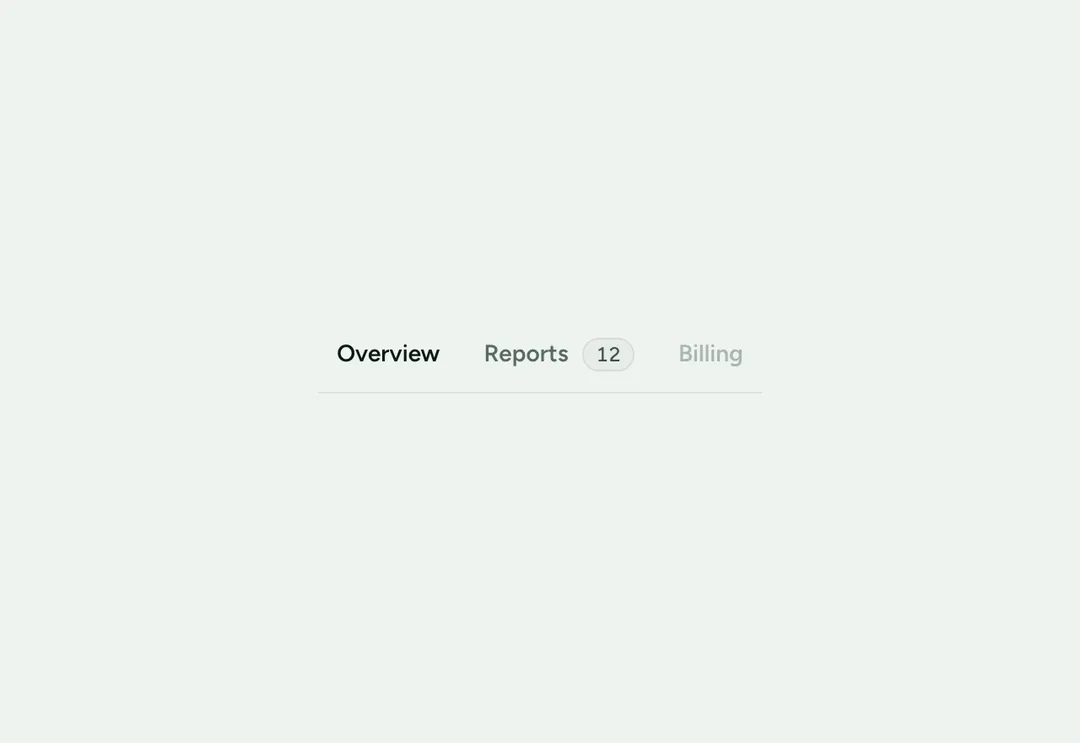
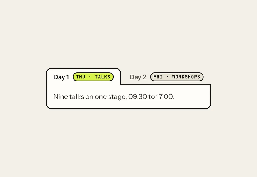
A tab list with panels, built from items (APG tabs, automatic activation): arrows move and select, Home and End jump, disabled tabs are skipped. underline sets the tabs on a hairline with a run of the meridian sliding under the selected one; pill is a sunken, outlined track with a glass thumb. On phones the list scrolls sideways with an edge fade. Client component.
It is part of Glass Meridian: daylight sky, frosted glass, one blue line. The style’s 92 pieces share one set of tokens, type and motion, in a light and a dark theme, so whatever you take from it fits together.
To put it in your project, copy the prompt into Claude Code, OpenAI Codex or Cursor, or add it by hand. The documentation walks through both.
Tabbed panels driven by arrow, Home and End keys; on phones the tab list scrolls sideways.
Tabbed panels driven by arrow, Home and End keys; on phones the tab list scrolls sideways.
Tabbed panels driven by arrow, Home and End keys; on phones the tab list scrolls sideways.
Tabbed panels driven by arrow, Home and End keys; on phones the tab list scrolls sideways.
Tabbed panels driven by arrow, Home and End keys; on phones the tab list scrolls sideways.
Tabbed panels driven by arrow, Home and End keys; on phones the tab list scrolls sideways.
Tabbed panels driven by arrow, Home and End keys; on phones the tab list scrolls sideways.
Tabbed panels driven by arrow, Home and End keys; on phones the tab list scrolls sideways.