Aeris Footer
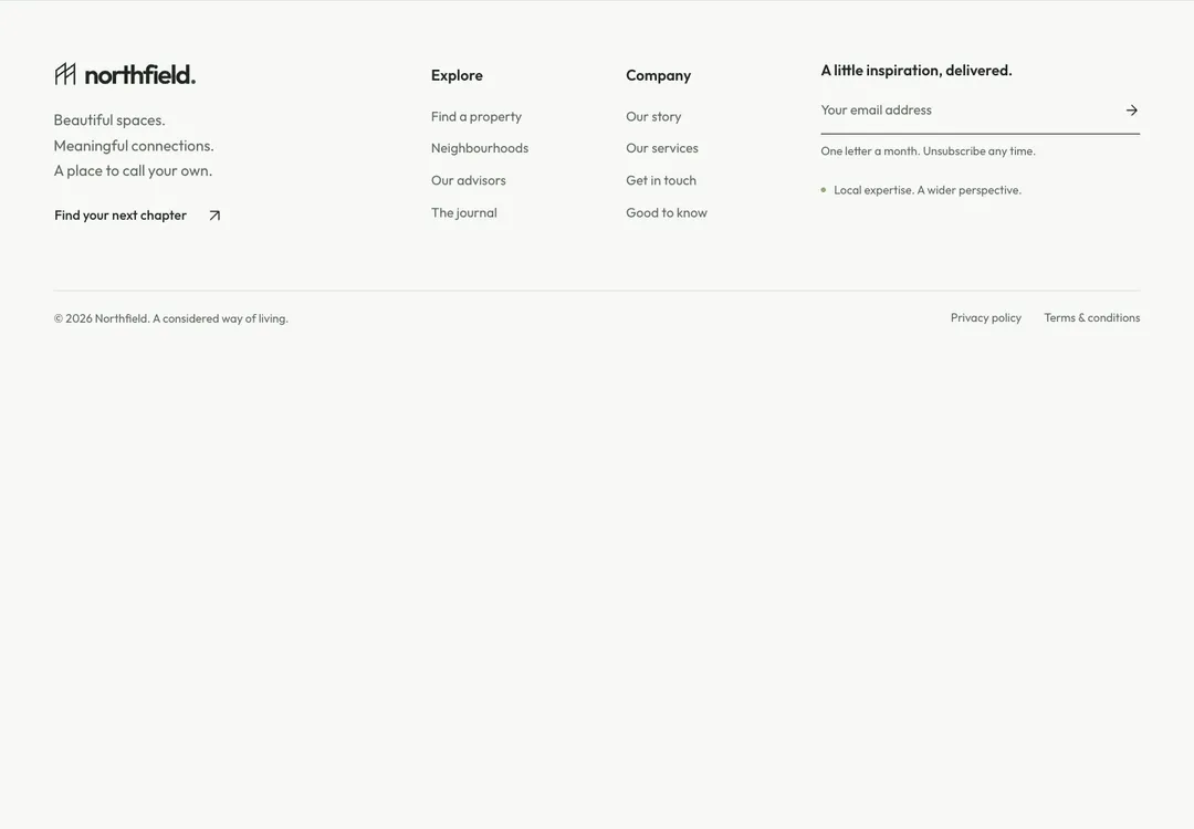
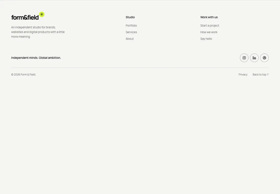
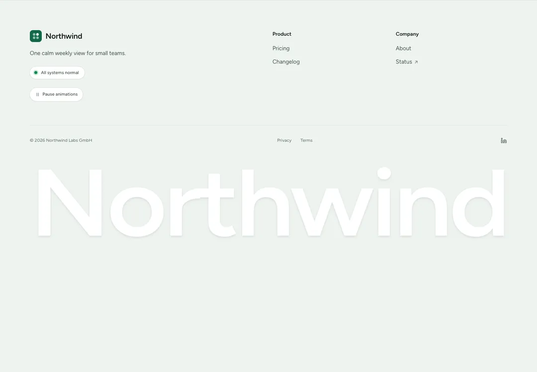
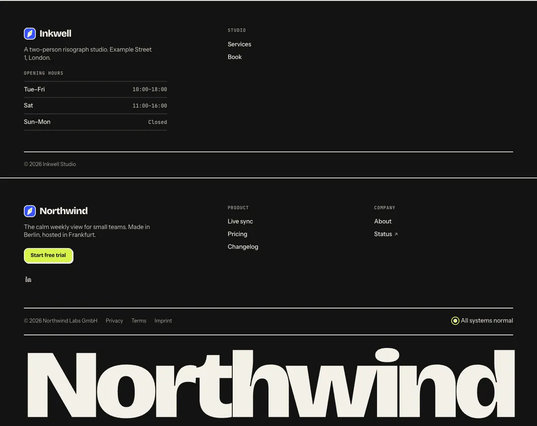
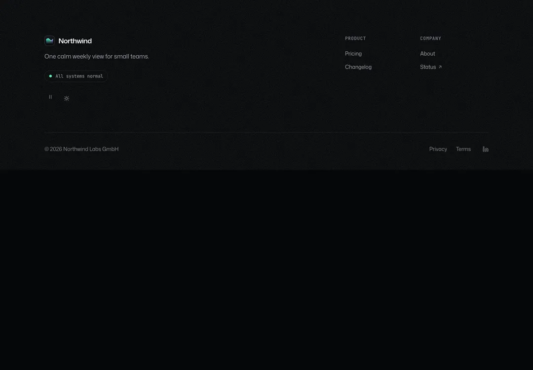
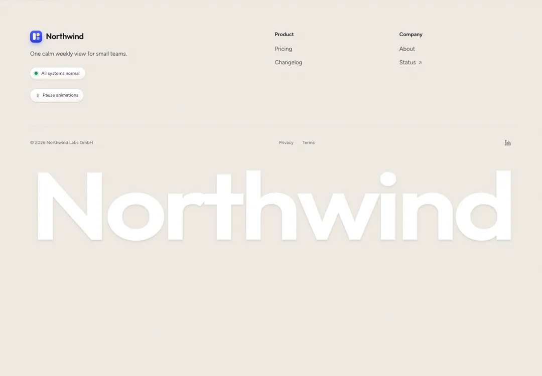
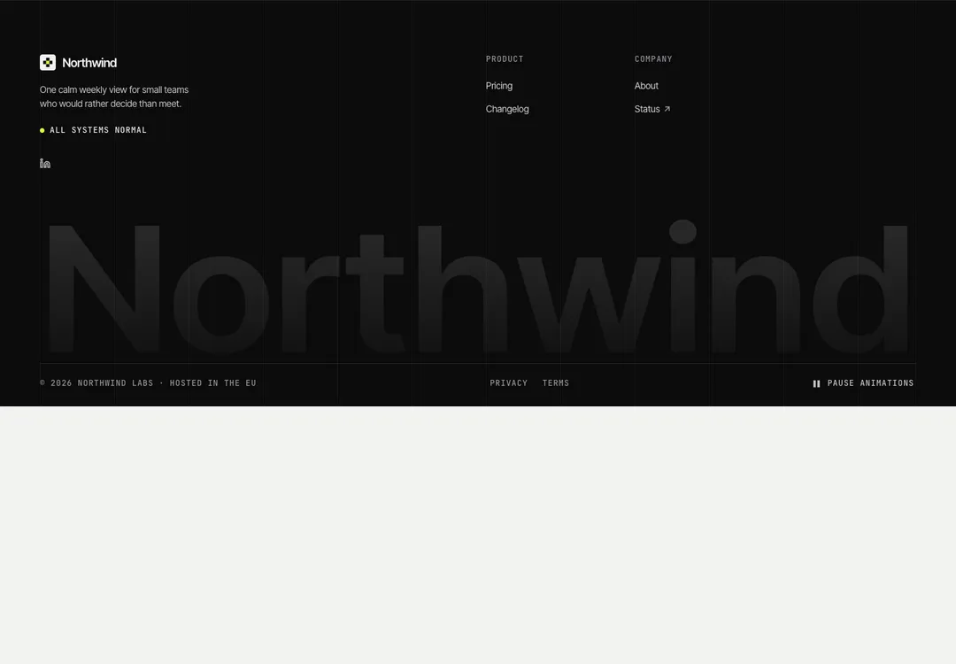
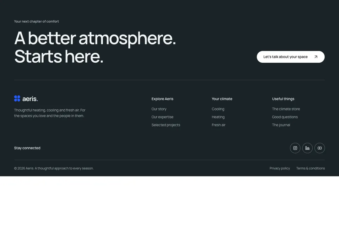
Brand, actions and link columns above a legal row with social links, plus an optional wordmark.
Glass MeridianMotion
Brand, actions and link columns above a legal row with social links, plus an optional wordmark.
The site footer: brand, text, actions and status beside the link columns (their h2 titles are data captions, in a labelled nav), then copyright, legal links and labelled social icons. MotionToggle and ThemeToggle go in actions. The wordmark variant sets the brand name huge across the bottom, sized to fit any width and hidden from screen readers.
It is part of Glass Meridian: daylight sky, frosted glass, one blue line. The style’s 92 pieces share one set of tokens, type and motion, in a light and a dark theme, so whatever you take from it fits together.
To put it in your project, copy the prompt into Claude Code, OpenAI Codex or Cursor, or add it by hand. The documentation walks through both.
Brand, actions and link columns above a legal row with social links, plus an optional wordmark.
Brand, actions and link columns above a legal row with social links, plus an optional wordmark.
Brand, actions and link columns above a legal row with social links, plus an optional wordmark.
Brand, actions and link columns above a legal row with social links, plus an optional wordmark.
Brand, actions and link columns above a legal row with social links, plus an optional wordmark.
Brand, actions and link columns above a legal row with social links, plus an optional wordmark.
Brand, actions and link columns above a legal row with social links, plus an optional wordmark.
Brand, actions and link columns above a legal row with social links, plus an optional wordmark.