Aeris Pricing Comparison Table
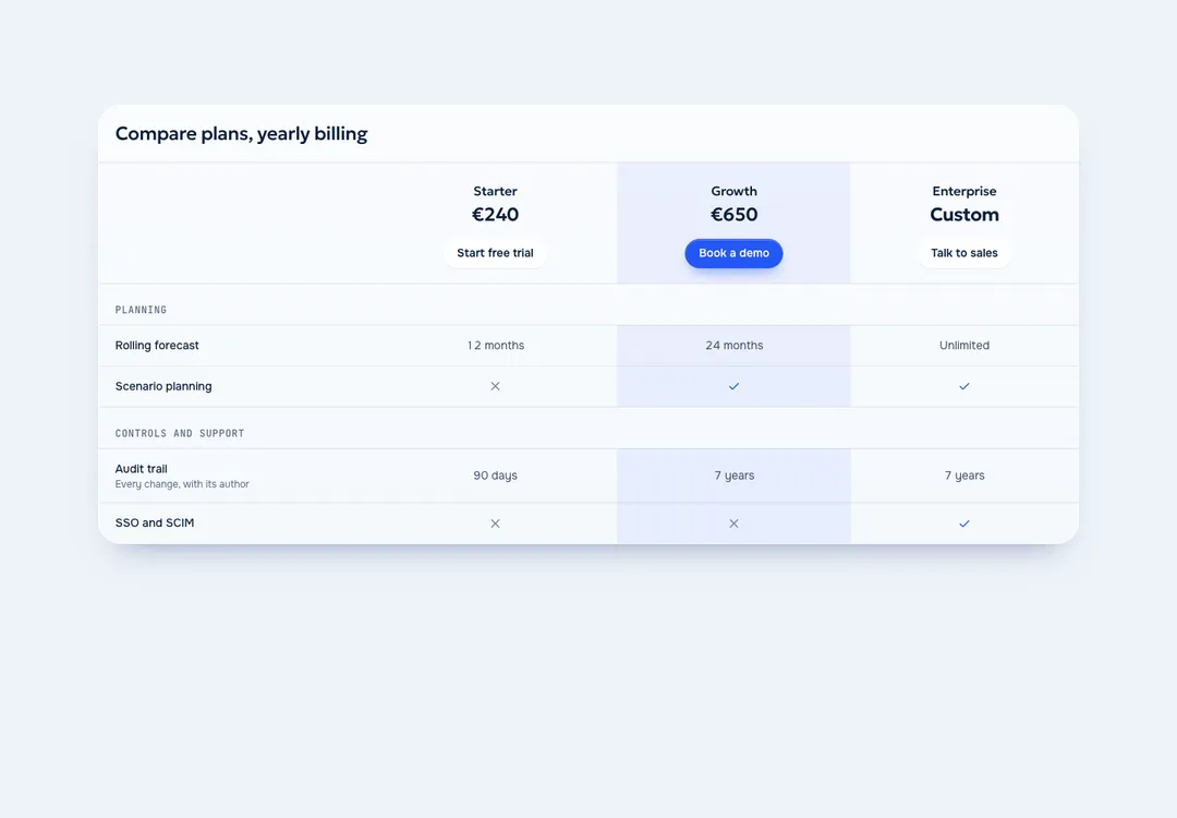
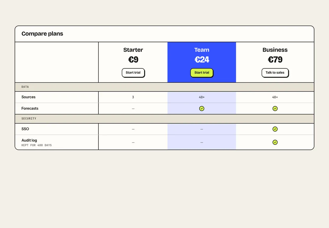
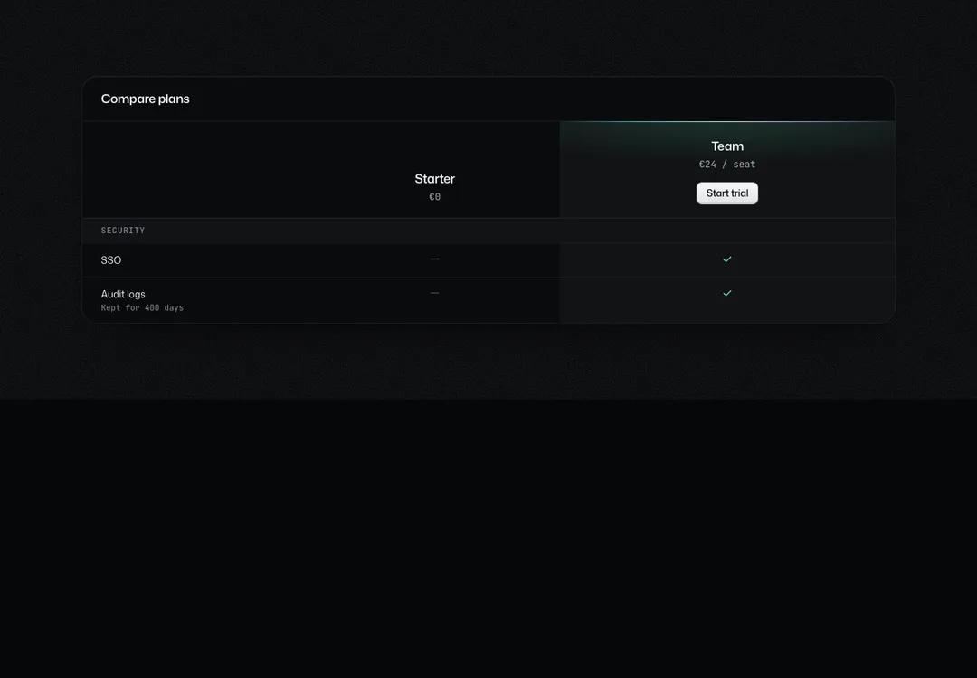
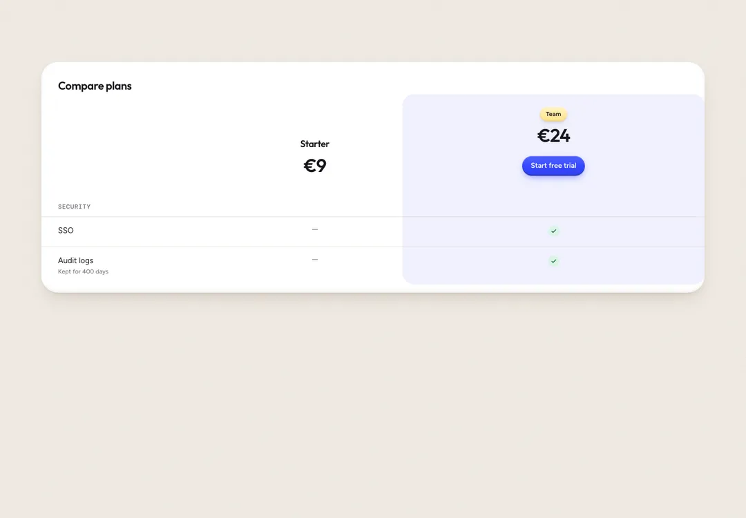
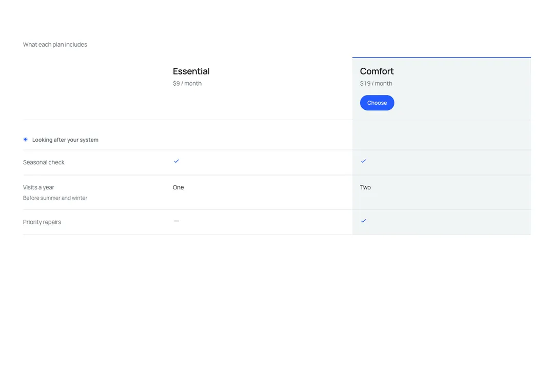
Plans side by side with grouped feature rows; on phones it scrolls with the feature column pinned.
Plans side by side with grouped feature rows; on phones it scrolls with the feature column pinned.
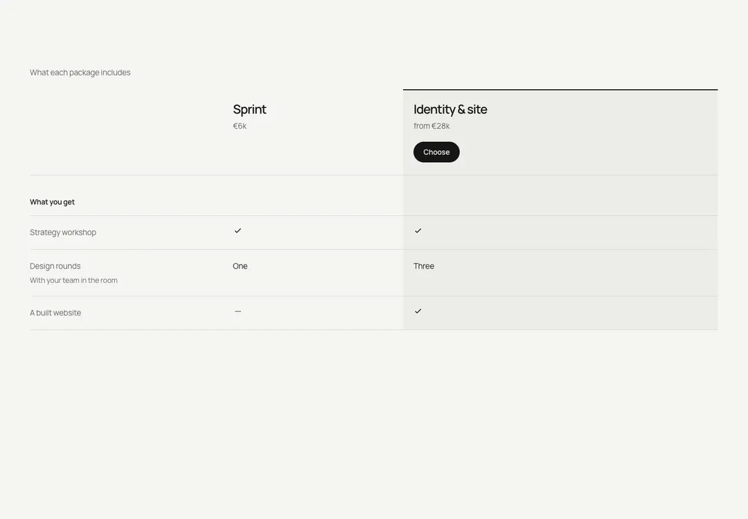
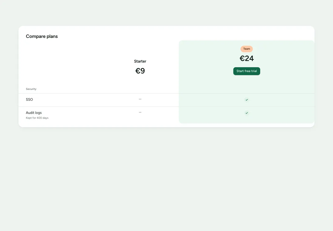
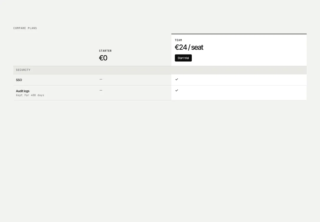
Plans or homes side by side as rows under hairlines: names, prices and calls in the head, group labels with the eyebrow dot, muted row labels, thin ticks and dashes with screen-reader text. The featured column is a white strip under a forest edge with a sage button. On phones it scrolls inside its own region (focusable, arrow keys scroll) with the label column pinned in the page colour; from md the table is see-through, so it sits on any band. Pass caption, or an aria-label, so the region has a name.
It is part of Bavaria: chalk pages, architectural photos, sage and forest green. The style’s 93 pieces share one set of tokens, type and motion, in a light and a dark theme, so whatever you take from it fits together.
To put it in your project, copy the prompt into Claude Code, OpenAI Codex or Cursor, or add it by hand. The documentation walks through both.
Plans side by side with grouped feature rows; on phones it scrolls with the feature column pinned.
Plans side by side with grouped feature rows; on phones it scrolls with the feature column pinned.
Plans side by side with grouped feature rows; on phones it scrolls with the feature column pinned.
Plans side by side with grouped feature rows; on phones it scrolls with the feature column pinned.
Plans side by side with grouped feature rows; on phones it scrolls with the feature column pinned.
Plans side by side with grouped feature rows; on phones it scrolls with the feature column pinned.
Plans side by side with grouped feature rows; on phones it scrolls with the feature column pinned.
Plans side by side with grouped feature rows; on phones it scrolls with the feature column pinned.